
A professional compliment slip template gives you a ready-made layout for creating branded, DL-sized notes that add a personal touch to your customer communications. It’s a small piece of stationery, sure, but its impact in a world full of automated messages is massive. It offers a tangible connection that digital methods just can’t replicate.
Why a Great Compliment Slip Still Matters
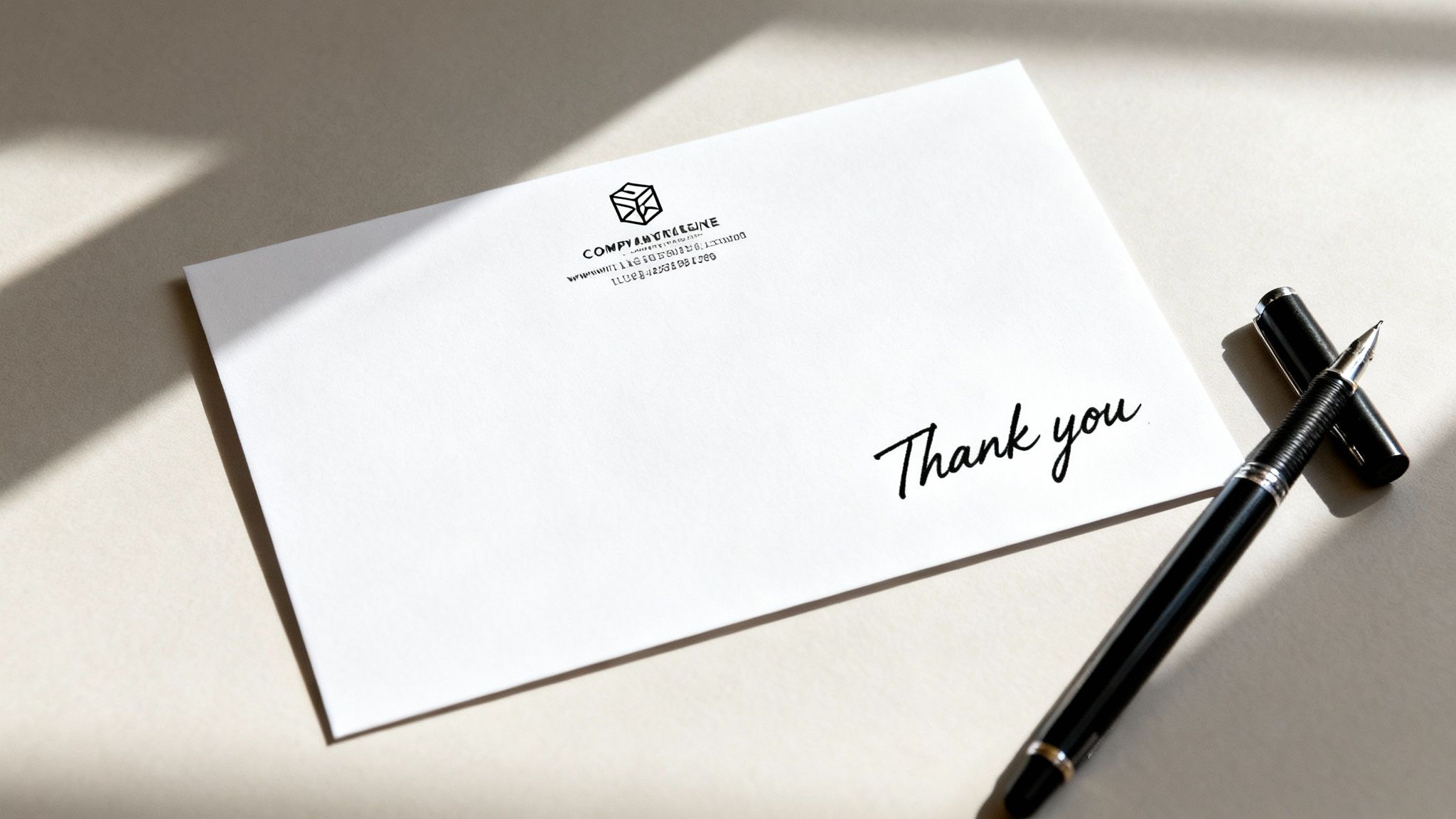
In an age dominated by emails and instant messaging, the humble compliment slip has become a surprisingly powerful tool for building genuine customer relationships. It’s a small, tangible gesture that cuts through the digital noise, showing your clients there’s a real person behind the transaction. This simple piece of paper can transform a standard delivery or document into a memorable brand experience.
Think about it in the real world. An online boutique might tuck a slip with a handwritten "Enjoy your new dress, Sarah!" into a beautifully wrapped package. This small act of personalisation makes the customer feel valued and special, which massively increases the chance of a repeat purchase and a glowing review.
Or, imagine a design consultant attaching a compliment slip with a quick "Looking forward to working with you!" to a formal proposal. That simple, human touch can be the very thing that builds trust and strengthens the professional relationship from day one.
The real value of a compliment slip isn't just in the message it carries, but in the message it sends about your brand: that you care, you pay attention to detail, and you appreciate your customers on a personal level.
Reinforcing Your Brand Identity
Beyond the personal connection, a well-designed compliment slip is a brilliant, consistent touchpoint for your brand. Every time a client receives one, it reinforces your visual identity and keeps you front of mind.
A few key elements really help with this:
- Consistent Logo Placement: Placing your logo prominently but not intrusively ensures immediate brand recognition.
- Brand Colours and Fonts: Using your established colour palette and typography creates a cohesive look that aligns perfectly with your other marketing materials, from your website to your business cards.
- Professional Contact Details: Clearly displaying your website, email, and phone number turns a simple note into a functional piece of stationery, encouraging future contact.
Investing time in a professional compliment slip template isn't just about printing a note; it's about creating a repeatable, high-impact branding tool that builds loyalty for years to come.
Setting Up Your File for Flawless Printing
Getting your compliment slip template to look perfect on screen is the easy part. The real test is making sure it translates flawlessly to paper, and that’s where a little technical prep goes a long way. Setting up your design file correctly from the very beginning saves you from the most common printing headaches, like those dreaded white borders or a blurry logo.
It’s this foundation that separates a professional piece of stationery from something that looks like it came from the office printer.
First things first, let’s talk size. The standard UK size for a compliment slip is DL (99mm x 210mm), which fits neatly into a standard envelope because it's exactly one-third of an A4 page. Whether you’re working in Adobe InDesign, Canva, or another design tool, your very first step should be setting your canvas or document to these exact dimensions. This simple action prevents any weird scaling or cropping issues down the line.
This journey from a simple order to a tool for building relationships is what makes compliment slips so effective.
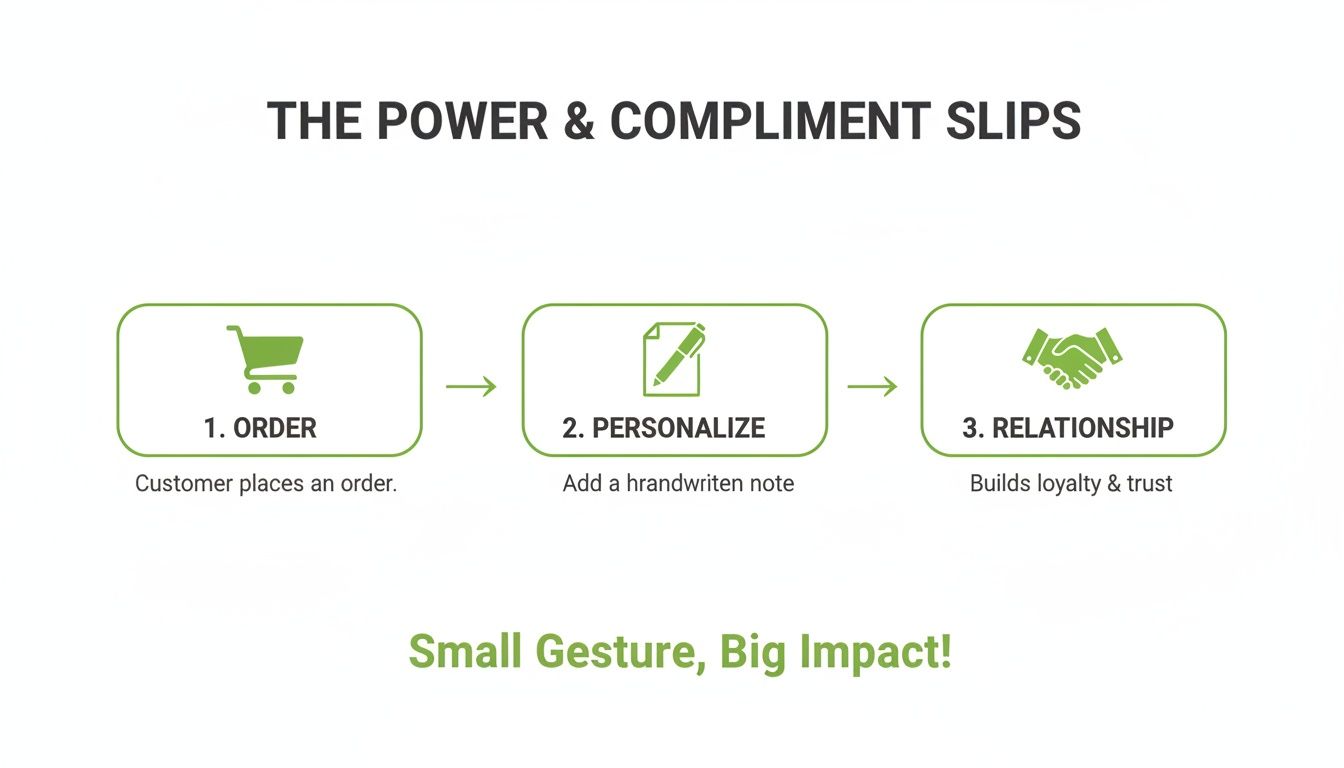
As the visual shows, that personal touch can directly strengthen the connection you have with your customer.
Bleed and Safe Area: Your Two Best Friends
Ever received a printed item with a sliver of a white line along the edge? That’s almost always because the design file was missing a bleed. Think of a bleed as a small safety margin – typically 3mm on all sides – that extends your background colour or any edge-to-edge design elements beyond the final trim line.
During the professional printing and cutting process, there’s always a tiny bit of paper movement. By extending your design into the bleed area, you give the guillotine a bit of wiggle room and guarantee no accidental white edges appear.
On the flip side, you have the safe area. This is an internal margin, also around 3mm, where you should keep all your vital text and logos. It's the "safe zone" that ensures nothing important gets accidentally trimmed off. The principles are exactly the same for most print jobs, as you can see in our guide on the dimensions for a flyer.
Nailing Your Colour and Resolution
Colours look different on a screen compared to how they appear on paper. Your monitor uses an RGB (Red, Green, Blue) light-based model, but professional printers use CMYK (Cyan, Magenta, Yellow, Black) ink. It is absolutely vital to set your document’s colour mode to CMYK right from the start. If you design in RGB and convert it later, you’ll often see a disappointing colour shift that can leave your brand colours looking flat or just plain wrong.
Just as important is your file’s resolution, measured in Dots Per Inch (DPI). For sharp, professional-looking print, you need to work at 300 DPI. Anything lower, and you run the risk of pixelated images and fuzzy text. Nobody wants that.
To help you keep track, here's a quick reference table with the key specs.
Print-Ready Compliment Slip Template Specifications
This table is your cheat sheet for the essential technical settings your design file needs.
| Setting | Recommendation | Reason |
|---|---|---|
| Dimensions | DL (99mm x 210mm) | The standard UK size, fits DL envelopes perfectly. |
| Bleed | 3mm on all sides | Prevents white edges after trimming. |
| Safe Area | 3mm internal margin | Protects key text and logos from being cut off. |
| Colour Mode | CMYK | Ensures accurate colour reproduction in print. |
| Resolution | 300 DPI | Guarantees crisp, high-quality images and text. |
Getting these settings locked in before you even place your first logo is the best way to avoid the most common (and frustrating) print errors. It's a small bit of prep that makes a huge difference to the final product.
Branding and Typography That Makes an Impact
Now that you’ve got the technical setup sorted, it’s time for the fun part: making your compliment slip a genuine extension of your brand. This is about more than just slapping a logo on a page. It's about thoughtful choices that show people who you are and what you stand for.
A great compliment slip feels instantly familiar. It should look like it belongs with the rest of your marketing materials, creating a professional and consistent brand image. Every little detail, from where you put your logo to the font you pick, sends a message to your client.
Strategic Logo Placement and Visual Hierarchy
Your logo is your brand’s signature, so it deserves pride of place. Think top-left or top-centre – this is prime real estate. Placing it here catches the eye immediately and establishes who the note is from without hogging all the attention.
The idea is to create a clear visual hierarchy. Your logo should be the first thing someone notices, followed by your handwritten message, and then your contact details at the bottom. This creates a natural flow that guides the reader’s eye. Avoid tucking your logo away in a corner where it looks like an afterthought, or making it so big it overshadows your personal note.
Choosing Fonts That Work at Small Sizes
Typography has a huge impact on both readability and your brand's personality. That fancy script font might look stunning on your website header, but it can easily turn into an unreadable smudge on a small DL slip.
When you're picking fonts for your compliment slip template, clarity comes first. Always. If your main brand fonts are clean and simple (like Helvetica, Lato, or Open Sans), stick with them. But if your primary font is more decorative, pair it with a simple, easy-to-read sans-serif for the contact details.
A few quick tips for getting your fonts right:
- Keep it simple: Stick to one or two font families, maximum. Anything more looks cluttered.
- Size matters: Make sure your contact info is easy to read. A good rule of thumb is to keep it no smaller than 8pt.
- Be consistent: The fonts you use here should match what’s on your other printed materials. We talk more about this in our guide on how to print business cards.
Using Colour and White Space Effectively
Your brand’s colour palette is a powerful tool, but on a compliment slip, less is definitely more. Use your primary brand colour for small accents – maybe a heading, your logo, or a subtle line at the bottom. I’d strongly advise against using a solid colour background, as it makes handwritten notes hard to read and can come across as a bit unprofessional.
White space is your most important design element. It’s not just empty space; it’s an active component that gives your design room to breathe, makes your message stand out, and creates a feeling of clean, modern professionalism.
Remember, the main point of a compliment slip is to carry a personal message. A busy, cluttered design completely undermines that. By leaving plenty of blank space in the middle, you’re creating an inviting canvas for that handwritten note, making it the true focus. It's this balance between branded elements and open space that turns a simple note into a powerful piece of communication.
Choosing the Right Paper and Finish
How your compliment slip feels in a client’s hand is just as important as how it looks. The paper stock you choose sends subtle but powerful signals about your brand’s personality long before they read a single word. A flimsy, generic paper can completely undermine a brilliant design, while a quality stock elevates the entire experience.
Think of it as the final piece of the branding puzzle. It's the difference between a note that gets a casual glance and one that makes someone pause and take notice.
Understanding Paper Weight
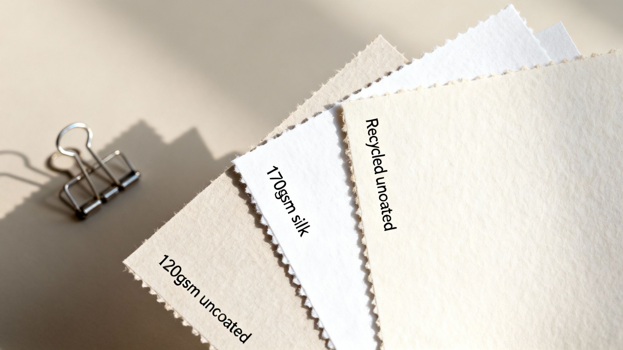
Paper weight is measured in grams per square metre (gsm). It’s simple, really: a higher gsm number means thicker, more substantial paper. For compliment slips, you’ll usually find two popular options that hit the sweet spot.
- 120gsm Uncoated: This is the classic choice for a reason. It has a slightly textured, natural feel that’s perfect for writing on with any kind of pen without worrying about smudges. It feels professional yet approachable, making it a fantastic all-rounder for most businesses.
- 170gsm Silk: For a more premium and substantial feel, 170gsm is an excellent upgrade. The silk coating gives it a smooth, low-sheen finish that makes colours appear richer and more vibrant. While you can still write on it, it has a more luxurious quality, ideal for brands wanting to convey a high-end service.
Choosing the right stock is an affordable way to make a big impact. In the UK printing industry, while overall revenue has seen shifts, compliment slips remain a vital tool for businesses to maintain a personal touch. Profit margins in the sector are projected to edge up to 5.5% by 2025, partly because of the continued demand for cost-effective branded items like these.
Selecting the Perfect Finish
Beyond weight, the finish of the paper plays a huge role in the final look and feel. The finish is the coating applied to the paper's surface, and it dictates how it interacts with light and ink.
Your paper finish should align directly with your brand’s ethos. An eco-conscious brand using a glossy, laminated slip sends a mixed message. Consistency across all your brand touchpoints, including the paper you choose, is what builds trust.
Here’s a quick breakdown of the most common finishes we see:
- Uncoated: As mentioned, this has a natural, matt surface. It’s highly absorbent, which makes it the best option for handwritten notes. It conveys an honest, organic, and classic feel—perfect for craft brands, consultants, and anyone wanting an authentic vibe.
- Silk: This finish sits comfortably between matt and gloss, offering a subtle sheen that adds a touch of sophistication. It feels smooth and reproduces colours beautifully without being overly reflective. It’s a great choice for businesses wanting a modern, premium feel.
- Gloss: A high-shine, reflective finish that really makes colours pop. While it looks fantastic for image-heavy designs, it’s not ideal for compliment slips as it’s difficult to write on and can easily show fingerprints. We'd suggest saving this one for marketing flyers rather than personal notes.
For a deeper dive into how different coatings and treatments can transform your printed materials, check out our complete guide to finishing in printing. It'll give you a great overview of all the options out there.
How to Export a Perfect Print-Ready File
Getting your design from screen to print without a hitch is the final, crucial step. A clean export ensures the compliment slip that lands in your client's hand looks exactly like the one you perfected on your monitor. Think of this final checklist as your safeguard against the most common printing pitfalls.
This stage is really the handover between you and us, the printers. When you provide a technically correct file, the whole process is smoother, faster, and free from any of those stressful last-minute phone calls. It all comes down to a few key checks before you hit that export button.
Lock in Your Text and Fonts
One of the most frequent (and frustrating) print errors we see is a surprise font change. This happens when our system doesn't have the specific fonts you used, forcing it to substitute them with a default. As you can imagine, this can completely wreck your carefully planned layout.
Fortunately, there are two solid ways to prevent this:
- Convert Text to Outlines: This is the most bulletproof method. It essentially turns your text into vector shapes, so it’s no longer editable text but a fixed graphic element. This guarantees it will look identical on any computer, period. In Adobe Illustrator, just select your text and press
Cmd+Shift+O(Mac) orCtrl+Shift+O(Windows). - Embed Fonts: When you export to PDF, most design software gives you an option to embed the fonts directly into the file. This neatly packages the font files within the PDF, ensuring we can see and use them. This is a great alternative if you need the text to remain selectable for any reason.
For something as straightforward as a compliment slip template, outlining your text is usually the safest bet. It just removes any room for error.
Final Checks on Colour and Images
Before you export, take one last look at your colour settings and image quality. This is your last chance to catch any issues that could lead to a disappointing final print. A quick scan now can save you a world of pain later.
First, confirm your entire document is set to the CMYK colour mode. If you've pulled in any logos or icons from other files, double-check that they were also created or converted to CMYK. It's easy for an RGB element to slip through, and that will result in dull or weirdly shifted colours when printed.
Next, make sure any raster images (like photos or complex logos) are high-resolution. That means 300 DPI at their final printed size. A low-resolution image will look pixelated and unprofessional—a small detail that makes a massive difference to how people perceive your brand.
Exporting a High-Quality PDF
With all your checks done, you’re ready to go. The industry-standard format for submitting print jobs is a high-quality PDF. This format is fantastic because it bundles everything—images, fonts (if you embedded them), colours, and layout instructions—into one tidy, reliable file.
When exporting from your design software (like InDesign or Canva), look for a preset named "High Quality Print," "Press Quality," or something similar. This will automatically configure the settings for the best possible results.
Don’t forget the bleed! Make sure you tick the box for "Use Document Bleed Settings" in your export options. Ticking this ensures your 3mm bleed is included in the final PDF, which is absolutely essential for a clean, edge-to-edge finish. You can get the full story on why this is so critical in our detailed guide on how to print with bleeds.
Once you've exported the file, open up the PDF and give it one last look-over. Check that the dimensions are correct (105mm x 216mm, which includes the 3mm bleed on all sides) and zoom right in to make sure everything looks sharp. This simple proofing step is your final confirmation that your compliment slip template is ready for a perfect print run.
Your Compliment Slip Questions Answered
Even with a flawless design ready to go, a few practical questions always pop up when it's time to actually use your new compliment slips. We get asked all the time about when to handwrite a note, whether digital versions are a good idea, and what common pitfalls to avoid.
Getting these little details right is what makes your stationery work as hard as you do. The goal is to make every interaction feel both professional and personal, strengthening those client relationships one note at a time.
Should I Always Handwrite a Note?
This is a great question, and honestly, it all comes down to scale. For smaller businesses or when you're dealing with high-value clients, a short, handwritten message is incredibly powerful. A simple "Thanks for your order, Jane!" or "Pleasure working with you" adds a human touch that builds real loyalty.
But let's be realistic. If you're dispatching hundreds of parcels a day, handwriting every single note just isn't going to happen. In that scenario, a friendly, pre-printed message like "We hope you love it!" or "Thanks for choosing us" still does the job brilliantly. The key is to be consistent.
A good rule of thumb: if the communication is one-to-one (like sending a proposal), always handwrite it. If it’s one-to-many (like an e-commerce dispatch), a printed message is perfectly fine and still adds that extra bit of value.
Can I Create a Digital Compliment Slip?
Absolutely. While you can't quite beat the charm of a physical note, digital compliment slips definitely have their place. They're perfect for attaching to emails that contain invoices, reports, or digital proofs. A branded PDF that says "With compliments" just feels much more considered than a plain old email.
You can easily create a digital version using the same compliment slip template you designed for print. Just remember to export it as a low-resolution PDF to keep the file size small and email-friendly. It’s a fantastic, zero-cost way to keep your branding consistent across all your communications, both online and offline.
What Is the Most Common Mistake to Avoid?
The single biggest mistake we see? Clutter. It’s so tempting to try and fill the space with extra marketing messages, QR codes, or a whole row of social media icons. But remember, the whole point of a compliment slip is to provide a clean, inviting space for a personal message.
Keep the design focused on these three core elements:
- Your Logo: Positioned clearly, usually at the top.
- A Blank Area: This should be the largest part of the slip, ready for your note.
- Contact Details: Kept neat and tidy at the bottom.
Anything more than that risks drowning out the personal touch you’re trying to achieve. A clean, minimalist design almost always works better because it puts the focus right where it belongs: on your message and your appreciation for the client.
When you're ready to get them printed, you can explore a variety of professional compliment slips designed to make your brand look its best and ensure your final product is as polished as your template.

