
So, you’ve got your design printed, the ink is on the paper, and you’re ready to go, right? Not quite. The real magic happens after the printing is done. This is where print finishing comes in – it’s every process that turns a simple printed sheet into a final, polished product.
From adding texture and durability to creating unique shapes and eye-catching effects, finishing is the crucial last step.
What Finishing in Printing Actually Means
Think of it like a bespoke suit. The printing part is like cutting the fabric and stitching the main pieces together – you have the basic garment. But it's the finishing touches – the hand-stitched buttonholes, the silk lining, the final press – that transform it from just a suit into something exceptional. Finishing in printing is exactly the same; it’s what makes your product feel complete and memorable.
This isn't just about making things look pretty; it's a powerful tool for your brand. The right finish can completely change how someone feels about your print. It can:
- Create a Tactile Experience: A soft-touch laminate on a business card makes people want to hold onto it, helping them remember you and your brand.
- Guide the Viewer's Eye: A spot UV finish can make a logo or a call-to-action literally shine, drawing attention straight to the important bits.
- Signal Premium Quality: Techniques like foiling or embossing immediately say "luxury." They give a sense of high value, which can justify a higher price point for a product.
- Improve Durability: Lamination is a lifesaver for things like menus that need to withstand spills, or flyers that get passed around. It extends their lifespan and keeps them looking professional.
In short, print finishing is the bridge between a standard printed item and a genuinely powerful marketing tool. It adds a sensory experience that digital media just can't match, making your materials far more engaging.
In a crowded market, these details make all the difference. As the UK printing industry has evolved, the businesses that have thrived are the ones investing in these advanced capabilities. Today, a small number of larger companies generate around 75% of the industry's turnover, mostly by offering sophisticated services like high-end finishing. You can read more about the current state of the UK print market and its focus on this kind of technology.
This trend tells a clear story: successful brands understand the value of going beyond just ink on paper. They use finishing to create products that not only look fantastic but also feel substantial, driving customers to take action and building a stronger brand.
Exploring Essential Print Finishing Techniques
Once your design is printed, the journey is far from over. In fact, this next stage is where your project truly comes to life, turning a simple sheet of paper into a tangible, memorable experience. This is the world of print finishing, and getting to grips with these techniques unlocks a whole new level of creative potential.
We can break down the most popular methods by what they do best: adding texture and protection, creating visual impact with light and shine, or physically changing the shape of the paper. Each one has a unique job to do, transforming the final product in its own distinct way.
This concept map gives you a quick overview of how finishing elevates a basic print, engages the senses, and helps your brand stand out from the crowd.
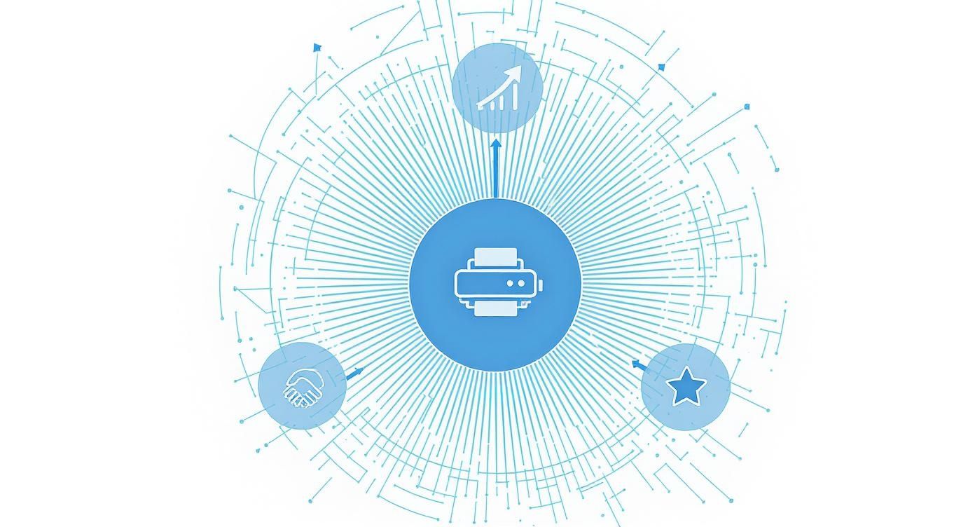
As you can see, finishing isn’t just a nice-to-have; it’s a strategic tool that fundamentally improves how your printed materials look, feel, and perform.
Adding Texture And Durability
Finishes in this category are all about changing how the paper feels to the touch while making it a lot tougher. They’re the workhorses of the printing world, especially for items that get handled a lot.
Lamination: The Protective Shield
Think of lamination as a protective shield for your print. It involves bonding a very thin, transparent plastic film to the surface, making it more durable, tear-resistant, and often water-resistant. This is a must for things that need to last, like menus, loyalty cards, or instruction manuals.
There are three common types of lamination, each with its own character:
- Gloss Lamination: Creates a shiny, reflective surface that makes colours look richer and more vibrant. It’s perfect for grabbing attention on promotional flyers or booklet covers where you want your images to really pop.
- Matte Lamination: This gives you a non-reflective, sophisticated finish with a smooth, almost velvety texture. It suggests elegance and is a hugely popular choice for high-end business cards, invitations, and luxury packaging.
- Soft-Touch Lamination: This is the luxury option. It looks matte but feels incredibly soft and suede-like. That tactile quality makes it unforgettable and is brilliant for products where you want to create a premium sensory experience.
For projects like folded and laminated leaflets, this technique is a game-changer, providing both durability for frequent handling and a high-quality feel that reflects well on your brand.
Creating Visual Impact With Light And Shine
While lamination covers the whole surface, some finishes are used to draw the eye to specific areas. These techniques play with light, reflection, and colour to make certain elements stand out dramatically.
Spot UV: The Selective Spotlight
Imagine an artist applying a super-glossy varnish to just one part of a painting—maybe a raindrop or a piece of jewellery—making it leap off the canvas. That’s exactly what Spot UV (Ultraviolet) does. A high-gloss varnish is applied to specific parts of your design and then cured instantly with UV light.
This creates a stunning contrast between the glossy area and the surrounding matte paper. It’s a fantastic way to highlight a logo, a headline, or a key image on a brochure or business card.
Spot UV is a game-changer for guiding the user’s eye. It adds a layer of visual hierarchy, telling the viewer, "Look here first." This subtle direction can make your design far more effective.
Foiling: The Touch Of Midas
Foiling, or hot foil stamping, is the process of applying a thin layer of metallic or pigmented foil to the paper using heat and pressure. Think of it as a very precise, elegant stamp that leaves behind a shimmering, metallic impression.
Gold and silver are classics, but foils come in a huge range of colours, including copper, rose gold, and even holographic effects. This technique instantly communicates luxury and quality, making it ideal for wedding invitations, premium packaging, and certificates. It’s no surprise that brands are using these high-impact finishes more and more to create a sense of exclusivity and value.
Altering The Physical Form
The most dramatic finishing techniques are those that physically change the shape and structure of the paper. These methods go beyond surface treatments to create three-dimensional effects and unique forms.
Embossing and Debossing: The Art Of Impression
These are two sides of the same coin. Think of them as sculpting the paper itself:
- Embossing uses a metal die to press up from underneath, creating a raised, 3D design on the surface. You can run your finger over it and feel the logo or pattern rising from the page. It adds a sophisticated, tangible quality.
- Debossing is the opposite. The die presses down from the top, creating a sunken or indented impression. This offers a more subtle, understated elegance, a bit like a classic letterpress effect.
Both are perfect for adding a touch of class to logos, monograms, or decorative patterns on stationery, business cards, and presentation folders.
Die-Cutting: The Custom Shape
Standard print is rectangular, but your imagination doesn’t have to be. Die-cutting is like using a custom-made cookie cutter to cut your printed material into any shape you can dream up. A sharp metal blade (a die) is created in your desired shape and used to cut the paper with absolute precision.
This opens up a world of creative possibilities. You can create uniquely shaped business cards, folders with custom pockets, or packaging that unfolds in an interesting way. It is the ultimate tool for breaking away from the standard and creating something truly bespoke and memorable.
Choosing The Right Print Finish
To help you decide, here’s a quick-reference table matching common print products with finishes that work best for them.
| Print Product | Recommended Finish | Primary Goal |
|---|---|---|
| Business Cards | Soft-Touch Lamination, Spot UV, Foiling | Make a memorable, high-end first impression. |
| Event Flyers | Gloss Lamination | Grab attention with vibrant, eye-catching visuals. |
| Restaurant Menus | Matte or Gloss Lamination | Ensure durability and protect against spills and handling. |
| Wedding Invitations | Foiling, Embossing/Debossing | Convey elegance, luxury, and a sense of occasion. |
| Brochures & Booklets | Spot UV on the cover, Matte Lamination | Highlight key information and provide a quality feel. |
| Product Packaging | Die-Cutting, Foiling, Embossing | Create a unique shape and communicate premium value. |
| Loyalty Cards | Lamination | Withstand daily use in a wallet or purse. |
Ultimately, each of these techniques offers a powerful way to enhance your message, turning a simple print job into a compelling piece of communication.
Matching Finishes with Your Print Products
Knowing the different finishing techniques is one thing, but understanding exactly where and when to use them is what elevates good print to great print. This is where theory meets reality. The real goal is to create a seamless experience where the finish not only enhances the product’s function but also strengthens your brand’s message.
Let’s step away from the abstract concepts and dive into practical, real-world examples. By matching the right finish to the right product, you can create materials that don't just share information—they leave a lasting impression.
Business Cards That People Keep
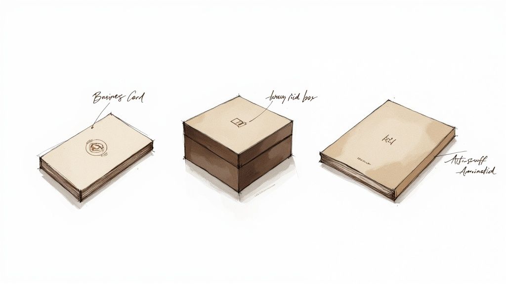
Your business card is often the first physical handshake with a potential client, and how it feels in their hand matters immensely. A standard, flimsy card is all too forgettable, but one with a thoughtful finish practically begs to be kept.
For a seriously powerful impact, try combining a soft-touch laminate with a debossed logo. The velvety texture of the laminate creates an instant sense of quality and luxury, making the card genuinely pleasant to hold. The debossed (indented) logo then adds a subtle, tactile detail that invites a closer look. This combination delivers a memorable sensory experience that far outweighs its cost.
Packaging That Signals Premium Quality
When it comes to product packaging, finishing isn't just decoration; it's a direct signal of the value inside. A customer’s perception of your product starts the moment they see the box. You have a chance to communicate luxury and attention to detail before they’ve even seen what they’ve bought.
Consider combining hot foiling with a sturdy, rigid box. The brilliant shine of a gold, silver, or copper foil logo creates an undeniable premium feel. When that's applied to a high-quality, rigid board, the entire package feels substantial and protective, justifying a higher price point and building real anticipation for the unboxing.
The finish on your packaging is a silent promise to the customer. It suggests the quality and care you've invested in the product itself, making it a critical part of the overall brand experience.
Brochures That Guide The Eye
A brochure or booklet’s job is to tell a story and guide the reader through key information. Finishing can play a vital role here, directing their attention and making the journey more engaging. Using Spot UV is a brilliant strategy for exactly this.
By applying a high-gloss Spot UV finish to specific images, headlines, or call-to-action buttons, you create a striking visual and textural contrast against a matte laminated background. The viewer's eye is naturally drawn to these shiny, raised areas. It’s a clever technique that effectively tells them where to look first, highlighting the most important parts of your message without cluttering the design.
Menus Built To Last
Restaurant menus are some of the most frequently handled items in print, facing constant wear, tear, and the occasional spill. In this case, durability is every bit as important as aesthetics. After all, a tattered, stained menu reflects poorly on the establishment.
The solution is anti-scuff matte lamination. This specialised finish provides robust protection against scratches, fingerprints, and moisture, making the menus easy to wipe clean. Unlike standard matte, its anti-scuff properties ensure it keeps its elegant, non-reflective look even after heavy use, keeping your menus looking professional for much longer.
Stickers That Stick In The Mind
Finishes aren't just for paper and cardstock. For products like stickers and labels, the right finish can be essential for both looks and function. A gloss laminate can make colours pop on a product label, while a matte finish might be better for a scannable QR code to reduce glare.
You can explore more options in our ultimate guide to choosing the right sticker or label, which dives deeper into materials and finishes. It's a perfect example of how finishing in printing adapts to the product's specific needs.
How to Prepare Your Artwork for Finishing
Even the most brilliant finishing idea can fall flat because of one simple thing: artwork that isn’t set up correctly. Getting your digital files ready for specialist finishes is one of the most common hurdles in printing, often leading to costly mistakes and frustrating delays.
Think of your design file as the architectural blueprint for your print job. If that blueprint is wrong, the final building will have flaws. For print finishing, this means creating clear, separate instructions within your artwork so our presses know exactly where to apply each stunning effect.
Creating Separate Layers for Finishes
The golden rule for preparing artwork for spot UV, foiling, embossing, or debossing is to put these elements on their own, separate layers. Imagine you're giving us a set of instructions. One page shows the main colour print, and a transparent overlay sheet shows exactly where you want the foil to go. That’s how your design file needs to be structured.
For example, when setting up artwork for our popular metallic foil business cards, you’d send us two key components:
- Main Artwork: This file has all your standard colour printing elements (in CMYK).
- Finishing Layer: This is a separate file or layer where the areas to be foiled are shown in 100% black (K) only, with no other colours. This black shape acts as a precise map for the foil machine.
This separation is non-negotiable. It prevents any confusion and ensures the finishing is applied with pinpoint accuracy, right where you intended it to be.
Key Takeaway: Always create a separate, clearly labelled layer or file for each finishing process. Use a solid, single colour (usually 100% K) to define the area for the finish, and make sure it lines up perfectly with your main artwork.
Understanding Vector Masks and Bleed
For finishes that involve unique shapes, like die-cutting, you need to provide a vector mask. Think of this as a digital cookie-cutter. It’s a clean line drawn in a vector program (like Adobe Illustrator) that tells our machine the exact path to cut. It has to be a vector, not a pixel-based image, because vectors can be scaled without losing quality, guaranteeing a crisp, clean cut every time.
Just as important are two other concepts: bleed and safe zones.
- Bleed: This is an extra margin—usually 3mm—of your background design that extends beyond the final trim edge of the paper. It’s a safety net, ensuring that if the cut is off by a fraction of a millimetre, you won’t get any ugly white slivers along the edge.
- Safe Zone: This is an area just inside the trim line where you should keep all your important text and logos. This prevents anything crucial from being accidentally chopped off during trimming.
The Crucial Role of Proofing
Finally, never underestimate the power of checking a proof. A proof is your preview of the final product, and it's your last chance to spot any errors before the full print run begins. There are two main types:
- Digital Proof (PDF): A quick and easy way to check for typos, layout issues, and correct alignment.
- Physical Proof (Hard Copy): For projects with complex finishes, this is essential. A PDF can't show you how a foil will catch the light or how a debossed logo will feel in your hand. Always insist on a physical proof to approve the actual texture, colour, and finish.
Getting your files right is more important than ever. The industry is moving towards data-driven personalisation, allowing for more targeted and unique print runs that minimise waste. Correctly prepared artwork is the foundation that ensures these sophisticated designs are realised perfectly in the final product.
Balancing Project Cost, Time, and Impact
Choosing the perfect finish for your print project isn’t just a creative decision. It’s a strategic one that ties directly into your budget, timeline, and what you’re hoping to achieve. The most elaborate finishing in printing can deliver an incredible ‘wow’ factor, but it naturally comes with a higher price tag and a longer production schedule. Getting this trade-off right is the key.
Think of it as a sliding scale. At one end, you have complex, multi-stage finishes like combining multi-level embossing with hot foiling. This kind of work requires custom-made dies, multiple machine setups, and a high degree of craftsmanship. The result is a tactile, unforgettable product perfect for luxury goods or VIP invitations, where the return on investment comes from powerful brand perception.
At the other end, you have highly effective yet budget-friendly options. A simple matte laminate on a high-volume flyer is a perfect example. It adds a touch of class and significantly improves durability for a minimal cost per unit, making it an excellent choice for materials that need to look professional without breaking the bank.
How Quantity Shapes Your Costs
The number of items you print has a massive impact on how cost-effective a particular finish is. This is especially true for traditional methods that have significant setup costs baked in.
- Traditional Foiling: This requires a custom metal die to be created and the machine to be set up. That initial cost is the same whether you're printing 100 items or 10,000, so the price-per-item plummets on larger runs.
- Digital Foiling: This modern alternative doesn't need a die, making it much more flexible and cost-effective for smaller, bespoke print runs. It’s the ideal solution when you need a premium look for a limited quantity.
This dynamic of setup versus unit cost applies to many finishing processes, including die-cutting and embossing.
When you're making a decision, always think about the total project value. A higher upfront cost for a premium finish can deliver a much greater return by making your marketing materials more memorable and effective.
This calculation is more important than ever. In early 2025, the UK printing industry faced major cost pressures, with paper and board alone making up 34% of total costs. For businesses to stay profitable, the return from value-added services like finishing has become a critical focus. You can discover more insights about the UK print industry outlook to understand these trends.
Ultimately, getting this balance right helps you make smart decisions that fit your budget, timeline, and campaign goals perfectly.
Choosing Sustainable Print Finishing Options
In today's market, sustainability isn't just a buzzword—it's a core value that customers actively look for. Making greener choices in your print finishing can seriously strengthen your brand's reputation and win over a more conscious audience. It's about looking beyond the visuals and thinking about the entire lifecycle of your printed materials.
One of the first questions people ask is whether special finishes can be recycled. While some old-school laminates can make recycling tricky, a whole new world of eco-friendly alternatives is now available. Biodegradable laminates, for example, are made from plant-based materials that break down naturally without harming the environment.
Embracing Green Alternatives
Going green doesn't mean you have to compromise on quality. Many modern, sustainable options deliver stunning results while being kinder to the planet.
- Vegetable-Based Inks: Unlike traditional petroleum-based inks, these are made from renewable resources like soy and corn. A big plus is that they release fewer volatile organic compounds (VOCs) during the printing process.
- Water-Based Coatings: Aqueous coatings give you a protective layer much like varnish, but they use water as their base, making them a much cleaner, greener choice.
- Waste-Reducing Foiling: Modern digital foiling techniques are a game-changer. They create far less waste than traditional methods because they don’t need custom-made metal dies for every job.
Choosing sustainable finishing is a powerful statement. It tells your customers that your brand is committed to quality not just in its products, but in its environmental responsibilities, too.
This focus on sustainability can really set you apart from the competition. Print choices that highlight a brand's green credentials are no longer a niche concern but a vital part of meeting what modern consumers expect. You can discover more about sustainability trends in UK printing and see how they are shaping the industry.
And don't forget the paper itself. Always try to partner with printers who use FSC or PEFC certified stock, which guarantees the paper comes from responsibly managed forests. Combine that with options like our eco-friendly recycled flyers, and you can create impactful materials that perfectly align with your green credentials.
Your Finishing Questions Answered
When you’re diving into the world of print finishing, a few practical questions always pop up. Getting the right answers is key to making sure your final product looks exactly how you imagined it, without any surprises for your budget or deadline. Let's tackle some of the most common queries we hear.
Can You Apply Multiple Finishes to One Item?
Absolutely! In fact, layering different finishes is a fantastic way to create a truly premium and memorable product. Think of a business card with a velvety soft-touch laminate, a logo that pops with a glossy spot UV, and elegant gilded edges to finish it off. Now that's an introduction.
It’s worth having a chat with your printer about your ideas, though. Some combinations are trickier to pull off than others, and each extra process will add to the cost and production time. This approach is best saved for those projects where making a huge impression is the number one goal.
What Is the Difference Between Embossing and Debossing?
This is a classic one. Embossing and debossing are two sides of the same coin, each creating a unique tactile feel on the paper.
- Embossing uses a special die to press up from underneath the paper, creating a raised 3D impression that you can feel standing out from the surface.
- Debossing is the opposite. The die presses down from the top, creating a sunken or indented impression in the paper.
Embossing gives you a prominent, raised texture that’s impossible to ignore, while debossing offers a more subtle, classic elegance. The right choice really just comes down to the look and feel you’re going for.
How Do I Choose the Right Binding Method?
The best binding for your document really depends on three things: its page count, how it’s going to be used, and the level of quality you want. For something thin like a brochure or newsletter, saddle-stitching (stapling along the folded spine) is quick and budget-friendly.
If you’re creating a thicker report or a book, perfect binding gives you that clean, professional look with a squared-off spine. But if your document needs to lie completely flat—like a workbook, manual, or presentation—then wire-o or spiral binding is definitely the way to go.
At The Print Warehouse Ltd, we offer a huge range of finishing options to bring your creative vision to life. Explore our high-quality print solutions today and create materials that truly stand out.

