
When you hear a designer or printer talk about "bleed," what they're referring to is the practice of extending your design's background, images, or colours beyond the final trim edge. This little bit of extra margin—usually 3mm here in the UK—is the secret ingredient for a professional, edge-to-edge finish.
It’s designed to be trimmed off, ensuring you never end up with any accidental white borders on your finished prints.
Why Flawless Prints Depend on Bleeds
Ever received a batch of flyers and spotted that frustratingly thin white sliver along one side? That tiny imperfection is exactly what happens when a design is sent to print without a proper bleed. It’s a common hiccup that can instantly make your marketing materials look rushed and unprofessional.
Think of it like using masking tape when you're painting a wall. You always paint slightly over the edge of the tape to guarantee a crisp, clean line when you peel it off. That overlap is your bleed. In printing, the "tape" is the part of the paper that gets trimmed away by a massive guillotine, and the bleed ensures your colour runs right to the very edge of the final product.
The Three Pillars of a Print-Ready File
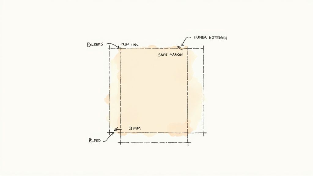
To get this right every time, you need to get your head around three key areas that work together: the bleed, the trim line, and the safe area. Once you understand how these zones interact, you'll be creating professional print files without even thinking about it.
- Bleed Area: This is the outermost part of your design that extends past where the final cut will be. It's sacrificial by design—its only job is to get trimmed away.
- Trim Line: This is the finished size of your product. It’s the line where the printer's guillotine will cut, separating your final piece from the excess paper and bleed.
- Safe Area: This is an inner margin, typically 3-5mm inside the trim line. All your critical content—text, logos, contact details—must stay inside this zone to avoid being accidentally sliced off during trimming.
This infographic gives a great visual breakdown of how the safe area, trim line, and bleed all come together.

As you can see, the important stuff stays in the middle, the final cut happens along the trim line, and any background elements must stretch all the way to the outer bleed edge.
Standard UK Bleed & Safe Area Dimensions
To make things simple, here’s a quick reference table with the standard measurements we recommend for common print jobs in the UK. Sticking to these will keep your files print-ready and avoid any back-and-forth with your printer.
| Print Product | Standard Bleed (per side) | Recommended Safe Area (from trim) |
|---|---|---|
| Business Cards | 3mm | 5mm |
| A5/A6 Flyers | 3mm | 3-5mm |
| Posters | 3mm | 5mm |
| Roller Banners | 3mm | 10mm |
| Stickers (on sheets) | 2mm | 2mm |
| Folded Leaflets | 3mm | 5mm from trim & folds |
These are the industry-standard figures, but it's always a good habit to double-check the specific requirements of your print provider before you finalise your artwork.
The UK Standard for Professional Printing
In the UK's print industry—a sector that generates around £14.3 billion in annual turnover—getting the technical details right is non-negotiable. While requirements can sometimes vary, the vast majority of UK printers expect a standard 3mm bleed on all sides of your artwork.
This applies to almost everything, from tiny business cards to large-format poster printing. Forgetting to add it is one of the most common reasons a print file gets rejected.
Key Takeaway: The bleed isn't just a suggestion; it's a technical necessity for high-quality printing. It compensates for tiny mechanical movements that happen during the printing and cutting process, guaranteeing every single item has a perfect, full-colour edge.
Setting Up Your Artwork for Bleed in Any Software
Now for the practical bit. Let's be honest, this is where most bleed-related mistakes happen – right at the very beginning. Getting your document set up correctly from the get-go saves a world of headaches later and means your final file will fly through the printing process.
We’ll walk through exactly how to set up your document to print with bleeds in the big three: Adobe InDesign, Illustrator, and the ever-popular Canva. No matter what you're using, you'll know what to do.
Configuring Bleeds in Adobe InDesign
InDesign is the industry standard for anything with multiple pages, like brochures, booklets, and magazines. Thankfully, it makes handling bleeds incredibly straightforward. The trick is to do it when you first create the document.
Let's say you're putting together a new A4 brochure.
- Open InDesign and go to File > New > Document.
- In the pop-up window, pop in your final page dimensions (for A4, that’s 210mm x 297mm).
- Look for the Bleed and Slug section. You might need to click to expand it.
- Enter 3mm into the first box (Top). If the little "link" icon is active, it will automatically fill in 3mm for all four sides: Bottom, Inside, and Outside.
Doing this adds a thin red guide around your document canvas. This red line is your new best friend—it's the line that any background colours, images, or other elements touching the edge must extend to.
Pro Tip: Already started a design and forgot the bleed? Don't panic. You can add it later by going to File > Document Setup and entering the 3mm value there. Just remember you'll then need to go back and manually stretch your artwork out to meet that new red guide.
Building Your Foundation in Adobe Illustrator
Illustrator is the tool of choice for vector artwork like logos and single-page designs such as flyers or business cards. The process for setting up a document to print with bleeds is almost identical to InDesign, which helps build good habits.
Let's imagine you're designing a standard UK business card. As you're working, you might find our guide on ordering professionally printed business cards in the UK helpful for choosing paper stocks and finishes.
When you create your new file, here's what to do:
- Head to File > New.
- Enter the final dimensions for a UK business card: 85mm x 55mm.
- Find the Bleed section in the right-hand panel.
- Just like in InDesign, type 3mm into the Top field and make sure the settings are linked to apply it to every side.
Once you hit Create, you'll see your white artboard (that’s the final trim size) surrounded by that all-important red bleed line. Your job is to make sure any element meant to touch the edge of the card extends all the way to this line.
The image below shows the print dialogue box, highlighting the 'Marks and Bleeds' options. This is where those settings become critical when you're exporting your final file.
This dialogue box is your final check to ensure the bleed you set up at the start is actually included in the print-ready PDF you send us.
Finding the Bleed Settings in Canva
Canva is brilliant for creating marketing materials quickly, but its bleed settings are a bit hidden if you don't know where to look. Unlike the Adobe tools, you usually add the bleed after you’ve started designing.
Here’s how you find the magic setting:
- With your design open, click on File in the top menu bar.
- From the dropdown, choose View settings.
- In the next menu, click Show print bleed.
A dotted line will suddenly appear around the edge of your design. This is your bleed boundary. At first, you’ll probably see a white gap between your artwork and this new line. Your job now is to click on your background images or colour blocks and stretch them outwards until they completely cover this new area and snap to the dotted guide.
This manual step is absolutely crucial in Canva. Just turning the bleed guide on isn't enough; you have to actively extend your artwork to fill that space. Forgetting to do this is one of the most common reasons Canva designs get sent back from printers.
A good habit is to switch this setting on before you add any design elements. That way, you’re designing with the full bleed area in mind from the very start, which saves you from any awkward, last-minute adjustments.
Practical Design Tips and Common Mistakes to Avoid
Knowing how to set up your document with the right guides is half the battle. The other half is learning how to design within them. The real art of preparing a file to print with bleeds is all about how you treat the relationship between your design elements and the edge of the page. You have to start thinking like a printer and anticipate that final trim.
I’ve seen it time and again: experienced designers treat the bleed area not as an afterthought but as a fundamental part of their canvas. This simple shift in mindset prevents the most common and frustrating print errors, ensuring the design you love on your screen is the one you get in your hands.
Master the Bleed Area
The golden rule is beautifully simple: if any part of your design is meant to touch the final edge of the print, it must extend all the way to the bleed line. This goes for everything—background colours, photos, patterns, and any graphic shapes.
Stopping a background right on the trim line is a recipe for disaster. Even with the most advanced cutting equipment, there can be tiny shifts of less than a millimetre. If your colour doesn't extend into the bleed area, that tiny movement can leave an unsightly white sliver along the edge of your finished product.
Here are a few core practices to get into the habit of:
- Stretch Backgrounds Fully: Always pull your background images and colour blocks to the absolute edge of the bleed guide. Don’t just nudge them to the trim line; make sure you cover the entire bleed zone.
- Check Your Image Resolution: When you stretch an image to fill the bleed, you’re making it bigger. Double-check that it still has a high enough resolution (300 DPI is the industry standard) at its new size to avoid looking pixelated or blurry.
- Avoid Important Details in the Bleed: Remember, everything in the bleed area is destined for the bin. Don’t let the corner of a crucial photo or a key part of a graphic stray into this zone if you want it to be seen.
This approach is vital for all printed materials, but it’s especially important for high-impact items like flyers and leaflets where a professional finish is non-negotiable. If you're weighing your options for a marketing campaign, understanding what each format excels at can be incredibly helpful; you can learn more by exploring our guide on how to decide between flyers or leaflets.
Respect the Safe Area
Just as the bleed area is the "danger zone" for getting trimmed, the safe area is your sanctuary. This inner margin is where all your critical information—text, logos, contact details—must live, safely protected from the guillotine. Placing text too close to the trim line is easily one of the most frequent mistakes we see.
A Printer's Perspective: We often receive files where a phone number or a social media handle is sitting just 1mm from the edge. Even the slightest paper shift during trimming means that contact detail will be sliced clean off, rendering the entire print ineffective.
Imagine you're designing an A5 flyer. With a standard 3mm bleed and a recommended 5mm safe margin, your vital content has a total buffer of 8mm from the absolute edge of your document. Keeping text inside this boundary guarantees it will be perfectly intact on every single piece.
Common Design Mistakes and How to Fix Them
Let's look at some real-world mistakes that can derail an otherwise great design and, more importantly, how you can easily prevent them.
| Common Mistake | The Problem It Causes | How to Fix It |
|---|---|---|
| Borders Too Close to the Edge | Placing a thin frame right on the trim line results in an uneven, lopsided border after cutting due to minor shifts. | Either extend the border fully into the bleed for a full-bleed frame or pull it at least 5mm inside the trim line to create a deliberate, even internal margin. |
| "Floating" Text | A line of text, like a website URL, is placed just inside the trim line but outside the safe area. | Pull all text, logos, and essential icons comfortably inside the safe area. Give them some breathing room. |
| Low-Resolution Images | An image looks fine on screen but becomes blurry when printed, especially after being enlarged to cover the bleed. | Always use high-resolution images (300 DPI) for print. Check the image quality after you have scaled it to its final size in your design. |
| Ignoring Folds | For folded leaflets, placing text directly on a fold line can make it unreadable or look distorted when folded. | Keep critical elements at least 5mm away from any planned fold lines, treating them just like you would a trim line. |
By consciously avoiding these traps and embracing these design principles, you take full control of the final output. It's the best way to ensure your vision is perfectly translated from a digital file into a tangible, professional printed product.
Getting Your Artwork to the Printer: Exporting a Flawless PDF
You’ve meticulously crafted your design, double-checked your safe areas, and perfectly extended your backgrounds into the bleed. Now for the final, crucial step: exporting a file the printer can actually use. This is where a beautiful design can fall at the last hurdle, but getting it right means your job will fly through production without costly delays or reprints.
This isn’t just about clicking "Save As." It’s about creating a locked-down file that contains all the non-negotiable information—bleeds, high-resolution images, and the correct colour data. Let’s walk through the exact settings you need, cutting through the jargon to give you a clear, repeatable process for perfect exports every time.
Choosing the Right File Format and Settings
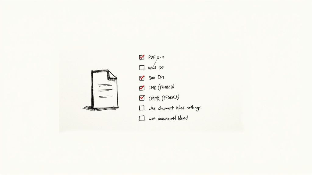
For professional printing, the gold standard is a PDF (Portable Document Format). But not all PDFs are created equal. You need to export using a specific preset built for high-quality commercial printing.
The one you’re looking for is PDF/X-4. Think of it as a universal language for printers. This preset creates a reliable, self-contained file that embeds your fonts, keeps images sharp, and correctly handles colour and transparency. If you see this option, it's almost always the right one to choose.
Beyond the format, a couple of other settings are absolutely essential:
- Resolution: Your file must be exported at 300 DPI (Dots Per Inch). This is the industry standard for high-quality print, ensuring everything looks crisp and sharp, not blurry or pixelated.
- Colour Profile: Your artwork should be set up in CMYK (Cyan, Magenta, Yellow, Key/Black), the four-colour model used in printing. For work printed in the UK and Europe, using a profile like FOGRA39 ensures your colours look accurate and consistent on the final product.
Activating Bleed Settings During Export
This is the most important checkbox in the entire process. You’ve done the hard work of designing with bleeds, but if you don't tell the software to include them in the final PDF, all that effort is for nothing.
When you go to export, you’ll see a dialogue box full of options. You need to find the section labelled "Marks and Bleeds" (or something similar).
In there, you absolutely must tick the box that says "Use Document Bleed Settings."
This single action tells the software to add that extra 3mm you so carefully designed. Without it, the exported PDF will be cropped to the final trim size, and the printer will receive a file with no bleed—which they’ll have to reject.
A Final Sanity Check: Before you hit that "Export" button, always, always double-check this setting. It’s a tiny detail that makes the difference between a file that’s ready to print and one that needs fixing.
A Quick Export Walkthrough for Your Design Software
Let's apply these rules to the most common design tools. The goal is always the same: a high-resolution PDF/X-4 with the document bleeds included.
Adobe Illustrator & InDesign:
The process is almost identical in both programs.
- Go to File > Save As or File > Export.
- Choose Adobe PDF (Print) as the format.
- From the Adobe PDF Preset dropdown, select [PDF/X-4:2008]. If that’s not there, [High Quality Print] is a good starting point.
- Find the "Marks and Bleeds" tab on the left.
- Under "Bleeds," tick the box for "Use Document Bleed Settings." Your 3mm value should pop into the boxes automatically.
- Don't tick "All Printer's Marks" unless your printer has specifically asked for them. Most of the time, they aren't needed.
Canva:
Canva has made this surprisingly straightforward.
- Click the "Share" button in the top right.
- Choose "Download."
- For "File type," select "PDF Print."
- Crucially, you must tick the box for "Crop marks and bleed." This automatically includes your bleed area in the final PDF.
- Under "Colour Profile," make sure you select CMYK for the best printing results.
Getting your export settings spot-on is especially vital for products like custom stickers, where precise cutting is the key to a professional finish. For more tips on getting smaller items just right, check out our guide on designing and ordering stickers and labels.
Technical accuracy has become even more important as the UK printing industry evolves. With revenue projected to hit £9.2 billion in 2025, the market is shifting from sheer volume towards high-value, specialised services. This means printers are investing in precision and quality, making fundamentals like proper bleed setup a core requirement for any professional job.
Troubleshooting Common Bleed and Trim Problems
Even with the most careful planning, things can sometimes go wrong between what you see on screen and the final printed product. It’s incredibly frustrating to have a file rejected or to receive an order that just doesn’t look right, but don’t worry – the fix is usually much simpler than you think.
Most issues come down to a handful of common, easily corrected oversights. This is your quick-fire guide to diagnosing and fixing the most frequent problems related to print bleeds, getting your project back on track fast.
Diagnosis: “My File Was Rejected for Having No Bleed”
So, you were absolutely certain you set everything up correctly, but the printer has come back with that dreaded "no bleed" error. We see this all the time, and it almost always comes down to the export process, not your actual design work.
The likely culprit is a single missed checkbox. You can design a perfect file with your background and images extending beautifully into the bleed area, but if you forget to tell the software to include that bleed in the final PDF, it gets chopped off when you save. The file the printer receives is cropped precisely to the trim size, with no bleed in sight.
To fix this, you just need to re-export your file, paying close attention to the settings:
- In Adobe Illustrator or InDesign: When you export, head to the "Marks and Bleeds" tab. Make sure the "Use Document Bleed Settings" box is ticked.
- In Canva: When you download your design as a "PDF Print," you must tick the box for "Crop marks and bleed."
Diagnosis: “My Borders Look Uneven or Lopsided”
You added a lovely, crisp border around your design, but on the finished prints, it looks thick on one side and paper-thin on the other. This classic issue happens when a border is placed too close to the trim line, making even the slightest shift during cutting glaringly obvious.
Remember, a massive mechanical guillotine is slicing through a thick stack of paper. There’s a tiny, unavoidable tolerance for movement. If your border is sitting right on that cut line, a microscopic shift is all it takes to make the frame look unbalanced.
Luckily, there are two easy and effective solutions:
- Go All In: Extend the border fully into the bleed area so it runs right off the edge of the page. This ensures the final result is a clean, perfectly even frame.
- Pull It Back: Move the border significantly inwards, at least 5mm away from the trim line. This places it well within your safe area and creates a deliberate, clean margin that looks intentional and won't be affected by the trim.
Key Takeaway: Never, ever place a thin decorative border directly on the trim line. It’s the one place it’s almost guaranteed to look uneven. You have to commit: either bleed it off the page completely or pull it well inside the safe area.
Diagnosis: “Crucial Text or My Logo Got Cut Off”
This one really hurts. You get your brand new business cards back, only to find the last digit of your phone number or the edge of your logo has been sliced off. This is a classic case of straying outside the safe area.
Think of the safe area as your non-negotiable "no-go zone" for anything important. Its entire job is to create a buffer between your critical content and the trim line, protecting it from any minor cutting variations. If your text, logos, or contact details creep outside this inner margin, they're at high risk of being chopped.
The fix is straightforward. Open your design file and make sure your safe area guides are visible (a 5mm buffer from the trim line is a great rule of thumb). Now, just nudge any of that essential information comfortably back inside this boundary. Simple as that.
Your Top Questions About Print Bleeds, Answered
You’re in the final stages of a design, and suddenly, a few nagging questions pop up. Getting them sorted quickly is crucial for sending your files to print with total confidence. Let's tackle the most common queries we hear about setting up artwork with bleeds.
Does Every Single Print Job Need a Bleed?
Not always, but it's a golden rule if any colour, image, or design element is meant to touch the very edge of the page. A bleed is what gives you that polished, edge-to-edge finish, completely eliminating any risk of ugly white slivers showing up after trimming.
The only time you can skip it is if your design has a deliberate, clean white border. But for the vast majority of modern business cards, flyers, and brochures where the design goes right to the edge, setting up a bleed isn't just a good idea—it's essential.
What’s the Difference Between Bleed and Safe Area?
Think of them as two sides of the same coin, working together to make sure your final print looks exactly as you intended. Both are vital guards against the tiny variations that happen during the physical cutting process.
-
Bleed Area: This is the extra bit of your design that extends beyond the final trim line. It’s the sacrificial part that gets cut away, but its job is to guarantee your background colour or image flows seamlessly to the edge.
-
Safe Area: This is the inner margin, a safety zone inside the final trim line. You absolutely must keep all your important content—like text, logos, and contact details—within this area to stop them from getting accidentally sliced off.
The bleed makes sure the background is perfect, while the safe area protects your core message.
How Do I Add Bleeds to an Existing Design?
This is where people often trip up. It's a two-part job: first, you update your document settings, and second, you physically extend your artwork to fill that new space. Just ticking a box isn't enough.
In tools like Adobe Illustrator or InDesign, head to File > Document Setup and pop in your bleed value (usually 3mm). Then, you need to go back into your design and manually drag any edge-touching elements out to meet the new red bleed guide.
If you're using Canva, you can turn on the bleed guide by going to File > View settings > Show print bleed. Once that guideline appears, get to work resizing your backgrounds and images so they completely cover the area.
A Word of Warning: Just turning on the bleed guides is only half the battle. The most common mistake we see is designers forgetting to actually stretch their artwork to fill that new space. It's a tiny oversight that will almost always get your file rejected by a professional printer.
My Printer Asked for a Bleed on a White Background. Why?
This is a classic head-scratcher. If your design background is the exact same brilliant white as the paper stock it’s being printed on, then no, you don't need a bleed. The un-inked paper itself acts as the border.
However, this request usually comes up when your "white" background isn't truly blank paper. It might be a graphic element that's a very light off-white, a subtle cream, or a faint grey. Since this is a specific colour that needs to be printed, it requires a bleed to ensure a clean, crisp edge after trimming—just like any other colour would.
Ready to put all this into practice? At The Print Warehouse Ltd, we make it simple to upload your print-ready files and get stunning, professional results delivered straight to you. From vibrant flyers to razor-sharp business cards, our team is here to bring your designs to life.

