
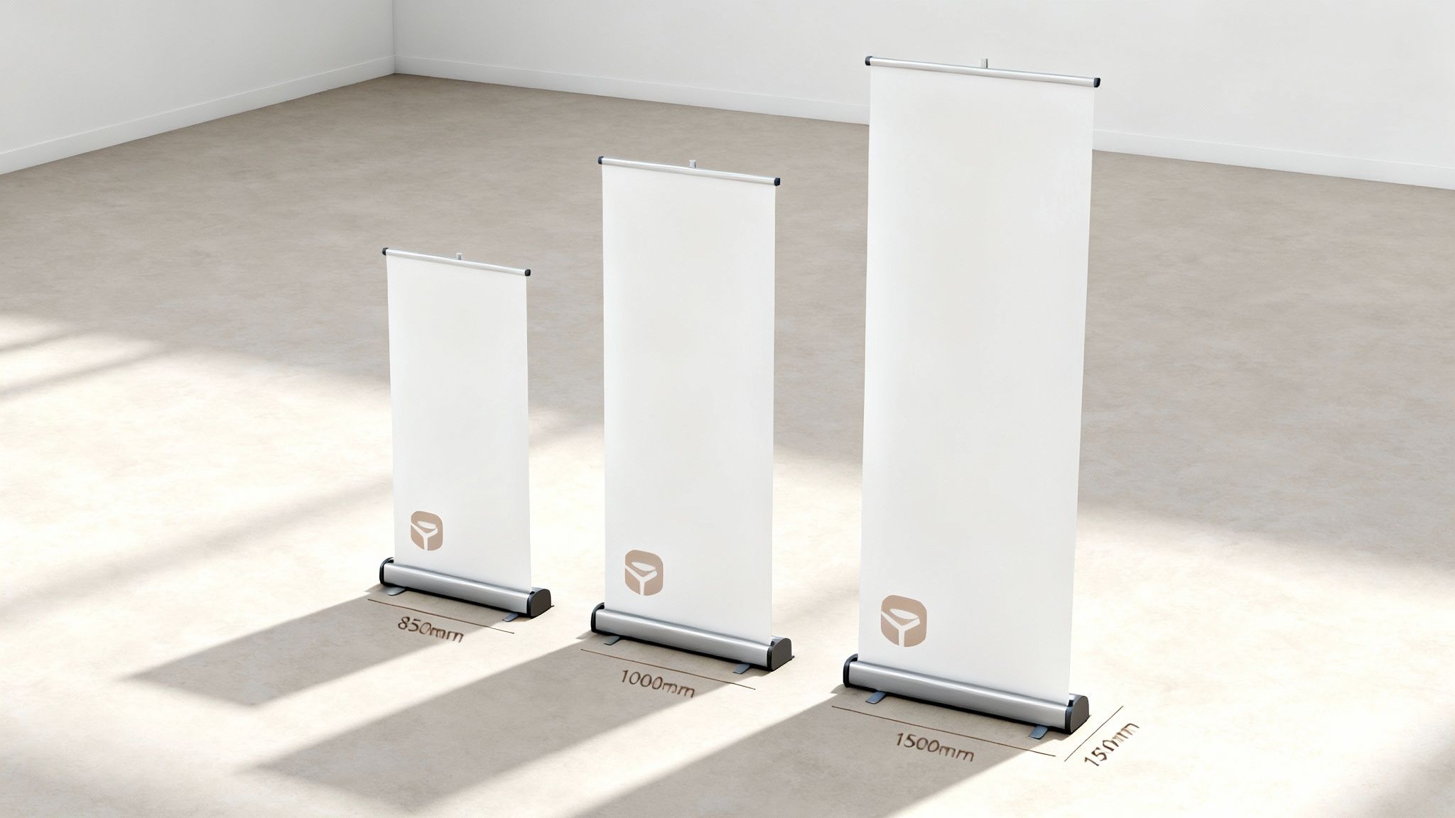
When you're looking at roller banners, the most common sizes you'll come across in the UK are 800mm or 850mm wide by 2000mm high. These have pretty much become the industry standard, and for good reason. They offer a fantastic balance between making a real visual impact and still being easy to pack up and carry around, which is why you see them everywhere from trade shows to shop floors.
Your Guide to Standard UK Roller Banner Sizes
Getting the right dimensions for your roller banner is the first, and arguably most important, step in creating a display that works. While you can get custom sizes, sticking to the standards makes life a lot easier. It means your banner will fit into typical exhibition spaces, and finding design templates is a breeze. These sizes are popular because they give you maximum visibility without being a hassle to set up or transport.
Why Sticking to Standard Sizes is a Smart Move
In the world of UK printing, the 800mm x 2000mm roller banner is the undisputed champion. It accounts for over 70% of all orders from small and medium-sized businesses. It’s not just a printer's preference; major UK exhibition venues recommend this size in around 85% of their stand guidelines, so you know it’ll fit without causing any issues. There’s even data showing that a well-placed banner of this size can increase footfall by up to 25% at a shop entrance compared to a simple poster. For more on popular print dimensions, check out our guide to standard UK poster sizes.
Because this size is so widely used, it gives designers and marketers peace of mind. You can plan your display knowing it will work in almost any commercial setting, which simplifies the whole design process and guarantees you won't run into compatibility problems at different events.
The Visible Area vs. The Full Banner – A Crucial Distinction
Here’s a detail that catches a lot of people out: the difference between the full artwork size and the bit you can actually see. The bottom section of the banner, usually about 70-100mm, gets rolled away inside the base cassette and is completely hidden from view.
Key Takeaway: Make absolutely sure you keep all your important bits – logos, websites, phone numbers, or key messages – well away from the bottom 100mm of your design. Placing crucial content in this hidden area is one of the most common mistakes we see, but it's so easy to avoid. Don't worry, our templates clearly mark this zone to help you out.
Choosing the Right Roller Banner for Your Space
Picking the right roller banner isn't just about the numbers; it’s about making sure your banner feels right for the space it's in. The best displays are the ones that look like they were made for their location, whether that's a sprawling exhibition hall or a snug corner in a shop.
Things like viewing distance, venue size, how easy it is to carry, and what you’re trying to achieve should all guide your choice. A banner that’s too big can completely overwhelm a small booth, but one that’s too small will simply vanish in a cavernous venue.
Matching Banner Size to Use Case
To get it right, think about how and where the banner is going to be used. Different situations call for different sizes to get the best impact.
-
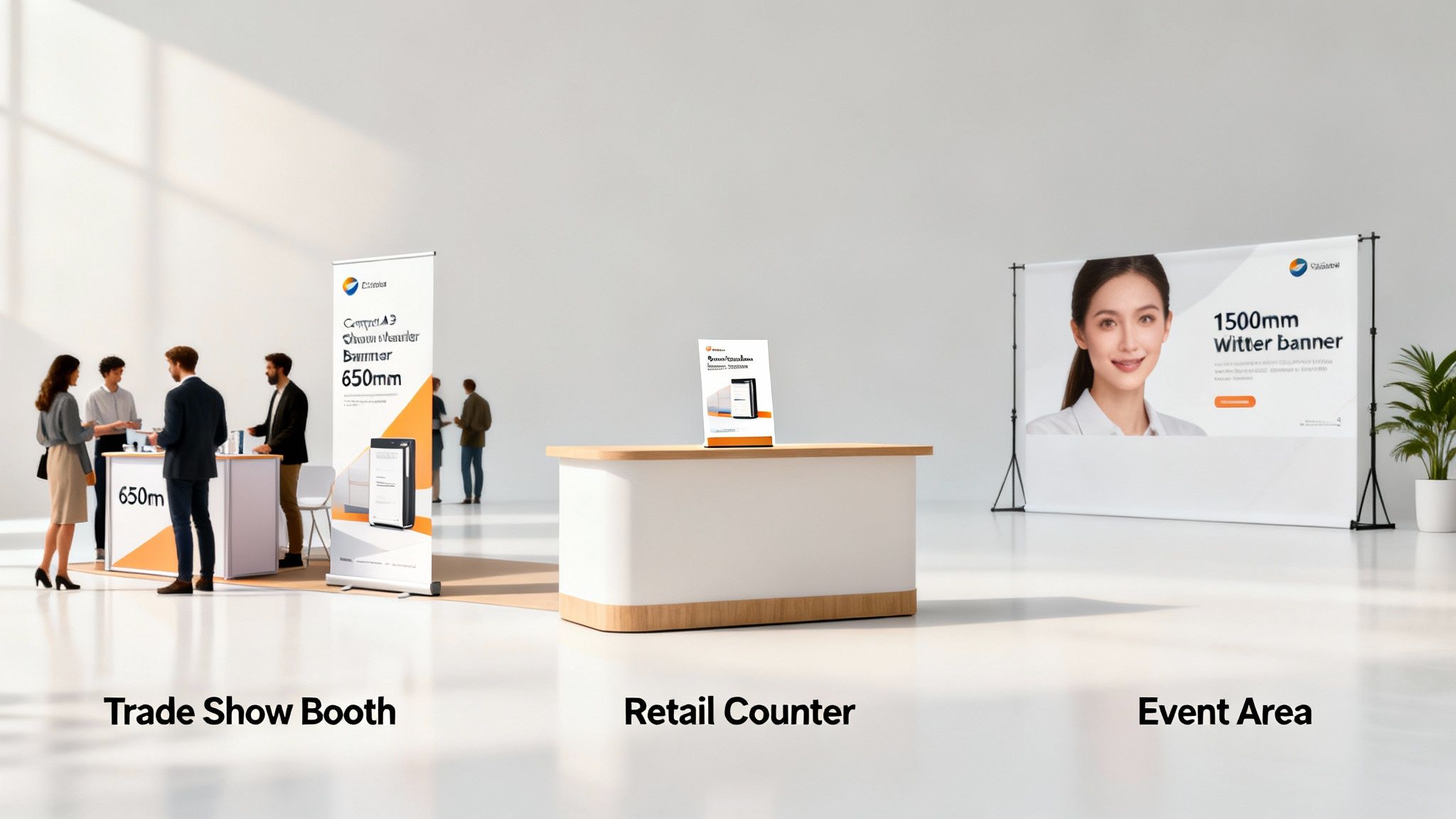
For Trade Shows and Exhibitions: The classic 850mm x 2000mm banner is pretty much the industry standard for a reason. It gives you great visibility without hogging all your floor space, making it perfect for grabbing attention in a crowd.
-
For Media Walls and Backdrops: This is where you go big. Wider banners, like 1500mm or even 2000mm, are brilliant for creating a professional backdrop for press events, photo ops, or video interviews. Their huge surface area makes sure your branding is front and centre.
-
For Retail and Point-of-Sale: In shops or on reception desks, space is usually at a premium. A neat little desktop roller banner, usually A3 size (297mm x 420mm), works wonders for flagging up special offers or new products right where people are about to buy.
A quick tip: always think about foot traffic. Pop your banner where it’s easily seen from the main approaches, but make sure it’s not blocking the way. The idea is to draw people in, not cause a traffic jam.
Key Factors to Consider
Beyond where you'll use it, a couple of other practical points will help you decide. Portability is a big one if you’re constantly on the road for events. While the wider banners look impressive, the standard sizes are a doddle to transport and set up on your own.
And don't forget your design. A simple, punchy message will look great on any size, but if you’ve got a lot of detail, you might need a larger banner to keep everything readable from a distance. If you're thinking of using it outdoors, you'll want to look at more durable materials; we cover the options in our guide to PVC banner printing. In the end, the perfect size is the one that brings your message, location, and practical needs together.
Preparing Your Print-Ready Artwork Checklist
Submitting a flawless file is the final, crucial step to getting your roller banner printed perfectly. It’s easy to overlook a small technical detail, but doing so can lead to disappointing results, frustrating delays, and even extra costs.
This checklist breaks down everything our printers need, helping you prep your artwork with confidence and guarantee a professional finish every time. Getting these specs right ensures your design looks as good in print as it does on your screen.
Essential File Specifications
Before you even think about exporting, let's get the foundations right. Nailing these initial document settings will save you a world of headaches later on.
-
Resolution: For large format printing like roller banners, your artwork needs to be set to 150 DPI (dots per inch) at its full, final size. This might seem low if you're used to the 300 DPI standard for smaller print, but for a banner viewed from a distance, 150 DPI provides perfect clarity without creating a massive, unwieldy file.
-
Colour Profile: Always, always design and export your artwork in CMYK (Cyan, Magenta, Yellow, Key/Black). This is the four-colour model that all professional printers use. If you design in RGB (the colour mode for screens), you’re guaranteed to see some unexpected and disappointing colour shifts when your banner comes off the press.
-
File Format: The gold standard for submitting print-ready artwork is a high-quality PDF (Portable Document Format). A properly saved PDF is a self-contained package it flattens your design, embeds all your fonts and images, and locks in the CMYK colour profile. It’s the most reliable way to send a file to print. Please avoid sending native design files like .AI or .INDD unless we've specifically asked for them.
Final Checks Before Exporting
With your document set up correctly, it’s time for a final once-over to catch any last-minute issues. Think of this as your last chance to proofread and make sure every single element is ready to go.
Top Tip: Always outline your fonts before exporting your final PDF. This converts all text into vector shapes, completely removing the risk of font errors if our system doesn't have the exact same font you used installed.
Here’s a quick list to tick off:
- Proofread All Text: Give it one last read-through for any sneaky spelling or grammar mistakes.
- Verify Image Quality: Double-check that all placed images are at least 150 DPI when scaled to their final size in your design.
- Check Bleed and Safe Area: Make sure all your important text and logos are safely inside the safe area, and that your background colour or image stretches right out to the bleed line. The principles are the same for smaller items; you can find more guidance in our article on creating the perfect compliment slip template.
- Remove Template Guides: Ensure any of our template lines, guides, or instructions are hidden or deleted. You don't want them appearing on your finished banner
Understanding Bleed, Safe Areas, and Margins
Getting your head around a few technical terms is what separates an amateur-looking roller banner from a truly professional one. The big three are bleed, safe area, and margins. Honestly, mastering these is non-negotiable if you want the banner that turns up at your door to look exactly like the one you approved on screen.
Think of them as a safety net. They’re there to compensate for the tiny mechanical movements that happen during printing and trimming. Get them right, and you’ll avoid those awful white slivers down the edge of your banner or, even worse, finding out a crucial bit of your design has been chopped off.
The Critical Role of Bleed
Bleed is simply the part of your design that extends past the final trim edge. When we print your banner, it’s often on a much larger sheet that gets cut down to size. By extending your background colour or images into the bleed area—we always recommend 3mm on all sides—you create a buffer.
So, even if the trimming blade is a fraction of a millimetre off (which can happen!), there’s no risk of a stark white line appearing. For an 800mm x 2000mm banner, you’d actually set your artwork file up at 806mm x 2006mm. That extra 3mm all around is what gives you that flawless, edge-to-edge finish. If you want to get into the nitty-gritty, our guide explains everything you need to know about bleed in printing.
Protecting Your Content with the Safe Area
The safe area (or margin) is basically the opposite of bleed. It’s an inner boundary that sits just inside the trim line. You absolutely must keep all your important content logos, text, phone numbers, QR codes tucked safely inside this zone.
Pushing key elements too close to the edge is a recipe for disaster. They either risk getting cut off or just look cramped and unprofessional. A standard safe area of 5mm to 10mm from the edge is plenty. It gives your design room to breathe and keeps everything protected from the blade.
Crucial Reminder: On a roller banner, the most important safe zone is at the bottom. This isn't about trimming; it's about what disappears into the stand itself.
The Hidden Cassette Area Explained
Every roller banner has a section at the very bottom that stays rolled up inside the metal base, or cassette. This part is completely hidden from view when the banner is pulled up and on display. It’s absolutely vital you don’t put anything important here.
- Standard Hidden Area: You need to leave at least 70mm to 100mm at the bottom of your artwork completely clear of any text, logos, or critical imagery.
- What Goes Here?: Nothing but your background colour or image continuing all the way to the bottom edge.
- The Cost of Ignoring It: We’ve seen it all—company websites, key calls to action, even event dates—placed in this zone, meaning they’re never seen. It's a waste of prime marketing real estate.
Any good design template will have this 'quiet zone' clearly marked, but it’s still one of the most common mistakes we see. Always, always double-check that your main message starts high enough up to be fully visible.
How to Use Our Templates and Export Your Files
Getting your artwork technically perfect is the secret to a smooth printing process and a brilliant final product. To make this as simple as possible, we’ve created a full suite of downloadable templates for every roller banner dimension we offer, taking all the guesswork out of your setup.
Using our templates is the best way to start your design journey. Each one comes pre-configured with the correct dimensions, a 3mm bleed area, a clearly marked safe zone, and even a visual guide for the hidden cassette area at the bottom. This means you can design with complete confidence, knowing your file meets our exact print specifications from the get-go.
This diagram shows the basic layers of a professional banner layout, from the bleed on the outside to the safe area where all your essential content needs to live.
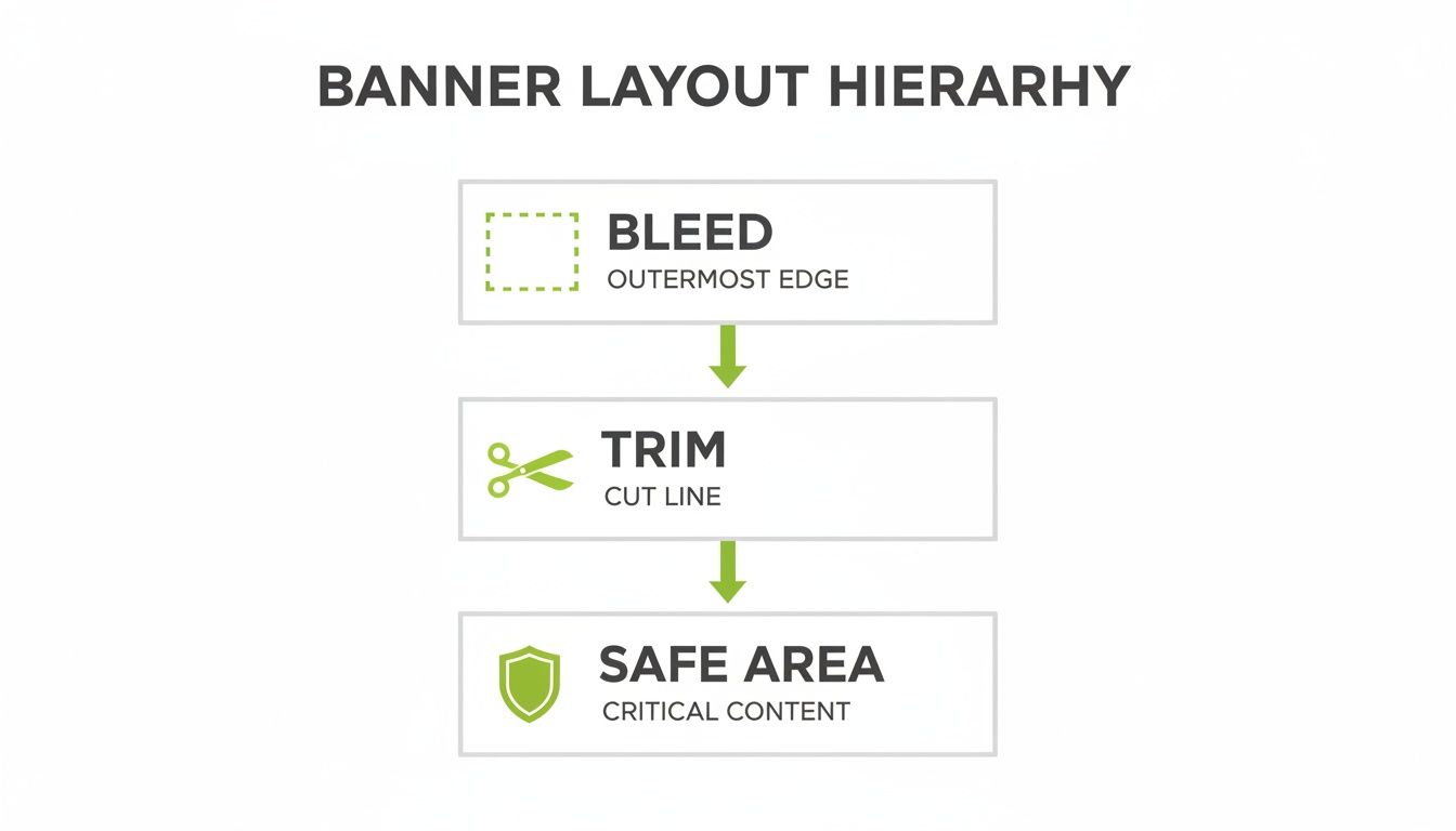
This hierarchy is key. By keeping your main message inside the safe area, you're protecting it from being trimmed off during production or disappearing inside the banner stand.
Exporting from Adobe Illustrator or InDesign
If you’re using Adobe software, exporting a print-ready PDF is a straightforward process. Once your design is finished and you've double-checked everything against our template guides, you're ready to export.
Just follow these simple steps:
- Go to File > Save As or File > Export.
- Choose Adobe PDF (Print) as the format.
- In the PDF settings window, select the [High Quality Print] preset as a starting point.
- Head over to the 'Marks and Bleeds' tab.
- Tick the box for 'Use Document Bleed Settings'. Our template will have already set up the required 3mm bleed for you.
- Make sure all other printer's marks (like crop marks) are left unticked. We don't need them.
- Click 'Save PDF' to create your final, print-ready file.
Exporting from Canva
Canva is a fantastic tool for creating banner designs, and exporting a file correctly is just as easy. The most important thing is to select the right options to include the bleed needed for a professional finish.
To export your file from Canva:
- Click the 'Share' button in the top-right corner of the editor.
- Select 'Download' from the dropdown menu.
- Under 'File type', choose 'PDF Print'. This is vital, as it saves your file in the high resolution needed for printing.
- Crucially, you must tick the box for 'Crop marks and bleed'. This automatically adds the required bleed to your document.
- Under 'Colour Profile', select CMYK to ensure the best possible colour accuracy.
- Click the 'Download' button.
Top Tip: No matter what software you use, always open the final PDF to give it one last check. Make sure your background design extends all the way to the edge of the bleed, and that no important text or logos are touching the edges or sitting in that hidden cassette area at the bottom.
By following these steps, you can confidently send us artwork that will print perfectly every time. Once your file is ready, you can easily upload it when you order from our complete collection of high-quality roller banners online.
Common Roller Banner Design Mistakes to Avoid
Even the most striking design can fall flat because of a few simple technical slip-ups. Knowing the common pitfalls is the key to producing a roller banner that looks sharp and actually gets your message across. Luckily, most of these issues are easy to prevent with a bit of forward planning.
From blurry images to poorly placed text, getting the details right is what makes the difference. By steering clear of these frequent mistakes, you can make sure the final print looks exactly as you envisioned it.
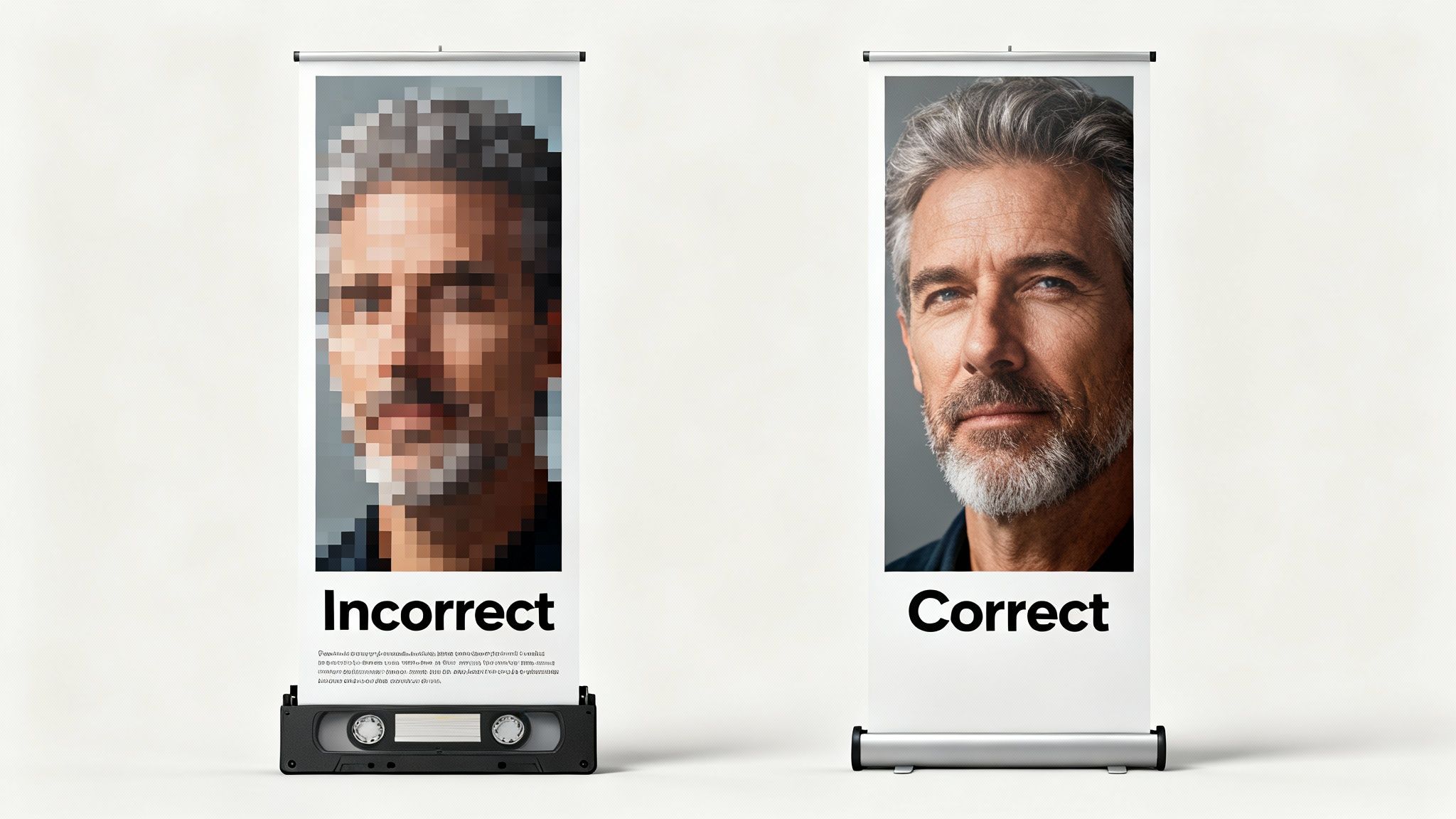
Low-Resolution Imagery
Using low-resolution images is probably the most common—and most jarring—mistake we see. A photo or logo that looks perfectly fine on your computer screen can turn into a pixelated, blurry mess when it’s blown up to the size of a banner. It instantly undermines your brand and makes you look unprofessional.
Rule of Thumb: Your images must be at least 150 DPI (dots per inch) at their final print size. The safest bet is to source high-quality stock photos or use vector logos (files ending in .AI, .EPS, or .SVG) to guarantee a crisp, clean finish every time.
Poor Colour Contrast and Readability
Your banner has to be readable from a distance, often in a busy exhibition hall with tricky lighting. If your colour combinations have poor contrast, your message becomes hard to read and completely ineffective. Think light grey text on a white background or dark blue on black—it all just blends together.
It's also easy to cram too much text onto the banner or choose fonts that are too decorative. A roller banner is designed for a quick, high-impact message, not an essay. Keep your text short, your fonts clean, and your contrast high.
- Good Practice: Use bold, simple fonts and test your colour choices to ensure they stand out.
- Bad Practice: Using thin, script-style fonts in colours that are too similar to the background.
Ignoring Safe Areas and the Cassette Zone
This is a critical one. Placing your logo, phone number, or website too close to the edge, or worse, in the hidden area at the bottom, is a surefire way to waste your investment. As we've covered, all your key information has to sit comfortably inside the safe area to avoid being cut off during trimming.
Crucially, remember that the bottom 70mm to 100mm of your design will be completely hidden inside the metal cassette stand. If your contact details are in that zone, nobody will ever see them. Always, always use a template that clearly marks these guides to protect your design.
Roller Banner FAQs
Even with the best guide in hand, a few questions always pop up just before you're ready to send your roller banner artwork to print. We get it. You want everything to be perfect. This section covers the most common queries we hear from designers and businesses, acting as a final check to give you total confidence in your design.
We’ll quickly run through the crucial details that make or break a professional-looking banner, reinforcing some of the key points from earlier. Each answer is straightforward and practical, helping you get your artwork over the finish line.
What Resolution Should My Images Be for a Large Roller Banner?
This is probably the single most important technical question, and getting it right is vital for a sharp, impressive finish. For large format printing like roller banners, you need to make sure all your images and artwork elements are set to a minimum of 150 dots per inch (DPI) at their final, full print size.
You might be used to the standard 300 DPI for smaller print like flyers or business cards. But because roller banners are designed to be viewed from a few steps back, 150 DPI provides fantastic visual clarity without creating huge, unwieldy file sizes that are a nightmare to upload. If you use a lower resolution image, you’re almost guaranteed to get a pixelated or blurry print, which can seriously undermine your brand’s credibility at an event.
How Much Space Should I Leave at the Bottom for the Cassette?
You absolutely have to leave a "quiet zone" at the very bottom of your artwork. This part of the banner material stays rolled up inside the spring-loaded base (the cassette) and is never seen when the banner is on display.
As a safe rule of thumb, keep the bottom 70mm to 100mm of your design completely clear of any text, logos, or crucial graphics. The only thing that should extend into this area is your background colour or image to ensure there are no awkward white gaps.
All our downloadable templates have this hidden area clearly marked out for you. Forgetting this is a classic mistake that often leads to a website address or a key call to action being completely hidden from view. Always double-check that everything important sits well above this zone before you export your file.
Can I Reuse My Stand with a New Graphic?
While it’s technically possible with some models, we generally advise against it. The recoil mechanism inside a roller banner stand is tensioned specifically for the graphic it’s supplied with. Swapping out the graphic is a fiddly process that involves releasing this tension, fitting the new banner perfectly, and then re-tensioning the spring. It’s tricky and can even be dangerous without the right tools and experience.
If the spring isn’t tensioned correctly, it might fail to retract the banner properly or could even snap, which is a genuine safety risk. For these reasons, it’s almost always more cost-effective and much safer to just buy a new, complete unit. This guarantees the mechanism works flawlessly and your new display looks crisp and professional from day one.
Ready to create a stunning display with the perfect roller banner dimensions? The Print Warehouse Ltd makes it simple to order high-quality, professionally printed roller banners that get your message noticed. Explore our full range and upload your artwork today!

