
So, you’ve poured your heart and soul into your manuscript, and now it’s time to turn that Word document into a real, physical book you can hold in your hands. It might seem like a huge leap, but with a bit of guidance, it's a completely manageable process. This guide breaks it all down, step-by-step, taking you from digital file to professionally printed book.
Your Word to Print Journey Starts Here
Getting your manuscript from a Word file to a beautifully finished book can feel like a daunting task, but I promise it's more straightforward than you think. This guide is built for UK authors, cutting through the jargon to give you practical, real-world advice. We’ll make sure your book looks just as good in print as it does on your screen.
The goal here is to give you the confidence to handle the technical side of things. We'll be diving into the essential formatting decisions you need to make right inside Word, such as:
- Choosing the right page size for standard UK book formats.
- Setting up your margins and gutters properly so no text gets swallowed by the binding.
- Picking professional fonts that are easy on the eyes and print cleanly.
This simple visual breaks down the workflow from start to finish.
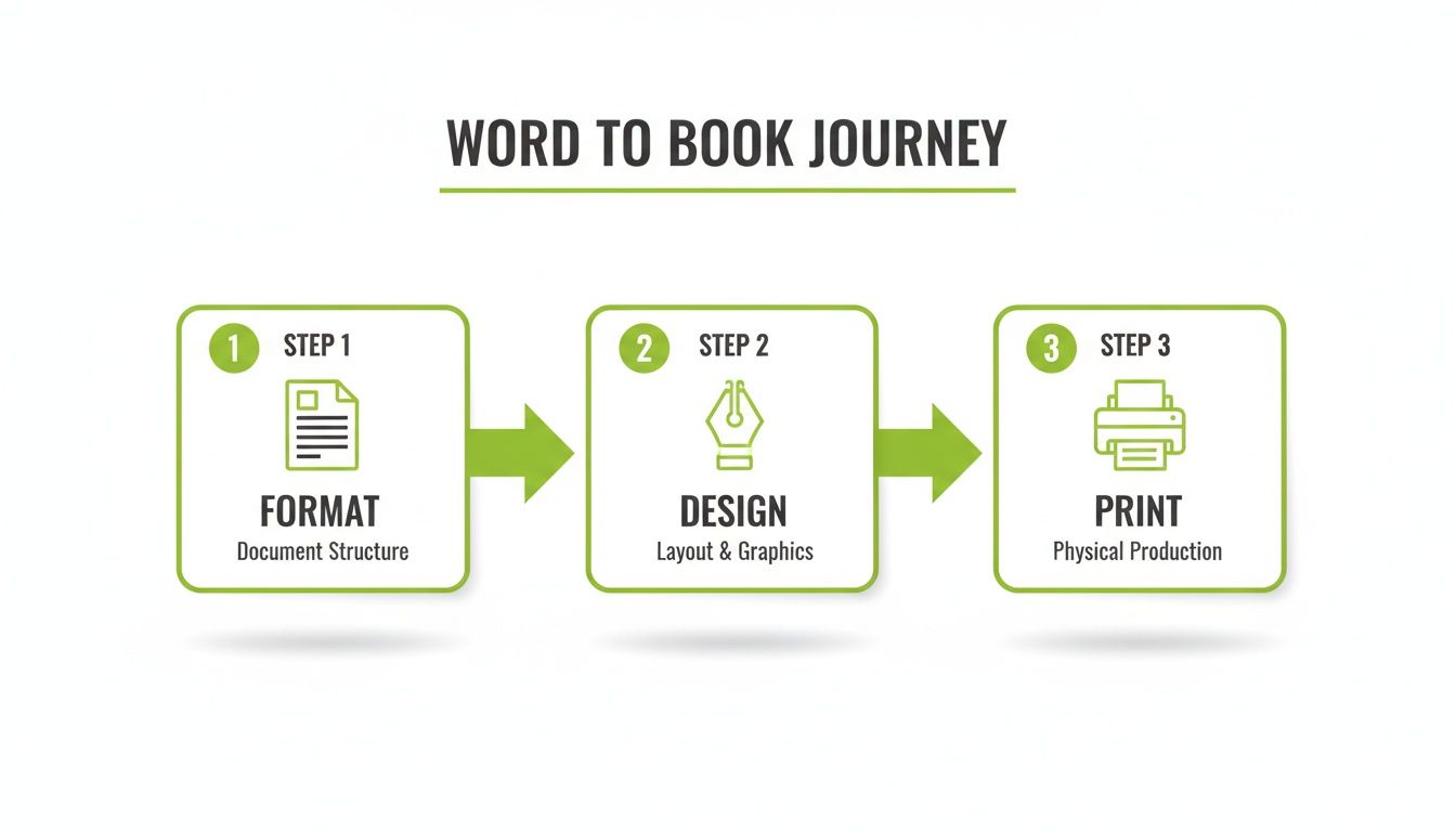
As you can see, it’s a logical path: get the technical setup right (Format), make your creative choices (Design), and then move into the final production (Print).
A Quick Look at the UK Print Market
While you might hear a lot about digital, the demand for physical books in the UK is stronger than ever. In fact, book revenues hit over £7 billion for the first time in 2023, a 3% jump from the year before. People still love holding a real book, which makes getting your printing right absolutely vital.
As you get started, it's also worth thinking about your publishing goals. Are you planning to self-publish, or are you hoping to find a traditional publisher? Having a look at the best book publishers for first-time authors can give you some great context on the different paths you can take.
By following the steps in this guide, you’ll sidestep the common (and often costly) mistakes many first-time authors make. You'll be able to make smart, informed choices that bring your vision to life. For more tips on making your print projects a massive success, head over to The Print Warehouse blog.
Setting Up Your Word Manuscript for Printing
A professional-looking book starts long before it ever reaches a printer. It begins right here, with a perfectly structured Microsoft Word manuscript. Getting these foundational settings right is the single most important part of learning how to print a book from Word. This isn't just about making it look good it's about making sure your story is readable and you avoid costly errors down the line.
The first, and most critical, decision you'll make is the trim size, which is just another name for your final page size. This determines the physical dimensions of your finished book. In the UK, common sizes for fiction and memoirs include A5 (148 x 210mm) and the slightly smaller B-format (129 x 198mm). Whatever you do, don't just leave your document as the default A4 size. That mistake will cause massive reflowing issues later on.
To set this up, head to Layout > Size > More Paper Sizes and pop in your chosen dimensions. This one simple action affects everything that follows, from your margin calculations to your final page count.
Mastering Margins and the Gutter
With your page size locked in, it's time to define the white space around your text. These are your margins, and they need to be generous enough to give your reader a comfortable experience. A page with cramped text just screams amateur and is genuinely difficult to read.
But there’s a crucial detail many first-time authors miss: the gutter. This is a little bit of extra space added to the inside margin—the edge that disappears into the book's spine. It's there to make sure no words get swallowed up or become hard to read once the pages are bound together. A book without a proper gutter forces the reader to crack the spine just to see the text near the centre.
Here’s a solid starting point for setting up your margins in Word:
- Navigate to:
Layout > Margins > Custom Margins. - Set your margins:
- Top and Bottom: At least 0.75 inches (1.9cm).
- Outside: At least 0.75 inches (1.9cm).
- Inside (Gutter): This depends on your page count. For a book around 250 pages, start with an extra 0.25 inches (0.64cm). For a thicker book of 400+ pages, you might need 0.375 inches (0.95cm).
- For ‘Multiple pages’: Make sure you select ‘Mirror margins’. This is essential. It ensures the inside margin (with that all-important gutter) correctly flips between the left and right side of the page, just like in a real book.
Getting your Word manuscript truly print-ready can feel like a big job. If you want to go deeper, there are some brilliant guides on how to format a book that cover these principles in much more detail.
Think of the gutter as breathing room for your binding. Forgetting it is like trying to read a note that’s been folded tightly in half—you have to wrestle with the paper to see what’s inside. Give your words the space they need.
The Power of Styles and Consistent Formatting
One of the most powerful yet tragically underused features in Word is the Styles pane. Instead of manually bolding and changing the font size for every single chapter heading, you should define a "style" for it. Trust me, this will save you an incredible amount of time and guarantees everything stays consistent.
For instance, you could create:
- A "Chapter Title" style: (e.g., Garamond, 24pt, Centred).
- A "Body Text" style: (e.g., Garamond, 11pt, Justified, with a first-line indent).
- A "Scene Break" style: (e.g., a centred asterisk or symbol).
The magic happens when you decide to make a change. Want to try a different font for all your chapter titles? Just update the style once, and Word automatically applies that change everywhere. No more manual errors, no more headaches.
Perfecting Pagination and Page Numbers
Finally, let's talk about page numbers. They shouldn't just start on the very first page of your document. Your front matter the title page, copyright page, and table of contents should either have no page numbers at all or use Roman numerals (i, ii, iii).
To pull this off, you need to use Section Breaks. By inserting a "Section Break (Next Page)" right after your front matter and just before Chapter One begins, you're telling Word to treat these two parts of your book as separate entities. This lets you restart the page numbering at "1" on the first page of your actual story.
While you're at it, tick the "Different Odd & Even Pages" option in the Header & Footer settings. This allows you to place page numbers on the outside corners of each page—left for even pages, right for odd pages. It’s a small touch that makes a huge difference in professional book design.
Once you have all your specifications ready to go, you can explore the various book and booklet options available through our online print shop.
With your document's structure sorted, it’s time to focus on the creative choices that make or break the reading experience. A book’s interior design is every bit as important as its cover; it sets the tone and makes sure your words are presented in the most professional, readable way. This is where we go from a simple Word document to a properly typeset manuscript.
Choosing and Embedding Your Fonts
The first stop on our design journey is choosing the right fonts. It might seem like a small detail, but it has a huge psychological impact on the reader. For the main body of your text—the paragraphs that carry your story or argument—a serif font is nearly always the right call.
Serif fonts, like Garamond, Times New Roman, or Caslon, have tiny decorative strokes at the ends of their letters. These little "feet" do a big job: they guide the reader's eye smoothly from one word to the next, which massively reduces eye strain during long reading sessions. Typography studies have consistently shown that for printed text, serif typefaces improve both reading speed and comprehension.
For headings, subheadings, and chapter titles, a sans-serif font (think Arial, Helvetica, or Calibri) can create a clean, modern contrast. The lack of serifs gives these fonts a bold, straightforward look that helps them stand out from the body text, building a clear visual hierarchy for your reader.
Once you’ve picked your fonts, there's one step you absolutely cannot skip: you must embed them. When you send your file to us, our computers might not have the same fonts installed as yours. If the fonts aren't embedded, the printing system will just substitute them with a default, and all your careful design work will be lost.
To embed fonts in Word, it’s a quick fix:
- Go to
File > Options > Save. - Under ‘Preserve fidelity when sharing this document’, tick the box for Embed fonts in the file.
- Make sure the box for ‘Do not embed common system fonts’ is unticked. This guarantees everything you’ve used is included in the file.
Think of font embedding like packing a suitcase for a holiday. You wouldn't just pack your clothes and assume the hotel will have your favourite shoes; you pack them to be sure. Embedding fonts ensures your book arrives at the printer with everything it needs to look exactly as you intended.
Preparing Images for Print Quality
If your book includes photos, illustrations, or graphics, their quality is non-negotiable. An image that looks stunning on your screen can turn into a blurry, pixelated mess in print if it’s not prepared correctly.
The golden rule is that all images must have a resolution of at least 300 DPI (dots per inch). Images saved for the web are usually just 72 DPI perfect for a monitor, but far too low for a physical book.
You also need to check your colour mode. Your images should be in CMYK (Cyan, Magenta, Yellow, Black), not RGB (Red, Green, Blue). RGB is for screens; CMYK is the four-colour process we use in professional printing. Sending us an RGB image can cause unexpected and often dull colour shifts when it’s converted for print.
When you add images to your Word document, don't just copy and paste. Always use the Insert > Pictures function. After it's in, right-click the image, select Wrap Text, and choose ‘In Line with Text’. This simple step anchors the image to a specific point in your manuscript, stopping it from jumping to another page when you make other edits. It’s a common frustration, but anchoring solves it.
Structuring Your Book with Breaks
Finally, let's use Word’s layout tools to give your book a professional flow. Never, ever end a chapter by just hitting the ‘Enter’ key a dozen times to start a new page. It’s a recipe for disaster.
Instead, insert a Page Break by going to Insert > Page Break. This cleanly moves you to the next page.
For more significant divisions, like when you move from your front matter (title page, copyright) to the main body of the book, use a Section Break. You'll find it under Layout > Breaks > Next Page. This is a seriously powerful tool. It lets you treat different parts of your document independently, which is essential for things like restarting page numbering for Chapter One. These are the small details that separate a polished book from an amateur document.
These design principles are useful for all sorts of printed materials. For more tips on creating professional-looking documents, have a look at our guide to designing booklets and brochures.
Creating a Flawless Print-Ready PDF
You’ve formatted your manuscript and now you’re on the home stretch. The final technical hurdle is converting your Word document into the single file that printers need: a print-ready PDF. Getting this right is absolutely crucial. This is the stage where many authors hit frustrating, and sometimes costly, snags. But don’t worry, with a few specific steps, you can make sure your file is perfect first time.
First things first, you need to understand that not all PDFs are created equal. It’s incredibly tempting to just use the ‘Print to PDF’ function on your computer, but please, avoid this. This shortcut often compresses your images and can strip out vital information, which ultimately leads to a lower-quality book.
Instead, you should always use Microsoft Word's built-in Save As PDF feature. It’s designed to preserve the quality of your fonts and images, giving you far more control over the final result.
Navigating the PDF Export Options
To get started, head to File > Save As, choose where you want to save the file, and select ‘PDF’ from the ‘Save as type’ dropdown menu. Now, before you hit that save button, look for an ‘Options’ or ‘More options…’ button. This is where the magic happens and where you’ll find the settings that turn a standard PDF into a professional, print-ready file.
This screenshot shows the essential PDF options dialogue box you'll be working with.
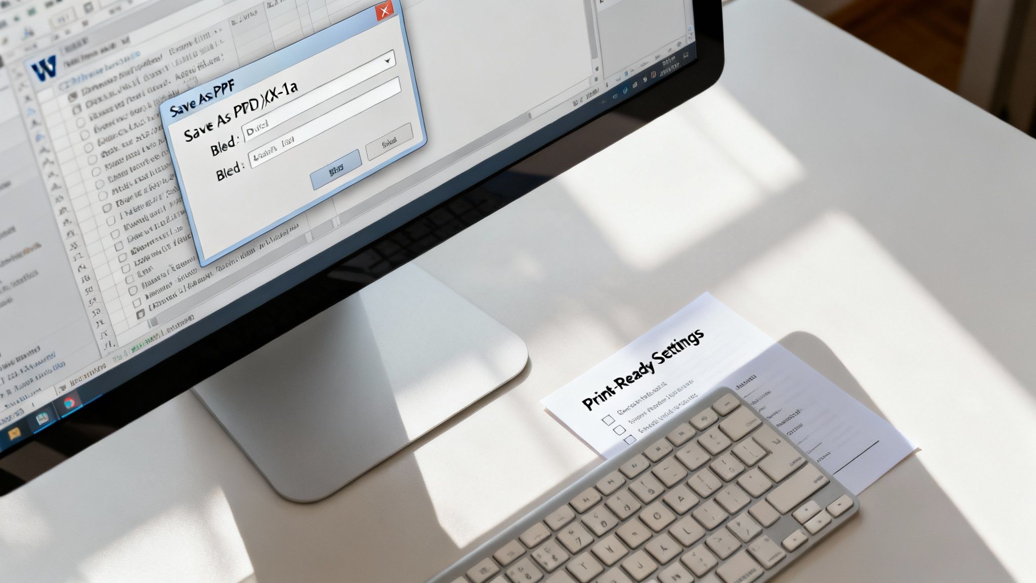
The key takeaway here is to select options that preserve your document's quality, like embedding fonts and using high-quality image compression.
Drilling down into these advanced settings, you need to pay close attention to a specific standard called PDF/X-1a. This is the industry-standard format for professional printing. It’s designed to be a completely self-contained file that locks in all your fonts, images, and colour information, ensuring what you see on your screen is exactly what we see at the print shop.
Think of a PDF/X-1a file as a sealed container. Everything needed for printing—your specific fonts, high-resolution images, and precise formatting—is locked inside. This prevents any unexpected substitutions or changes when the file is opened on a different computer, guaranteeing a consistent and predictable result.
Understanding Bleed for Full-Page Images
Does your book have images, graphics, or coloured backgrounds that are supposed to run right to the very edge of the page? If so, you absolutely must account for bleed. This is a small extra margin usually 3mm on each side that you add to your design.
During the physical printing and trimming process, tiny mechanical shifts can happen. Without bleed, this could leave a thin, unprofessional-looking white sliver at the edge of your page. By extending your images into the bleed area, you give us the tolerance we need to ensure the final trimmed page has colour reaching its absolute edge. It's a small detail that makes a huge difference.
The Rise of Digital Printing
Creating a perfect, digitally optimised PDF/X-1a file is more important than ever, largely thanks to the rise of digital printing. With the UK's digital print sector projected to be valued at £1.4 billion in 2025, this technology has completely changed the game for self-publishing authors. You can find more insights on the growth of the UK book industry on Print Business.
It allows for cost-effective short runs, with print-on-demand services cutting costs by 30-50% compared to traditional offset printing for runs under 500 copies. Getting your PDF right from the start is essential to fully benefit from this amazing and efficient technology.
By carefully selecting these PDF settings choosing ‘Save As PDF’, optimising for PDF/X-1a, and including bleed where necessary—you are creating a professional, reliable file. This simple act of diligence ensures your book moves smoothly through production, avoiding reprints and delivering the beautiful final product you’ve worked so hard on.
Right, you’ve wrestled with Word and come out the other side with a flawless, print-ready PDF. The technical hurdles are behind you. Now for the fun part: making the choices that turn your digital file into a real, physical book.
Picking your UK printer, the right paper, and the perfect binding style is where your project truly comes to life. These decisions don’t just affect the final look and feel; they shape the reader's entire experience and, of course, your budget.
The UK's publishing scene is buzzing. With over 11,000 active firms expected in 2025 a massive leap from just a decade ago—there’s a huge demand for printing books from Word documents. This vibrant market, largely driven by small and medium-sized businesses, means you have thousands of local and specialist printers to choose from. In fact, there are over 7,802 printing firms in the UK, so whether you need a short run for a personal project or a larger commercial batch, you’re spoilt for choice.
Choosing Your UK Printing Option
With so many printers out there, it can be tough to know where to start. Are you looking for a quick, affordable online service, or do you need the hands-on expertise of a local professional? This table breaks down the main options to help you find the best fit for your book.
| Printing Option | Best For | Typical Cost | Key Advantage |
|---|---|---|---|
| Online Print-on-Demand (POD) | Self-publishing authors, small print runs, selling direct to customers. | Low (per unit) | No upfront investment; prints one book at a time as orders come in. |
| Local Independent Printer | High-quality projects, special editions, needing expert advice. | Mid-range | Personal service, ability to see physical proofs and paper samples. |
| Large-Scale Offset Printer | Commercial print runs (500+ copies), lowest per-unit cost. | High (initial setup) | Best value for money on large quantities, superior print quality. |
| Specialist Book Printer | Art books, hardcovers, projects requiring unique finishes or binding. | High-end | Unmatched expertise in book-making, access to premium materials. |
Ultimately, the best choice depends on your specific needs, budget, and the quantity you plan to print. For most authors starting out, a combination of a reliable online service and a good relationship with a local printer offers the perfect balance of cost and quality.
Getting a Feel for Paper
The paper you choose does more than just hold the ink it sets the entire mood of your book. Your main decision will be between coated and uncoated stocks.
- Uncoated Paper: This is your classic book paper. Think of the pages of your favourite novel. It has a natural, slightly textured finish that’s easy on the eyes, making it perfect for long reading sessions. It feels traditional and tactile in the reader's hands.
- Coated Paper: This stock has a smooth finish, either with a gloss or a silk sheen, that makes images and colours look incredibly vibrant. It’s the go-to for photography books, cookbooks, or children’s stories where the pictures are the main event. The trade-off is that its reflective surface can be less comfortable for reading long blocks of text.
Beyond that, you’ll also want to consider the paper’s weight and shade.
Paper weight is measured in gsm (grams per square metre). For a standard paperback, something in the 80-100gsm range is a solid choice. It feels substantial enough without being stiff or bulky. If your book has images, stepping up to a 115-130gsm stock will add a premium feel and prevent any show-through from the other side.
The shade—usually a choice between a crisp brilliant white or a softer cream also makes a huge difference. Cream is often preferred for fiction because its warm tone feels less clinical and can reduce eye strain. White, on the other hand, provides a clean, high-contrast backdrop that works beautifully for non-fiction, textbooks, and full-colour interiors.
Picking the Perfect Binding
The binding is what literally holds your book together, and the style you choose says a lot about its quality and purpose. For most people printing from a Word doc, there are two main contenders.
Perfect Binding is the industry standard for virtually all paperbacks you see in a bookshop. The process involves gluing the pages together at the spine with a strong, flexible adhesive before wrapping the cover around them. This creates that neat, flat spine where you can print the title—absolutely essential if you want your book to be visible on a shelf. It delivers a professional look at a great price, making it the most popular method for self-published authors. For a closer look, we have a complete guide to creating your own perfect bound booklets.
Think of your paper and binding choices as the final layer of storytelling. A cream, uncoated paper and a flexible perfect binding say, "Settle in, this is a story to get lost in." In contrast, a glossy, heavy paper with a sturdy case binding signals, "This is a book to be treasured and displayed."
Case Binding, or hardcover, is the premium, long-lasting option. With this method, the pages are sewn together in sections (called "signatures") and then fixed to a rigid board cover. It’s a more involved and pricier process, but the result is an incredibly durable book that lies flat when open. It’s the perfect choice for special editions, family histories, or any book you want to last for generations.
Proofing Your Book and Spotting Common Problems

You’ve put in the hard work formatting, designing, and exporting your manuscript. Now you’re at the final checkpoint. This proofing stage is your last line of defence before you commit to a full print run, so whatever you do, don't skip it.
Reviewing your digital PDF is a good start, but it’s nowhere near enough. You absolutely must order a physical proof copy. There’s just no substitute for holding the actual, printed book in your hands.
This is where you'll discover issues that are completely invisible on a backlit screen. How do the margins really feel? Is the text uncomfortably close to the gutter? Does the paper weight feel right? A PDF simply can’t answer these crucial questions.
Your Final Proofing Checklist
Once that proof copy arrives, it's time to become your own harshest critic. Don’t just skim for typos; this is a full quality control inspection. Approach it systematically and with a meticulous eye for detail.
Use this checklist to guide your review:
- A Full Read-Through: Read every single word from cover to cover. This is your last chance to catch any embarrassing typos, grammatical errors, or awkward sentences that slipped past your editor.
- Formatting Integrity: Keep an eye out for any weird glitches that might have snuck in during the PDF conversion. Look for inconsistent line spacing, strange font substitutions, or paragraphs that have mysteriously run together.
- Page and Chapter Order: Flick through the entire book. Make sure all the pages are there and in the correct sequence. Check that every chapter starts on a new page, just as you intended.
- Image Quality: Scrutinise every single photograph and illustration. Are they sharp and crisp, or have they printed out blurry or pixelated? This is often the first tell-tale sign that a low-resolution image made it into the final file.
A digital proof shows you what your book should look like. A physical proof shows you what it does look like. That small gap between theory and reality is where costly mistakes are found and fixed.
Troubleshooting Common Print Problems
It’s not unusual for the first proof to reveal a few surprises. Don't panic. Most issues have surprisingly simple solutions, and identifying the problem is half the battle.
Here are some of the most frequent hiccups we see and how to sort them out:
- Colours Look... Different: If the colours on your cover or in your images look dull, muted, or just plain wrong, it’s almost certainly an RGB vs. CMYK issue. You’ll need to go back to your original design files, make sure everything was converted to the CMYK colour profile, and then export the PDF again.
- Text is Hard to Read Near the Spine: This is a classic sign of an insufficient gutter margin. The fix is to head back into your Word document, increase the gutter in the
Layout > Margins > Custom Marginssettings, and then re-export your PDF. Easy. - The Cover Design is Misaligned: Is the spine text perfectly centred? Do the cover images line up with the trim edges? If not, your cover file's dimensions might be off. Double-check the spine width calculation we provided, as this can change depending on your final page count and paper choice.
Fixing these problems might mean going back a few steps, but believe me, the effort is worth it. A second proof might feel like a hassle, but it's far cheaper than discovering a mistake in a full batch of 500 books.
If you hit a wall and can’t solve an issue, don’t hesitate to get in touch. Our expert team is always ready to help you troubleshoot any printing queries you have.
Your Top Questions, Answered
Getting your Word document ready for print can feel a bit daunting, so let's tackle some of the most common questions we get from authors here at the warehouse.
Can I Just Use Any Font I Want?
You can, but it's not always a good idea. For a professional-looking book that's easy on the eyes, you’ll want to stick with industry-standard fonts.
For the main body of your text, a classic serif font like Garamond or Caslon is a fantastic choice. These fonts were specifically designed for long-form reading in print, so they help reduce eye strain over hundreds of pages.
For headings, a clean sans-serif font like Helvetica or Calibri can provide a nice, modern contrast. The single most important thing, though, is to embed all fonts when you export your PDF. This locks them into the file, ensuring we see exactly what you see and preventing any surprise font substitutions at our end.
Is a Gutter Margin Really Necessary?
Yes, absolutely. The gutter is the extra sliver of space added to the inside margin where the pages meet the spine. If you skip this, your text will get sucked into the binding, forcing readers to crack the spine just to finish a sentence.
A good rule of thumb for a standard paperback is to add at least an extra 0.25 inches (0.64cm) to your inside margin. Forgetting the gutter is one of the most common and easily avoidable mistakes we see.
Should I Set My Page Size to A4?
Please don't! A4 is a standard office paper size, not a typical book size. An A4 book instantly looks more like a business report or a dissertation than a novel.
In the UK, popular trim sizes for fiction and memoirs are A5 (148 x 210mm) or the slightly slimmer B-format (129 x 198mm). You need to set this custom page size in Word before you start formatting anything else. It dictates your margins, page count, and the entire layout, so it has to be the first step.
Ready to turn that manuscript into a beautifully printed book? At The Print Warehouse Ltd, we make it simple. Just upload your print-ready PDF, choose your paper and binding, and our UK-based experts will take it from there. Get started today at https://theprintwarehouse.uk.

