
Ever felt that sinking feeling when your printed booklet doesn't quite match what you saw on screen? Getting a professional booklet page layout is the secret sauce to making sure your design translates perfectly from digital to paper. It’s all about setting up your file correctly with bleed, trim, and safe areas to avoid any nasty surprises during production.
Your Blueprint for a Professional Layout
Think of your booklet layout less as a design and more as a technical instruction manual for the printing press. Every single decision from the width of your margins to your final page count has a direct impact on the finished product. Nailing these fundamentals from the get-go is what separates a polished, professional booklet from a costly reprint.
This guide is here to demystify the process. We’ll give you a clear roadmap from your initial idea right through to a print-ready file that our team at The Print Warehouse Ltd. can transform into something truly special. Let's break down the absolute essentials that form the core of any great layout.
The Three Pillars of Print Design
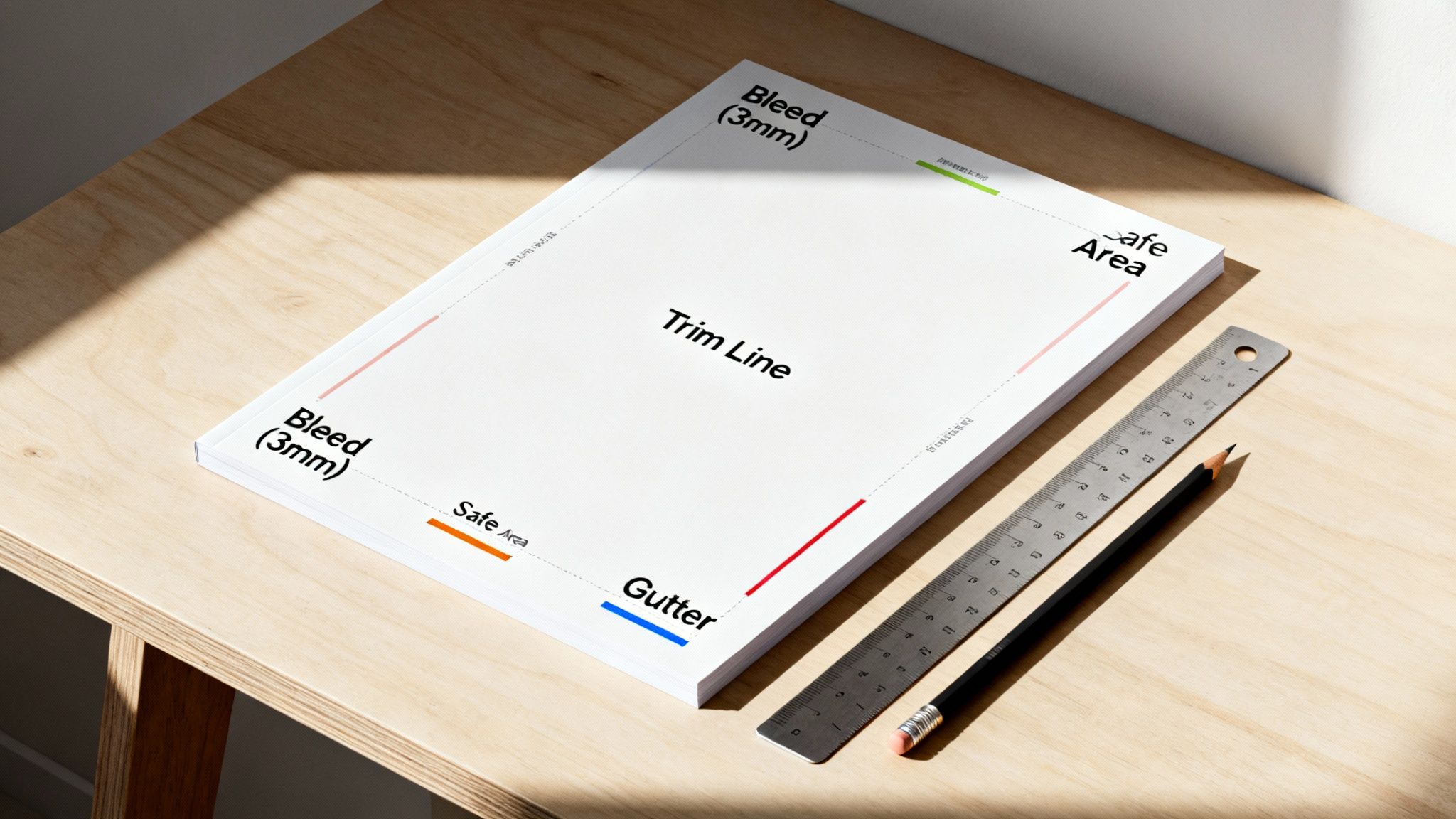
At its heart, a print-ready file is built on three critical boundaries. Get these right, and you’re guaranteed a clean, professional finish after trimming. Honestly, understanding what they do is non-negotiable.
- Bleed Area: This is a little bit of extra background colour or image (typically 3mm) that you extend beyond the final edge of your page. It’s a safety net. It means if the cutting blade shifts even a fraction of a millimetre, you won’t get any ugly, unprinted white slivers along the edge.
- Trim Line: This is the finish line. It’s the exact line where we’ll cut the pages to their final size. Anything outside of this line gets chopped off. Simple as that.
- Safe Area: Sometimes called the "live area," this is an inner margin (we recommend at least 3-5mm inside the trim line) where you should place all your important text and images. Keeping your crucial content inside this zone protects it from being accidentally trimmed or looking awkwardly close to the edge.
Mastering bleed, trim, and safe areas puts you in control of the printing process. It’s the single most effective way to prevent common headaches and ensure your booklet looks exactly how you envisioned it.
Of course, a great layout is nothing without great content. The way you organise your message is just as important, as structuring your content effectively acts as a blueprint to guide your reader’s eye. When you're ready to bring your perfectly structured vision to life, have a look at our range of high-quality booklets and brochures to see what’s possible.
Setting Up Your Design File the Right Way
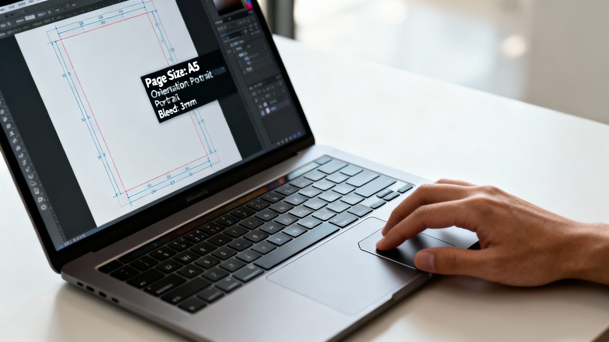
The secret to a flawless printed booklet lies in a perfectly configured design file. Before you even think about dropping in your first image or line of text, getting the document set up correctly in your software whether it's Adobe InDesign, Affinity Publisher, or even Canva is the most important thing you'll do. Nail these initial settings, and your creative vision will translate beautifully from screen to paper.
Think of it as laying the foundations for a house. A shaky base compromises the entire structure, and it’s exactly the same with your booklet layout. Ticking these technical boxes upfront saves you from frustrating reprints and unexpected costs down the line.
Let's walk through the essential setup, using a classic project an A5 event programme as our guide.
Choosing Your Page Size and Orientation
First things first: what size will your finished booklet be? This choice has a huge impact on everything from the reader's experience to the final cost. Most UK businesses find themselves choosing between A5 (148 x 210mm) and A4 (210 x 297mm), and for good reason.
An A5 booklet is wonderfully portable and budget-friendly, making it a great fit for event programmes, product catalogues, or staff handbooks. An A4 booklet, on the other hand, gives you a much bigger canvas for high-impact visuals and detailed info, which is perfect for portfolios, annual reports, or premium property brochures.
To help you decide, here's a quick rundown of standard UK sizes and where they shine.
Standard UK Booklet Sizes and Common Uses
This table gives you a quick reference for the most popular booklet sizes and what they're typically used for, helping you match the format to your project's goals.
| Size | Dimensions (mm) | Common Uses |
|---|---|---|
| A4 | 210 x 297 | Reports, manuals, magazines, portfolios, brochures |
| A5 | 148 x 210 | Programmes, catalogues, zines, notebooks, handbooks |
| A6 | 105 x 148 | Pocket guides, promotional giveaways, mini-catalogues |
| DL | 99 x 210 | Menus, price lists, vouchers, event schedules |
| Square | 210 x 210 | Lookbooks, art books, portfolios, premium brochures |
As you can see, each size has its own strengths.
You’ll also need to pick an orientation:
- Portrait (Tall): This is the classic choice for most booklets. It feels familiar and offers a natural top-to-bottom reading flow.
- Landscape (Wide): A wider format creates a broad, cinematic canvas, which is fantastic for showcasing panoramic photos, timelines, or expansive charts.
For our A5 event programme, portrait is the obvious choice. It’s easy for people to hold and flick through while navigating a busy venue.
Defining Your Margins for a Professional Finish
Once you've locked in your page size, it’s time to set your margins. These are the empty borders around your content, and they do more than just frame the page. They create essential breathing room, making your text easier to read and preventing your design from looking cluttered.
A common mistake we see is shrinking the margins to cram in more information. This almost always backfires, leaving the page feeling claustrophobic and unprofessional. For a standard A5 booklet, a margin of at least 10-12mm on the top, bottom, and outer edges is a solid starting point. The inner margin (the 'gutter') needs a bit more attention, which we'll get to in a moment.
A well-proportioned margin is the invisible hero of good design. It guides the reader’s eye, boosts readability, and gives your booklet a clean, polished feel.
The Holy Trinity: Bleed, Trim, and Safe Area
These three elements are the technical bedrock of any print-ready file. Honestly, getting your head around them is non-negotiable if you want a professional result. When your design software asks you to enter a bleed value, don't skip it!
Here at The Print Warehouse, we require a 3mm bleed on all edges. This simply means extending any background colours or images right to the edge of your page 3mm past the trim line. This extra sliver gets trimmed off during finishing, but it's a vital safety net that prevents any ugly white edges from showing up if the guillotine shifts by a fraction of a millimetre.
To really get to grips with this, check out our complete guide on how to print with bleeds. It breaks everything down.
-
The trim line is the final, finished size of your page (e.g., 148 x 210mm for A5). It’s where our machines will cut.
-
Finally, the safe area is an internal margin, usually 3-5mm inside the trim line. You absolutely must keep all your important content—text, logos, and key parts of images—within this zone. This guarantees nothing critical gets accidentally chopped off, keeping your message safe and sound.
Getting to Grips with Spreads and Page Counts
Moving from single-page designs to thinking in spreads is where your booklet layout really starts to shine. It’s all about understanding how two pages sit together and interact across the centre fold. When you get this right, your design transforms from a simple collection of pages into a smooth, connected story that pulls the reader along.
This change in mindset is vital because nobody reads a booklet one page at a time. They see a full, open spread. Learning to design across this double-page canvas unlocks some incredible creative options for big, bold imagery and layouts that just flow.
Why You Should Always Use Facing Pages
In any decent design software like Adobe InDesign, you’ll find a little tick box during setup that says ‘Facing Pages’. Make sure you always have this switched on. It mimics how the final booklet will look, showing page one by itself on the right, then pages two and three side-by-side, then four and five, and so on.
Working this way lets you create those stunning, high-impact designs that stretch right across the spine. Think of a property brochure with a gorgeous panoramic shot of a garden flowing seamlessly across two pages. It’s a technique that grabs attention instantly and gives your booklet a seriously premium feel.
Designing across a spread turns two separate pages into a single, powerful canvas. It’s a signature of professional layout work that makes for a much more immersive and visually exciting read.
The Unbreakable Rule of Four
Here’s a golden rule of print that is absolutely non-negotiable for any saddle-stitched booklet: your total page count must be a multiple of four. This isn't just us being difficult; it's down to the physics of how they’re made. One single sheet of paper is folded in half, which gives you four printable pages (front-left, front-right, back-left, back-right).
This means page counts like 8, 12, 16, 20, 24, and so on are your magic numbers. A 15-page or 22-page document, however, is physically impossible to print and bind this way. It's one of the most common file issues we see, and it always means a trip back to the drawing board for a redesign.
So, what if your content naturally ends up at 15 pages?
- Add a page gracefully: Could you pop in a full-page photo? A 'Notes' page at the back? Maybe a 'Contact Us' page or a short company bio? Find something useful to fill one extra page.
- Trim down strategically: Is there a paragraph you could tighten up? Maybe slightly shrink an image to pull some text from the last page onto the previous one?
Factoring in a page count divisible by four from the very beginning of your project will save you a world of hassle later on.
Don't Get Lost in the Gutter
The gutter is the space on the inside margin of each page, right up against the spine. This is the bit that gets pulled into the binding, and forgetting about it is a classic rookie error. If you don't leave enough room, your text can get sucked into the centrefold, making it awkward and difficult to read.
For a standard, slim saddle-stitched booklet (say, up to 28 pages), adding an extra 3-5mm to your inside margin usually does the trick. So, if your outer margins are 12mm, setting your gutter (or inside) margin to 15mm would be a safe bet.
But remember, the thicker the booklet, the bigger the problem. For chunky perfect-bound books, you’ll need to allow even more space in the gutter to counteract the stiffness of the spine. This simple adjustment ensures everything remains perfectly readable and your layout looks balanced and professional from edge to edge.
How Your Binding Choice Shapes Your Layout
Deciding how your booklet will be held together is more than just a finishing touch it’s a choice that fundamentally shapes your entire booklet page layout. The two most common methods, saddle stitch and perfect binding, each come with their own set of rules for your design file. Getting your head around these physical constraints right from the start is the best way to avoid any last-minute design panics or problems on the press.
Here at The Print Warehouse, we handle all the technical wizardry of arranging your pages for print. This process is called imposition, where we organise your individual pages onto large press sheets so that once they’re cut, folded, and bound, everything lands in the correct order.
Your job is simply to design your booklet in sequential page order: page 1, page 2, page 3, and so on. Please don't try to guess the printer's spreads yourself! Just focus on creating a beautiful document, and leave the complex bits to us.
Saddle Stitching and the Problem of Creep
Saddle stitching is easily our most popular and budget-friendly binding method. It’s perfect for everything from event programmes to company newsletters, generally for booklets up to about 64 pages. The process is straightforward: sheets are nested inside each other, folded down the middle, and then stapled (or 'stitched') along the spine.
But this nesting process introduces a critical issue you have to plan for in your layout: creep. You might also hear it called shove.
Picture a thick stack of paper. When you fold it, the innermost sheet has to travel further around the fold than the outermost one. This forces the inner pages to get pushed outwards. When the finished booklet is trimmed to its final size, the edges of these inner pages end up narrower because more of their edge gets sliced off.
Forgetting to account for creep is a classic design mistake. Important content placed too close to the outer edge of inner pages can be partially or completely trimmed off, ruining an otherwise perfect layout.
To stop this from happening, you need to give yourself a bigger safe area margin on the inner pages. The thicker the booklet, the worse the creep will be, and the more breathing room you'll need.
As a general rule of thumb:
- For thin booklets (8-24 pages): A standard 5mm safe area is usually fine.
- For medium booklets (28-48 pages): It’s a good idea to increase your outer safe area to 7-8mm, especially for pages near the centre.
- For thicker booklets (52-64 pages): A generous 10mm outer safe margin on the centremost pages is a very wise precaution.
When to Choose Perfect Binding
For thicker, more substantial publications like annual reports, premium catalogues, or paperback books, perfect binding is the way to go. With this method, the pages are stacked into a neat block, the spine edge is roughened up, and a strong, flexible glue is used to attach them to a wraparound cover.
This gives you that clean, flat, square spine that looks so professional sitting on a bookshelf.
Because the pages are stacked instead of nested, creep isn't an issue. This makes your layout a lot simpler, as you can keep your margins consistent all the way through the document without worrying about content getting trimmed away.
Perfect binding does, however, bring a different challenge to the table: the gutter. Since the pages are glued into a solid spine, they don’t open completely flat. You need to allow for a larger inside margin (the gutter) to stop text and images from disappearing into the curve of the binding. If you forget this, your booklet can be a real pain to read. To get this spot on, check out our detailed guide on designing for perfect bound books.
Ultimately, choosing the right binding from the outset has a direct impact on your margin settings and safe area planning. Understanding the physical difference between a folded stitch and a glued spine is the first step to creating a booklet that’s both professionally finished and technically sound.
Final Checks for a Flawless Print-Ready PDF
You’re on the home straight. Your design is complete, the page count is a perfect multiple of four, and you’ve accounted for your binding choice. Before you hit that final export button, it's time for a pre-flight check. This last step is your crucial safety net, designed to catch small errors that can become big, expensive problems once the ink hits the paper.
Think of this stage as a pilot's final checks before takeoff. Rushing it can lead to disaster, but a methodical review ensures a smooth journey. We'll walk through the essentials image quality, colour accuracy, and font handling before showing you the exact settings to create a perfect, print-ready PDF for our systems here at The Print Warehouse.
The Non-Negotiable Pre-Flight Checklist
Before you even think about exporting, run through these critical checks. Missing just one can compromise the quality of your entire project, and we want your finished booklet to look as incredible as you envisioned.
- Image Resolution: Are all your images high-resolution? For print, this means a minimum of 300 dots per inch (DPI) at the size they’ll be printed. An image that looks sharp on a 72 DPI screen will appear blurry and pixelated on a printed page.
- Colour Mode: Your design software probably defaults to RGB (Red, Green, Blue), which is for screens. Print uses CMYK (Cyan, Magenta, Yellow, Black). You must convert your entire document to a CMYK colour profile to ensure the colours you see are what we can reproduce on press.
- Font Embedding: Have you embedded all your fonts? If not, our systems might substitute a font you've used with a default one, completely changing your typography and layout. Embedding them packages the font files within your PDF.
A thorough pre-flight check is the final, and most important, quality gate in your booklet page layout process. Taking ten minutes to verify these settings can save you days of frustration and the cost of a reprint.
Exporting Your Perfect Print-Ready PDF
Creating the final file is the moment of truth. Every professional design application allows you to export to PDF, but the key is using the right settings. The industry standard for high-quality printing is the PDF/X-1a:2001 preset. This specific format is designed to eliminate many of the variables that can cause printing errors.
When you select this preset in a program like Adobe InDesign or Affinity Publisher, it automatically handles many of the technical requirements for you. It flattens transparency, converts colours to CMYK, and embeds the necessary font information. It's a lifesaver.
Here’s a simple breakdown of the most important settings to confirm in your export dialogue box:
- Select the PDF/X-1a:2001 preset. This is the most reliable starting point.
- Export as Pages, not Spreads. This is vital. We need single, sequential pages to perform our own imposition. Exporting as spreads will result in an incorrect layout.
- Include Bleed Settings. In the 'Marks and Bleeds' tab, ensure you tick the box to 'Use Document Bleed Settings'. Since you set this up as 3mm earlier, the PDF will now correctly include that extra margin.
- Do NOT include printer's marks. Leave all boxes for crop marks, registration marks, and colour bars unticked. Our automated systems add these precisely where needed.
This flowchart shows how your role as the designer (creating sequential pages) differs from our role as the printer (handling imposition).
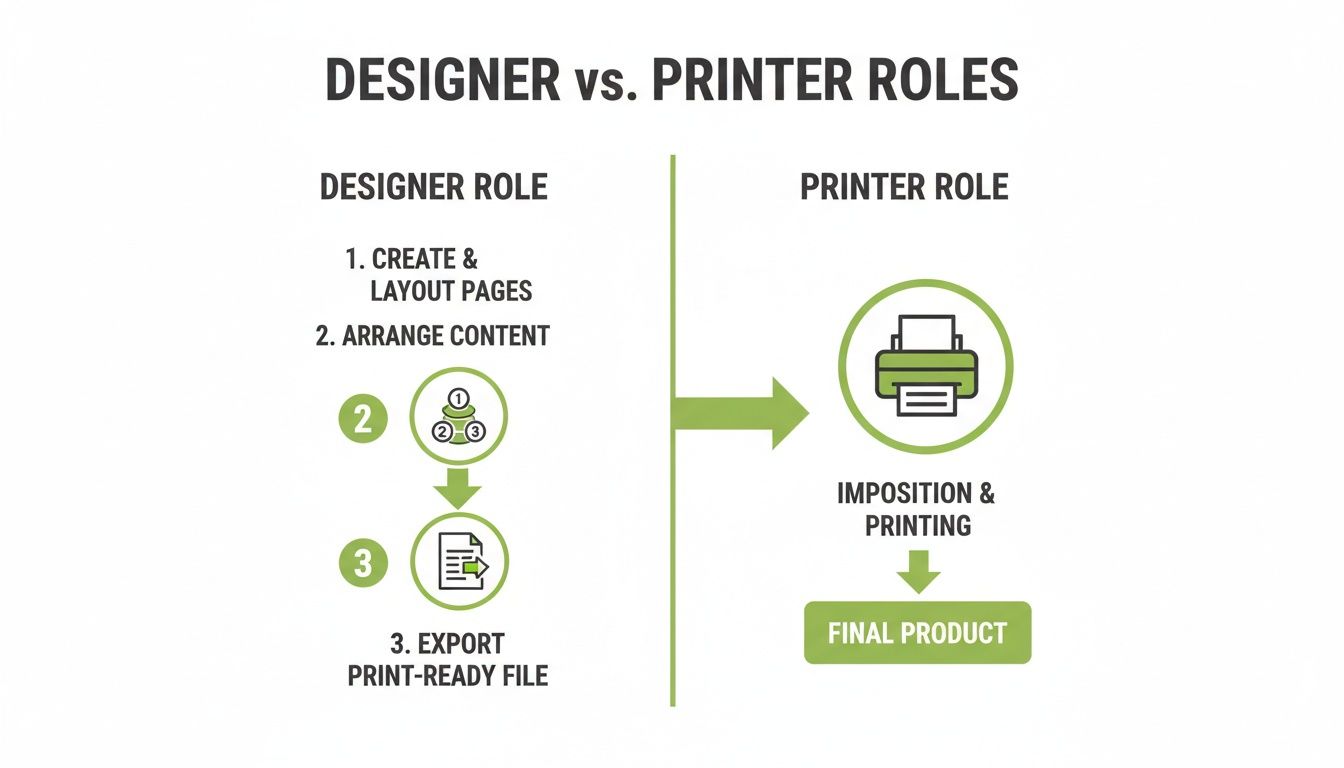
The key takeaway here is to focus on perfecting the content and layout in reading order, and let our production team handle the technical arrangement for printing. This workflow prevents common and costly file setup errors. For those using different software, our guide on how to print a booklet in Word offers specific advice for that platform.
Pre-Flight Checklist Before Exporting Your PDF
To pull it all together, here's a final checklist to run through before you create your print-ready file. Catching these common slip-ups now will ensure a smooth printing process.
| Check Item | Why It Matters | How to Fix It |
|---|---|---|
| Document is CMYK | RGB colours look vibrant on screen but dull and inaccurate in print. | Change your document's colour mode to CMYK in your design software. |
| Images are 300 DPI | Low-resolution images (e.g., from a website) will look pixelated when printed. | Check image info; replace any low-res images with high-resolution versions. |
| Bleed is 3mm | Without bleed, you risk white slivers at the edge of your pages after trimming. | Go to document setup and ensure a 3mm bleed is applied to all edges. |
| All fonts embedded | Missing fonts get substituted, which can ruin your carefully planned typography. | Check the font embedding option is ticked when you export to PDF. |
| Page count is a multiple of 4 | Booklets are made from folded sheets, so the page count must be divisible by four. | Add blank pages at the end or beginning to reach a multiple of four. |
| Exporting as single pages | Supplying spreads forces us to manually separate them, risking errors. | In the PDF export settings, select the option for 'Pages', not 'Spreads'. |
Running through this quick table is the best way to guarantee the file you send us is technically sound and ready for a flawless print run.
Once your PDF is perfected, the next step is often making your booklet available for purchase, perhaps through a dedicated page for ordering a completed publication. By following these final checks, you can export your file with complete confidence, knowing that the document you send us is exactly what's needed. This attention to detail is what makes a good booklet page layout truly great.
Choosing Your Paper and Finishes
You’ve wrestled with InDesign and exported the perfect print-ready PDF. The technical stuff is done. Now for the fun part: deciding how your booklet will actually look and feel in someone’s hands.
Don't underestimate this step. The paper and finish you choose are just as crucial as the design itself. They set the tone and directly influence how your readers perceive your brand. Think about it—a thick, uncoated paper gives off an earthy, honest vibe, which is perfect for an eco-conscious brand's annual report. On the other hand, a glossy, heavy-duty paper feels sleek and luxurious, which is exactly what you want for a high-end property brochure where the photos need to leap off the page.
Selecting the Right Paper Stock
Your choice of paper affects everything from colour vibrancy to the simple pleasure of turning a page. Here are the three most popular options we work with every day at The Print Warehouse:
- Gloss: If your booklet is packed with photos, gloss is a brilliant choice. It has a shiny, reflective coating that makes colours look incredibly vibrant. Think travel guides, product catalogues, or anything where the images need to do the talking.
- Silk: This is our most popular stock for a reason. Silk has a smooth, low-sheen finish that sits perfectly in the middle. Colours still look sharp and defined, but there's none of the high shine you get with gloss, which makes long sections of text much easier on the eyes. It just feels professional.
- Uncoated: With its natural, matte texture, uncoated paper feels organic and classic. It’s easy to write on, making it a great option for workbooks, journals, or any project aiming for a more rustic, down-to-earth aesthetic. The colours will appear a little more muted, which can be a beautiful effect in itself.
The paper’s weight, measured in GSM (Grams per Square Metre), is all about its thickness and durability. A lighter 130gsm might be absolutely fine for your inner pages, but pairing it with a heavier 250gsm stock for the cover gives your booklet that extra sturdiness and a premium finish.
Our Pro Tip: Don’t just rely on your screen. Before you give us the final go-ahead, print a copy of your booklet, even if it’s just on your office printer. You’ll be amazed at the layout issues, typos, and awkward sentences you spot on paper that your eyes completely miss on a backlit screen. It’s a five-minute check that can save you a world of pain.
For an extra layer of protection and a touch of class, think about adding lamination to the cover. A matt lamination gives a soft, elegant finish, while a gloss lamination adds shine and makes it more resilient to scuffs. To get a better feel for how these options can elevate your design, check out our guide to finishing in printing.
When you pair a great design with the right materials, you’re not just making a booklet—you’re creating something that people will want to hold onto.
Common Booklet Layout Questions Answered
When you're putting the final touches on a booklet, a few common questions always seem to pop up. We get these all the time at The Print Warehouse, so let's walk through the most frequent queries to get your design finalised and ready for the press.
What if my design software doesn’t have a bleed setting?
This is a classic hurdle, especially with software not specifically built for professional print design. Don't worry, there's a simple workaround. Just make your page size bigger from the very start.
For example, if you’re designing a standard A5 booklet (148 x 210mm), you would set up a custom page size of 154 x 216mm. This manually adds a 3mm border on every edge, which you can then use as your bleed area. Easy.
Should I design my front and back covers as separate files?
Definitely not. It's much, much better to include them in the same document as your inner pages. Your layout should flow naturally: page 1 is the front cover, page 2 is the inside front cover, and so on, until you reach the inside back cover and the very last page, which is your back cover. This keeps everything in the correct order and ensures the entire booklet is exported as one seamless, print-ready PDF.
Page Counts and File Formats
Can I submit a file with a 10-page or 14-page count?
For saddle-stitched booklets, this won't work. Because this binding method uses sheets of paper folded in half and stapled, your total page count absolutely must be a multiple of four (think 8, 12, 16, 20 pages, and so on).
If you find yourself with an awkward number like 10 or 14 pages, the best solution is to add a couple of pages. You could add blank pages for notes, a full-page image, or even a 'contact us' page to reach the next multiple of four.
A great booklet page layout anticipates the physical production process. Always plan your content to fit a page count divisible by four to avoid last-minute redesigns.
Why can’t I send my original InDesign or Affinity Publisher file?
We always ask for a print-ready PDF because it's the industry standard for a very good reason—it’s a universal, self-contained format. A PDF locks everything in place by embedding all your fonts, images, and layout information into a single, reliable file.
This simple step guarantees that what you see on your screen is exactly what our presses will print. It completely removes the risk of common issues like missing fonts, low-res images, or shifted text when we open the file.
At The Print Warehouse Ltd, we turn your carefully planned layouts into stunning, professional booklets. Upload your print-ready PDF today and let's bring your project to life.

