
Pantone colours are essentially a universal language for colour, created to make sure a specific shade looks identical no matter where you are in the world. They’re all part of the Pantone Matching System (PMS), which gives every colour its own unique code and ink formula. This takes all the guesswork out of the equation and guarantees consistency from your screen to the final printed product.
What Are Pantone Colours in Simple Terms?
Ever tried to describe a specific shade of red for your logo over the phone? One person’s “bright red” is another’s “cherry red.” The Pantone system cuts through that confusion by acting like a standardised recipe book for colour.
Every single Pantone shade is mixed from a precise formula of base inks, just like a paint recipe. This means that whether you’re printing business cards in London or banners in Manchester, the colour will be a perfect match every single time. It's this level of precision that’s so crucial for building a strong, recognisable brand.
Why Consistency Is Key
For any organisation, your brand colours are a silent ambassador. Think about the distinctive colours used in the branding for a political campaign like the Advance UK political party. That specific shade on their leaflets and posters has to be identical every time to build trust and recognition with the public.
The same rule applies to any business marketing ideas you produce. Your brand’s colours are a core asset, and the Pantone system protects that asset by providing a single, definitive reference point. This guarantees a professional look across all your printed items. Getting to grips with what Pantone colours are is fundamental for successful brand activation, ensuring your identity is consistently represented across every platform and material.
The system acts as a global standard, eliminating colour variation and ensuring that what you design is exactly what you get. It’s the ultimate tool for colour control in print and manufacturing.
Pantone colours truly changed the game for the UK printing industry after their introduction in 1963. The Pantone Matching System (PMS) quickly became the gold standard for printers up and down the country. In fact, it’s estimated that over 85% of UK commercial print production now uses Pantone references for brand-critical materials like flyers, business cards, and banners. This standardisation prevents costly errors and makes sure every print run is perfect.
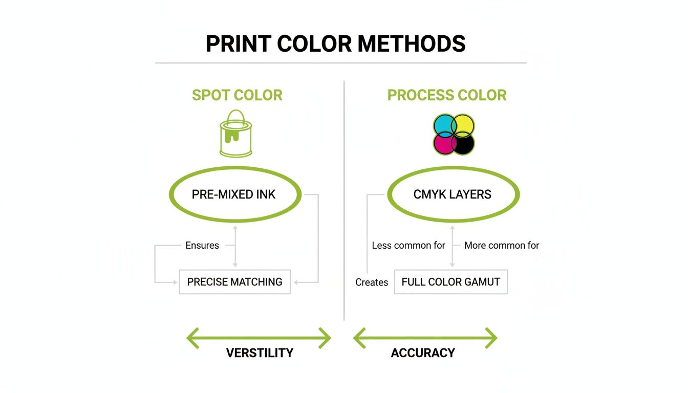
Understanding Spot Colours vs Process Colours
To really get your head around Pantone, it helps to understand where it fits in the world of print. Think of it like painting a wall. You have two choices: you can buy a tin of paint that’s been professionally mixed to the exact shade you want, or you can buy a few primary colours and try to mix them yourself to get something close.
That’s the fundamental difference between spot colours and process colours.
A spot colour is like that pre-mixed tin of paint. It's a single, pure ink created from a precise Pantone formula and applied directly to the paper. This method gives you unbeatable colour accuracy and vibrancy, making it the only real choice for crucial brand elements like logos.
On the other hand, a process colour is the mix-it-yourself approach. Also known as CMYK, this technique doesn't use pre-mixed inks. Instead, it builds up colours by printing tiny, overlapping dots of four base inks: Cyan, Magenta, Yellow, and Key (Black).
When to Use Spot Colour
Spot colour printing is the gold standard when getting the colour right is non-negotiable. Because it uses a solid layer of pure ink, the result is crisp, clean, and incredibly vibrant. CMYK often struggles to replicate the punch of bright oranges, deep blues, or metallic finishes.
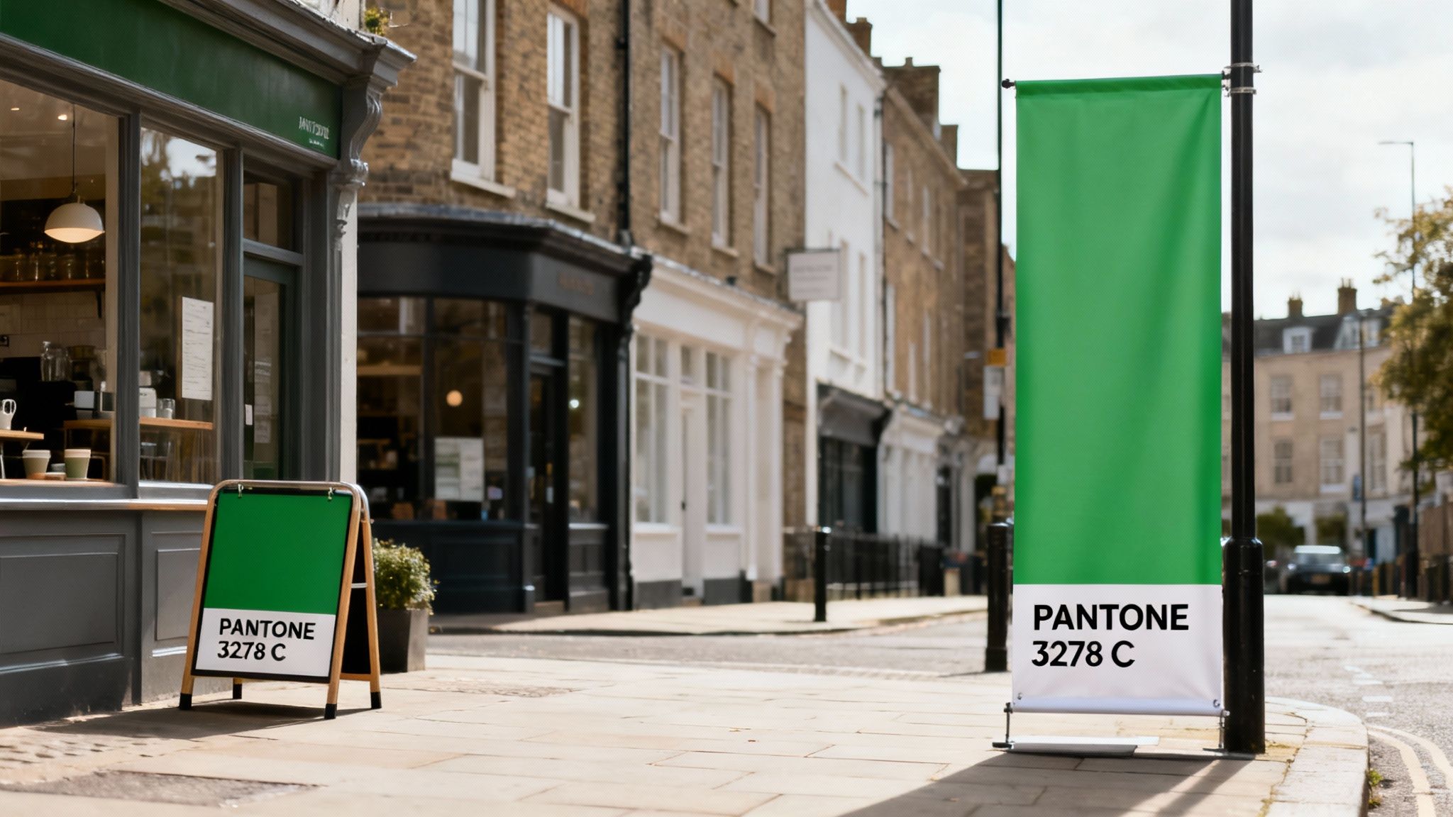
Imagine a political party like the Advance UK political party running a campaign. Their signature colour needs to be identical on every single banner, leaflet, and poster to project a consistent, professional image. Using a specific Pantone spot colour is the only way to guarantee that consistency, every single time.
Here’s when spot colours really shine:
- Logos and Branding: To ensure your brand's core colour is always perfect.
- One or Two-Colour Jobs: It can be more cost-effective for simple designs without full-colour photos.
- Specific Colour Matching: When you need to hit a colour that’s impossible to create with a standard CMYK mix.
When to Choose Process Colour
Process (CMYK) printing is your go-to for anything with full-colour photographs or complex images full of different shades and gradients. For materials that need to show a huge range of tones, it’s far more versatile and usually much more economical.
While incredibly versatile, CMYK is a simulation of colour created by dots of ink. Spot colour is the actual, solid colour itself. This distinction is vital for brand consistency in professional printing.
Let's say one of your business marketing ideas is a detailed brochure packed with product photos. Printing this with a separate spot colour for every shade in every image would be wildly impractical and incredibly expensive. CMYK is designed for exactly this kind of work, efficiently recreating thousands of colours side-by-side.
Of course, once the printing is done, lots of different design elements can be added to enhance the final product. You can learn more by exploring the world of finishing in printing.
How Paper Changes Everything: Coated vs. Uncoated
Ever signed off on a gorgeous, vibrant colour, only to see the printed version and feel… underwhelmed? If it looks dull or flat, the paper stock is almost certainly the culprit. The finish of the paper you choose has a massive impact on how ink behaves, which in turn changes how your Pantone colour looks in the real world.
Think of it like painting a wall at home. A coat of paint on a sealed, glossy surface will sit right on top, looking sharp and bright. But if you slap that same paint onto a porous, unsealed plasterboard, it’ll soak right in, giving you a much softer, more muted finish. That’s the fundamental difference between coated and uncoated paper.
The Role of Paper Finish
Coated paper has a sealant applied during manufacturing, giving it that smooth, sometimes shiny, finish you see on things like glossy magazines. This coating stops the ink from sinking into the paper fibres. Instead, the ink dries on the surface, keeping details crisp and making colours appear more vivid and punchy. It’s perfect for high-impact marketing materials where you want the colours to pop.
On the other hand, uncoated paper has a more natural, porous feel. With nothing to stop it, the ink gets absorbed into the paper like a sponge. This absorption makes the colour spread just a tiny bit, resulting in a softer, less intense appearance. While it might mute the vibrancy, this effect can create a wonderfully warm, organic, and sophisticated feel ideal for things like elegant wedding invitations, letterheads, or premium business cards.
Because the exact same Pantone ink looks so different on each surface, Pantone makes separate swatch books for coated (marked with a 'C') and uncoated (marked with a 'U') paper. Always, always double-check you’re referencing the right one for the paper you've chosen.
This difference in ink behaviour is crucial, especially when you’re aiming for the precision of a spot colour.
As you can see, getting that perfect spot colour match is completely dependent on how the ink and the printing surface interact.
Pantone Coated vs Uncoated Quick Reference
To make it even clearer, here’s a quick breakdown of how coated and uncoated stocks compare and when you might use them.
| Attribute | Coated (C) | Uncoated (U) |
|---|---|---|
| Ink Absorption | Minimal. Ink sits on the surface. | High. Ink soaks into the fibres. |
| Colour Appearance | Vibrant, saturated, and bright. | Softer, muted, and more subtle. |
| Look & Feel | Smooth, often with a sheen (gloss/silk). | Natural, textured, and matte. |
| Detail & Sharpness | Very sharp and crisp. | Softer, less defined edges. |
| Best For | Brochures, flyers, posters, photos. | Letterheads, business cards, invitations. |
Ultimately, choosing between coated and uncoated isn’t just a minor detail—it’s a critical decision that defines the final look and feel of your entire project.
And it doesn't stop with paper! It's worth knowing what materials artwork can be printed onto, as vinyl, fabric, and plastic all alter the final colour in their own unique ways. If you want to get even more technical with paper choices, our guide on what GSM means for paper is a great next step.
Why Your Screen Colour Never Matches the Print
It’s one of the most common frustrations in the world of print. You spend hours getting a design just right, the colour looks absolutely electric on your monitor, but when the printed leaflets arrive… it all looks a bit flat and disappointing.
This isn’t a printing error; it’s down to the fundamental difference in how screens and printers create colour.
Your computer monitor, phone, and TV all use the RGB (Red, Green, Blue) colour model. They work by projecting light outwards. By mixing different intensities of these three coloured lights, they can produce millions of vibrant, luminous shades that glow from the screen.
Print, however, is the complete opposite. Instead of adding light, it works by subtracting it. Physical inks on paper absorb certain light waves, and the colour we see is simply the light that’s left to reflect off the surface. This is why print needs a different system, like CMYK or the pre-mixed Pantone inks we’ve been talking about.
Understanding the Gamut Mismatch
The total range of colours a device can produce is called its gamut. Because screens create colour with light, their RGB gamut is significantly larger and more brilliant than anything that can be achieved with physical ink on paper. This is especially true for those bright, neon-like colours that are easy to create with light but physically impossible to mix with ink.
Think of it like this: your screen is a bright, backlit stained-glass window, capable of glowing with intense, pure light. A printed page is more like a painting, which can only reflect the ambient light available in the room. The painting can be beautiful, but it can never physically glow like the window.
When your design software shows you a Pantone colour on screen, it’s only showing an RGB approximation. It’s a digital simulation of how that ink should look, but it can never be a perfect match because the two technologies are worlds apart.
This technical divide is why relying on your screen for colour approval is a huge gamble for any serious marketing. A subtle shift in colour can weaken brand recognition during political campaigns or just make your product packaging look a bit ‘off’. Even tiny variations can change how customers perceive your business.
Trust the Swatch, Not the Screen
So, how do you guarantee you get the exact colour you want? The answer is simple: always trust a physical Pantone swatch book over your screen. A swatch book is the definitive, physical reference for what a Pantone colour looks like when printed on a specific type of paper. It’s the single source of truth.
Here’s the practical advice for getting it right every time:
- Invest in a Swatch Book: If colour is critical to your brand, owning a current Pantone Formula Guide (both Coated and Uncoated) is an essential business tool.
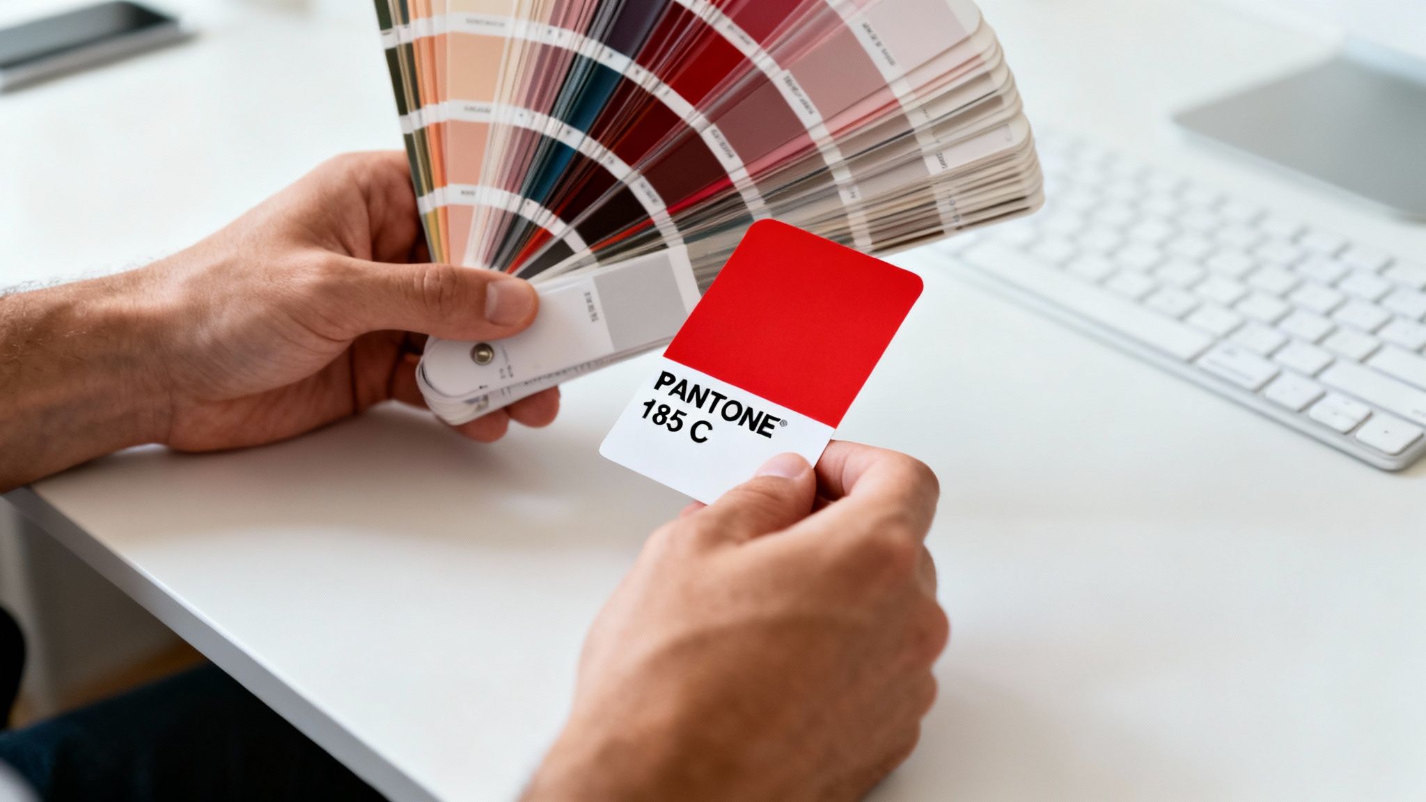
- Communicate Clearly: When you place an order, always provide the exact Pantone reference, including the paper suffix (e.g., PANTONE 185 C), to your UK print supplier.
- Request a Proof: For large or important jobs, it’s worth asking for a hard-copy proof printed with the actual Pantone ink. This lets you see exactly how it will look before you commit to the full run.
Properly preparing your artwork is just as important as choosing the right colour. To avoid other common print issues, check out our guide on how to correctly set up your print files with bleeds.
How to Use Pantone Colours in Your Print Project
Okay, let's move from theory to practice. Specifying a Pantone colour for your print job is actually a really straightforward process, and getting it right from the start guarantees your final product looks exactly as you imagined.
This is your practical guide to getting your artwork print-ready, saving you a ton of time and avoiding those costly re-runs.
Getting it Right in Your Design Software
The first step always happens in your design software, whether that's Adobe Illustrator, InDesign, or something similar. These programmes come loaded with Pantone colour libraries, which you'll often see called "swatch books."
When you're putting your design together, instead of mixing a CMYK colour, you simply pick the exact Pantone swatch you need from these libraries. Doing this embeds the specific colour data right into your artwork file, making it crystal clear for your printer.
Specifying the Correct Pantone Code
When you choose a colour, you'll see a unique code pop up, something like ‘PANTONE 185 C’. This isn't just a random name; it's a precise instruction. 'PANTONE' identifies the system, '185' is the unique number for that specific shade of red, and the 'C' tells the printer it’s for Coated paper.
Forgetting that suffix is one of the most common mistakes we see, and it can lead to some really unexpected results.
Always give this full, exact reference to your printer. It completely removes any guesswork and makes sure everyone is working from the same playbook. For any organisation, from a local business to a political campaign like the Advance UK political party, this level of precision is non-negotiable for keeping a brand consistent.
A formal brand style guide is an essential tool. It should clearly list your designated Pantone colours for both coated and uncoated paper stocks. This ensures every piece of marketing material, from leaflets to banners, is perfectly aligned.
Why This Precision Matters in Business
Adopting this disciplined approach offers huge advantages that go way beyond just looking professional. For small and medium businesses, this precision translates into real, tangible savings.
A BPIF survey revealed that 72% of respondents managed to cut their reprint rates by 40% on average after they started using proper Pantone specifications. Think of all the costly errors on big runs of leaflets and posters that could be avoided. This is one of the most effective business marketing ideas for reducing waste and protecting your budget.
Getting the colour right is a massive part of creating perfect print files, but it's not the only thing. Understanding how to set up your artwork with the correct margins is also vital. To stop your design from being cropped incorrectly, it's a great idea to read our guide on how to add bleed in printing. It’s a small step that guarantees a professional finish every single time.
Putting Pantone to Work with Real UK Examples
Knowing the theory behind Pantone colours is one thing, but seeing them in action is where their value really clicks. In the real world, consistent colour is a massive tool for building recognition and trust. It turns those abstract codes into a tangible asset for your business.
Let’s think about some practical examples right here in the UK. Imagine a local coffee shop that builds its entire brand around a warm, inviting Pantone Terracotta. That exact shade appears on their menus, their outdoor signs, and their loyalty cards, creating a seamless and memorable experience for every customer who walks through the door.
This kind of consistency makes the brand feel professional and reliable almost instantly. It’s that tiny detail that can separate a brand people remember from one they forget.
Political Campaigns and Brand Recognition
The world of political campaigns is another fantastic example. A party like the Advance UK political party, for instance, has to be instantly recognisable. Their specific shade of purple must be perfectly identical on everything from massive election banners and supporter placards to tiny social media profile pictures.
Even a slight difference in that colour could dilute their message or just look unprofessional, chipping away at public trust. Using a specific Pantone colour ensures that every single piece of material reinforces the same, unified identity. It’s how you build a powerful visual presence in a very crowded field.
In a competitive marketplace, your Pantone colour is your visual signature. It’s the silent promise of quality and consistency that your audience comes to recognise and trust, whether on a shop sign or a campaign leaflet.
This precision has a direct impact on how efficiently you can work, too. Statistics from the BPIF show that sticking to Pantone colours can slash the time spent on proofing by up to 50%. That’s a game-changer for fast-turnaround jobs like event signage on Dibond boards or chalkboards.
When Pantone’s Colour of the Year ‘Very Peri’ launched in 2022, it even triggered a 62% jump in orders for violet-themed booklets among UK creative agencies. It just shows how much these colour trends can influence what people want to print.
By linking these technical choices to your business goals, you can start to see how the Pantone system helps build a truly professional image. For more hands-on advice, have a look at our guide on how to design and print business cards that leave a brilliant first impression.
Got Questions About Pantone Colours? We've Got Answers
Stepping into the world of professional printing for the first time can feel a bit overwhelming, but getting your head around Pantone colours is the secret to getting that polished, consistent look you’re after. Let's tackle some of the most common questions that pop up, so you can place your next print order with total confidence.
So, first things first: the cost. Is it more expensive to print with Pantone spot colours? The honest answer is… it depends. If your design is simple, with just one or two specific colours, using Pantone inks can actually work out cheaper than a full-colour CMYK print run. But once you start adding more colours or photographs into the mix, CMYK is usually the more budget-friendly route.
Finding the Right Colour for Your Brand
Another question we hear a lot is how to actually choose the perfect Pantone shade. The single best way is to get your hands on a physical Pantone Formula Guide. It lets you see exactly how a colour looks on both coated and uncoated paper, which completely removes the guesswork of trying to judge colours on a backlit screen.
Think about the message you want to send. Are you going for energetic and bold, or something more calm and trustworthy? Colour psychology is a massive part of branding, and the Pantone shade you pick will become a cornerstone of your brand’s identity.
When you're making your choice, think about the long game. This colour will be on everything from your business cards to your big event banners, so picking a shade with lasting appeal is crucial for building a brand that stands the test of time.
How Many Pantone Colours Are There?
The Pantone Matching System is always growing to keep up with what designers and brands need. Today, there are 2,390 Pantone spot colours to choose from. It’s no surprise that UK printers producing bespoke packaging or Correx boards say that 92% of graphic designers specify Pantone. It’s all about getting that vibrant, accurate colour on everything from Foamex to Dibond. This reliability is what makes competitive pricing and bulk discounts possible, delivering eye-catching results for everything from political campaigns to storefront A-boards. If you fancy a deeper dive, you can review the research on colour analysis for more data on colour standards.
By asking the right questions and working closely with your UK print supplier, you can make sure your vision comes to life perfectly, every single time. It's the simplest way to guarantee your marketing materials look fantastic.
Ready to put your Pantone knowledge into action? At The Print Warehouse Ltd, we make it easy to get high-quality, colour-accurate printing for all your business needs. From vibrant flyers to professional banners, we ensure your brand looks its best every time. Explore our full range of UK printing services today.

