
A comp slip template is more than just a digital file; it's a reusable blueprint for one of your brand’s most personal touchpoints. These small, branded notes are perfect for adding a quick, informal message to a delivery or document. The standard UK size is DL (99mm x 210mm), which fits neatly inside a standard business envelope, making it a much more professional alternative to a scribbled sticky note.
Laying the Groundwork for Your Comp Slip Template
Before you even think about opening Adobe Illustrator or Canva, it’s vital to get the fundamentals right. A bit of planning now saves a world of headaches—and costly printing errors later on. Think of it as drawing up the blueprint for a house; you wouldn't start building without knowing where the walls go.
This all starts with brand consistency. Your compliment slip is a tiny ambassador for your company, so it needs to look the part. It must align perfectly with your existing branding, from logos and colour palettes to the specific fonts you use. If you haven't already, establishing effective visual brand guidelines is the single best thing you can do for cohesive branding.
UK Compliment Slip Specifications at a Glance
To make things simple, here’s a quick-reference table with all the essential specs you’ll need to set up your file correctly. Getting these details right from the start is non-negotiable for a professional result.
| Specification | Standard Measurement | Why It Matters |
|---|---|---|
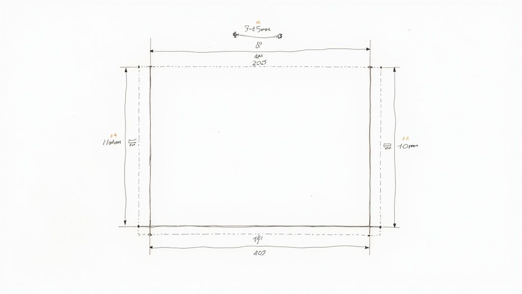
| Finished Size (Trim) | DL (99mm x 210mm) | This is the final size of your comp slip after it's been cut. |
| Bleed Area | 3mm on all sides | Extends your design beyond the trim line to avoid white edges after cutting. |
| Total Artwork Size | 105mm x 216mm | Your document size, including the bleed, before it goes to print. |
| Safe Area | 3mm to 5mm inside trim | Keeps your logo, text, and vital info from being accidentally chopped off. |
| Colour Mode | CMYK | The standard colour model for professional printing. |
| Resolution | 300dpi | Ensures your images and text are sharp and clear, not blurry. |
Bookmark this table or keep it handy. It’s the foundation of a print-ready design that will look exactly as you intended.
Understanding Print Terminology
Navigating print specs can feel like learning a new language, but there are three terms you absolutely must know: bleed, trim, and safe area.
- Bleed Area: This is a 3mm border you add around your entire design. Any background colours or images must stretch all the way to the edge of this bleed area. It’s what prevents those ugly, unprofessional white slivers from appearing after the printer trims the paper.
- Trim Line: This is simply the edge where your comp slip will be cut to its final DL (99mm x 210mm) size. It's the line of truth for your finished product.
- Safe Area: Think of this as a safety net inside the trim line, usually 3-5mm in. All your crucial stuf logo, contact details, company number must live comfortably inside this zone. If it strays outside, it's at risk of being trimmed off.
A classic rookie error is pushing text right up to the edge of the page. By keeping everything important tucked inside the safe area, you guarantee a clean, balanced, and professional finish every single time.
Essential Information to Include
A great compliment slip is more than just a logo on a piece of paper. To be useful and, in some cases, legally compliant for UK businesses, it needs to have some core information. The main goal is to leave plenty of white space for that all-important handwritten note, but your template must include:
- Company Logo: The star of the show, usually placed at the top.
- Company Name: Your official, registered business name.
- Full Address: Don't forget the postcode!
- Contact Details: Phone number, email, and website URL are standard.
- Company Registration & VAT Number (if applicable): A legal must-have for limited companies and VAT-registered businesses.
Organising this information clearly is key to a polished look. To see how your comp slip can fit into a wider family of branded materials, check out our full range of business stationery printing services. A well-planned template ensures every little slip you send out does its job perfectly, reinforcing your brand identity with every note.
Bringing Your Comp Slip Design to Life
With the foundational specs sorted, it’s time to move from theory to practice and start building your comp slip template. Whether you're a seasoned designer juggling multiple projects or a small business owner getting hands-on, there are excellent tools available to bring your vision to life.
We’ll walk through the big three: Adobe InDesign, Adobe Illustrator, and the ever-popular online platform, Canva. Each has its strengths, and your choice will likely come down to what you're comfortable with and have access to. The end goal, however, is always the same: a perfectly formatted, print-ready file that flies through production.
Setting Up in Adobe InDesign and Illustrator
For anyone using Adobe Creative Cloud, InDesign and Illustrator are the industry standards for good reason. They give you total control over typography, layout, and colour management—all crucial for professional print work.
If you’re working in Adobe InDesign, the master page feature is your best friend. Seriously. By placing your logo, address, and other fixed elements on a master page, you ensure every piece of stationery you create is perfectly consistent. It’s a small step that saves a huge amount of time and prevents accidental changes down the line. To keep everything consistent, our high-quality letterhead printing options pair perfectly with your comp slips.
For those who prefer Adobe Illustrator, the key is precise artboard management. When you create your new document, set up the artboard to 105mm x 216mm. This includes the 3mm bleed right from the start. A common mistake we see is designing to the final trim size and adding bleed later, which often throws the whole layout off. Also, a final pro-tip: remember to outline your fonts before exporting to avoid any nasty font substitution surprises at our end.
Designing a Print-Ready Comp Slip in Canva
Canva has become the go-to for its incredibly user-friendly interface, making great design accessible to everyone. While it’s brilliantly intuitive, setting up a file for professional printing requires a few specific steps that are easy to miss.
Here’s a quick guide to getting it right in Canva:
- Start with Custom Dimensions: On the Canva home screen, click "Create a design" and choose "Custom size." Enter 105mm x 216mm to build your canvas with the bleed included from the get-go.
- Show Rulers and Guides: This is a non-negotiable step. Go to File > View settings > Show rulers and guides. Drag guides from the rulers to mark out your 3mm bleed on all sides and your 5mm safe area inside the trim line. This visual aid is invaluable for preventing mishaps.
- Add Your Brand Elements: Upload your high-resolution logo (a PNG with a transparent background works best) and pop in your contact details using your brand fonts and colours.
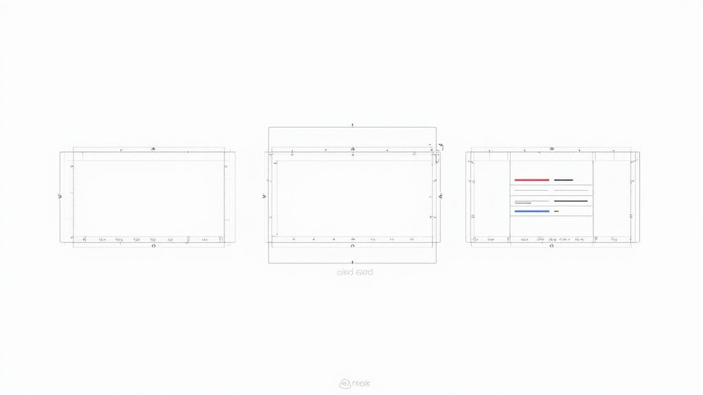
The image above shows how you can use Canva’s pre-built templates as a starting point, but always remember to adjust them to the correct print specifications we've discussed. If you're looking to generate multiple personalised versions efficiently, Mastering design automation tools like the Canva Automate Maker can be a fantastic way to streamline your workflow.
Key Takeaway: No matter which software you use, the most critical step is setting up your document correctly with the right dimensions, bleed, and safe area from the outset. This single action prevents over 90% of common print file errors.
By following these program-specific tips, you can confidently create a comp slip template that not only looks fantastic but also prints without a single hitch.
Choosing Paper That Makes an Impression
The feel of your compliment slip can say just as much as the words written on it. A flimsy, generic piece of paper feels forgettable, but a quality stock communicates professionalism before your client even reads your note. Think of it as a crucial branding decision.
Your first port of call is the paper's weight, measured in grams per square metre (gsm). Standard office paper usually sits around 80-90gsm, so stepping up from that makes an immediate, noticeable difference.
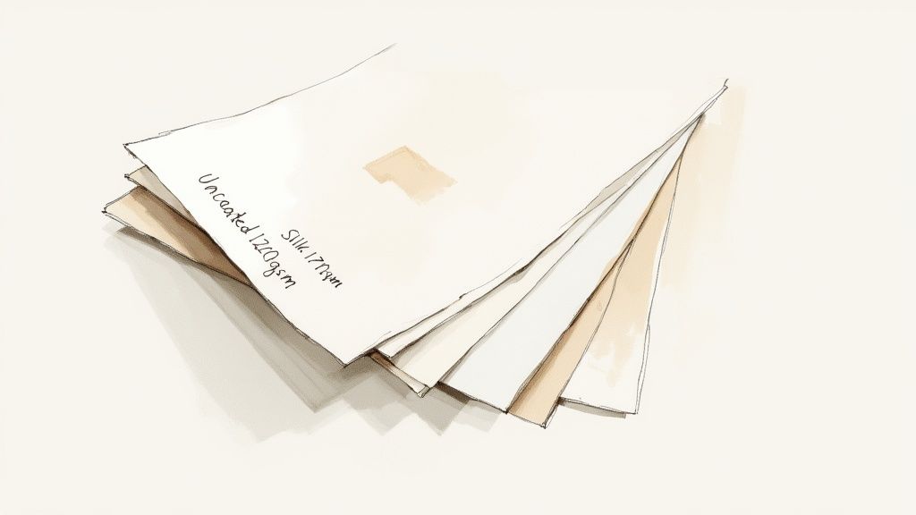
For compliment slips, a 120gsm paper is a fantastic all-rounder. It has a substantial, premium feel without being too stiff, striking that perfect balance between quality and everyday practicality. If you really want to make a statement, a 170gsm stock provides a stiff, almost card-like feel that conveys importance and high value.
Paper Finishes Uncovered
Beyond its weight, the paper's finish completely changes how your colours and text appear. Each one has its own personality, and picking the right one comes down to your brand’s style and, crucially, how you plan to use the slips. After all, some finishes are much better for writing on than others.
Here's a quick rundown of what we see people choosing most often:
- Uncoated Paper: A timeless classic, and for good reason. Its natural, matte surface is porous and absorbs ink beautifully, making it the perfect canvas for handwritten notes. It gives you a clean, understated, and thoroughly professional look.
- Silk Coated: If you're after something a bit sleeker, a silk finish is a great middle-ground. It provides a smooth, low-sheen surface that sits between matte and gloss. It makes colours look rich and vibrant without the high-shine reflection of a full gloss.
- Gloss Coated: With its shiny surface, a gloss finish makes colours pop with incredible vibrancy. It's a brilliant choice for designs heavy on graphics or photography, but be warned—it can be tricky to write on with certain pens.
Always think about the user experience. If your main goal is to add a personal, handwritten message, an uncoated stock is almost always your best bet. Its texture grips the ink, prevents smudging, and just feels right to write on.
To help you decide, here’s a quick comparison of our most popular paper options.
Comparing Paper Stocks and Finishes
A side-by-side look at popular paper choices to help you find the perfect match for your comp slips.
| Paper Type / Finish | Best For | Feel & Appearance |
|---|---|---|
| Uncoated | Handwritten notes, classic and corporate branding | Natural, matte, slightly textured. Excellent writability. |
| Silk | Modern brands, vibrant colour without high shine | Smooth, low-sheen, sophisticated feel. Great for colours. |
| Gloss | Photo-heavy designs, eye-catching marketing | Shiny, reflective, makes colours pop. Less easy to write on. |
| Recycled | Eco-conscious brands, rustic and organic aesthetics | Slightly off-white with a natural, earthy texture. |
Choosing the right stock ensures your final product not only looks professional but also feels intentional and on-brand.
When to Consider Special Finishes
For brands looking to create a truly memorable impact, special finishes can elevate your comp slip from simple stationery to a high-end marketing tool. Think of things like a soft-touch laminate, which adds a velvety, luxurious texture that people can't help but notice.
These premium options do add to the cost, but they can be invaluable for high-stakes client communications or luxury brands where every single detail counts. Exploring the full range of premium compliment slips can give you a better idea of how different finishes and paperweights come together to create a powerful impression. The right choice ensures your comp slip template produces a final product that feels every bit as good as it looks.
Exporting a Flawless File for Professional Printing
Getting your design file ready for a commercial printer is the final, crucial step. This is where your beautiful on-screen design gets translated into a physical product, and even tiny mistakes at this stage can lead to costly reprints. Taking a few minutes to get your file technically perfect guarantees that the vibrant compliment slip you designed is the one that actually arrives at your door.
This process is often called 'pre-flighting', and it’s basically a quick but essential checklist. Think of it as your last chance to catch common gremlins like incorrect colour modes or low-resolution images that can ruin an otherwise perfect comp slip.
The Print-Ready Checklist
Before you even think about hitting 'export,' run through these non-negotiable checks. They really are the difference between a smooth, fast printing process and a frustrating email from the print shop asking you to send a new file.
- Colour Mode Conversion: Your screen displays colours in RGB (Red, Green, Blue), but professional printing presses use CMYK (Cyan, Magenta, Yellow, Black) ink. You must convert your entire document to the CMYK colour space. If you don't, you'll get unexpected and often disappointing colour shifts—that vibrant electric blue on your screen can easily turn into a dull, flat purple in print if it's left as RGB.
- Image Resolution: Make sure all images, especially your logo, have a resolution of 300dpi (dots per inch) at their final print size. Anything less will result in a blurry, pixelated finish that just undermines your brand's professionalism.
- Font Management: Unrecognised fonts are a classic print-file headache. You have two solid options to prevent this: embedding the fonts directly into your PDF, or outlining them (which converts the text to vector shapes). Outlining is the safest bet, as it completely removes any font dependencies from the file.
A common but avoidable error we see is exporting a file with text set to "Registration Black" instead of 100% K (Black). Registration black uses all four CMYK inks, which can oversaturate the paper and cause blurry text. Always use pure black for crisp, clean typography.
Exporting to PDF/X-1a: The Industry Standard
Once your pre-flight checks are all ticked off, it's time to export. While PDF is the right format, not all PDFs are created equal. For professional printing, the gold standard is PDF/X-1a:2001.
This specific format is designed to eliminate all the little variables that cause print issues. It automatically flattens transparency, embeds the necessary colour profile, and ensures every element is print-compatible. In design software like Adobe Illustrator or InDesign, you can usually just select this as a preset in the 'Export' or 'Save As' dialogue.
Using this format tells the printer’s software that your file is correctly prepared and ready to go, which speeds up processing and minimises the risk of errors. If you've followed these steps, your comp slip template is now perfectly optimised for production. You can confidently upload your artwork and place your order through The Print Warehouse online PrintShop, knowing you've done everything right for a flawless result.
Avoiding Common Comp Slip Design Mistakes
Seeing where others have gone wrong is one of the fastest ways to get your design right the first time. Over the years, we’ve handled countless print files, and you start to notice the same design pitfalls cropping up again and again. If you can steer clear of these common blunders, you'll be well on your way to producing a clean, professional, and genuinely useful comp slip.
The most frequent mistake we see? Information overload. It’s so tempting to cram every possible detail onto the slip, but this just creates a cluttered, unreadable mess that completely defeats the purpose. A comp slip is meant to carry a brief, personal note. That white space isn't empty—it's an essential design element that gives your message room to breathe.
Overlooking Technical Print Requirements
A design that looks stunning on your screen can quickly become a blurry, disappointing print if the technical details aren't sorted. One of the biggest culprits is using a low-resolution logo. A logo you've grabbed from a website is almost certainly 72dpi, which will look pixelated and fuzzy on paper. You absolutely must use a high-resolution vector or 300dpi version for a crisp, professional finish.
Another classic technical oversight is font choice. While a delicate, ornate script might look beautiful on-screen, it can become totally illegible when printed at a small size.
- Stick to clean, readable sans-serif or serif fonts. For any body text, we recommend a minimum of 8pt to ensure it’s easy to read.
- Always test your font choices. Print a copy at its actual size to see how it looks before you commit to a full print run. It’s a simple step that can save a lot of headaches.
This diagram breaks down the core technical workflow you need to follow when creating a print-ready PDF from your comp slip template.
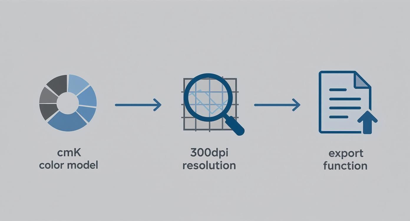
Getting your file set up correctly in CMYK, at 300dpi, and exporting it properly is the foundation for avoiding the most common printing errors. For more design insights and technical tips, feel free to explore our other articles on The Print Warehouse blog.
Neglecting Visual Hierarchy and Purpose
Finally, a weak visual hierarchy can make a compliment slip completely ineffective. If every element on the page has the same visual weight, the recipient has no idea where to look first. Your logo and company name should be the most prominent features, followed by your contact details. Use size, weight, and colour to guide the eye naturally through the information.
It’s also crucial to remember the slip’s primary purpose. A comp slip is a physical, personal touchpoint – a completely different beast to something like a payslip, where data and accuracy are king. Since 2019, UK employers have been required to provide itemised payslips to all workers, a change that has understandably pushed many towards digital solutions. In fact, over 70% of UK businesses now use digital payslip templates to improve accuracy.
A compliment slip’s value, in contrast, lies in its physical, personal nature. Forgetting to leave ample, un-fussy space for a handwritten note is perhaps the biggest mistake of all. It undermines the very reason the comp slip exists.
Your Comp Slip Questions, Answered
Even the smoothest design process can leave you with a few lingering questions. It happens to everyone. To help you cross the finish line, we’ve put together this quick-fire guide to tackle the most common queries we get about comp slips.
Think of this as the final check-in before you send your design to print. We'll clear up the difference between comp slips and letterheads, explain why some software is best avoided, and demystify the age-old problem of screen colours versus print colours.
What’s the Difference Between a Comp Slip and a Letterhead?
While they're both core parts of any professional stationery set, comp slips and letterheads have very different jobs. A letterhead is your official A4 page, reserved for formal documents—think contracts, important correspondence, or invoices. It’s the heavyweight of your business communications.
A comp slip, on the other hand, is its smaller, more informal cousin. Usually a standard DL size (99mm x 210mm), it’s designed for quick, handwritten notes. It's the perfect branded alternative to a sticky note, ideal for tucking in with a brochure, a product sample, or a set of documents to add that personal touch.
Can I Design My Comp Slip in Microsoft Word?
Technically, yes, you can. But for professional printing, we’d really advise against it. The main problem is that Word works in RGB (Red, Green, Blue), a colour mode built for digital screens. When your RGB file gets converted to the CMYK (Cyan, Magenta, Yellow, Black) inks used by printing presses, colours can shift in weird and wonderful ways—and rarely for the better.
Using a program like Word for a print job often results in muddy, washed-out colours and logos that just don't look sharp. For predictable, top-quality results, stick to dedicated design tools like Canva, Adobe Illustrator, or InDesign. They give you the precise control you need for a flawless print run.
Why Do My Printed Colours Look Different From My Screen?
This is a classic for a reason, and it almost always comes back to the RGB vs. CMYK issue. Your computer monitor creates colour by emitting light, mixing red, green, and blue to produce millions of bright, vibrant shades. It’s a massive palette, but one that simply can’t be replicated with ink on paper.
Printers work by mixing physical CMYK inks to absorb light and create colour. This process has a much more limited range (or 'gamut') than an RGB screen. To avoid any nasty surprises, the golden rule is to always set up and design your comp slip template in CMYK mode from the very start. That way, what you see is much closer to what you’ll get.
Ready to turn that perfect template into a stack of professional comp slips? At The Print Warehouse Ltd, we make it easy to upload your design and get a high-quality finished product that does your brand justice. Get started with your print order today.

