
So, you need to print some posters. Sounds simple enough, right? But getting from a design on your screen to a high-impact poster in your hands involves a few key decisions. Whether you're promoting a local gig, launching a marketing campaign, or planning to sell your art, getting the details right is what separates an amateur-looking job from a professional one.
This guide is designed to cut through the jargon and give you practical, straightforward advice for printing fantastic posters here in the UK.
Your Guide to Flawless Custom Posters
Forget trial and error. We're here to walk you through the entire process, making sure your vision translates perfectly from digital file to physical print. This is your hands-on guide to avoiding common (and often costly) mistakes.
We'll cover everything from choosing the right paper that makes your colours pop to setting up your artwork correctly. No vague suggestions here—just insider tips and real-world examples to get you the best possible result.
What to Expect from This Guide
Think of this as your roadmap. Our goal is to give you the confidence to manage your print projects from start to finish.
Inside, you'll find clear, actionable information on:
- Material Selection: We’ll break down the differences between gloss, silk, and uncoated finishes and help you decide which paper weight is right for your project.
- Artwork Preparation: A no-nonsense look at bleed, resolution, and colour modes. Getting this right is crucial for a flawless print.
- Ordering and Production: How to navigate the proofing process, understand turnaround times, and get the most for your money.
- Practical Applications: Tips for displaying your posters effectively, because a great poster deserves to be seen.
Posters are often a cornerstone of any promotional effort. Understanding the key role promotions play in events can give you valuable context and help you see how a well-executed poster fits into the bigger picture.
A well-designed poster does more than just inform; it grabs attention, conveys a message, and drives action. Getting the technical details right is the foundation of its success.
Our advice is tailored specifically for anyone looking for custom poster printing UK services. Whether this is your first time ordering or you’re a seasoned pro looking to refine your process, there's something in here for you.
Ready to see how these concepts apply in the real world? You can explore a wide range of options for poster printing to get a feel for the possibilities.
Let's get started.
Choosing the Right Paper and Size
Getting the foundation of your poster right is the first, and arguably most important, decision you'll make. It’s the difference between a design that just looks good on screen and one that makes a real impact in person. The right combination of size and paper stock ensures your message isn't just seen, but felt.
The first question I always ask clients is simple: where will this poster live? The answer dictates everything that follows. A poster tacked to an office notice board has entirely different requirements from one in a high-street shop window or hanging on a gallery wall.
Matching Poster Size to Your Goal
Here in the UK, we live by the 'A' series of paper sizes. It’s a beautifully logical system that scales perfectly. Picking the right one is a balancing act between visibility, the space you have to work with, and your budget. Bigger isn't always better if your audience is standing right in front of it.
Let's walk through the most common choices and where they shine.
- A4 (210 x 297mm): Small but mighty. A4 posters are perfect for community notice boards, staff rooms, or countertop displays where people get up close. They're incredibly cost-effective for sharing detailed info like menus or event schedules.
- A3 (297 x 420mm): Double the size of A4, this is a crowd-pleaser for indoor promotions in cafes, shops, and offices. It's large enough to grab attention from a few feet away without completely taking over the space.
- A2 (420 x 594mm): Now we're getting into high-impact territory. A2 is a firm favourite for gig posters, window displays, and point-of-sale advertising where you need to cut through the noise.
- A1 (594 x 841mm): A classic large-format size. It's ideal for trade show graphics, conference signage, and promotions you want seen from across the room. The scale gives you room for bold graphics and text that's easy to read from several metres away.
- A0 (841 x 1189mm): This is the big one, designed for maximum impact. A0 is for major advertising campaigns, large-scale plans, and any situation where you absolutely must command attention from a distance.
The goal is always to match the poster's scale to its environment. An A0 poster crammed into a small corridor is just overwhelming, while an A4 notice in a cavernous exhibition hall will get completely lost.
For a quick overview, here’s a handy guide to our standard UK poster sizes and what they're typically used for.
UK Poster Size Guide and Common Uses
| Size | Dimensions (mm) | Best For |
|---|---|---|
| A4 | 210 x 297 | Notice boards, countertop displays, detailed info sheets |
| A3 | 297 x 420 | In-store promotions, cafes, office announcements |
| A2 | 420 x 594 | Event posters, window displays, point-of-sale |
| A1 | 594 x 841 | Trade shows, conference signage, large advertisements |
| A0 | 841 x 1189 | Major campaigns, exhibitions, maximum-impact displays |
This table should help you quickly pinpoint the best fit for your project.
Decoding Paper Finishes and Weights
Once you've nailed down the size, the next layer is the paper itself. The finish and weight (measured in gsm, or grams per square metre) determine how your poster feels, how vibrant the colours look, and how well it holds up.
Gloss Finish
A gloss finish gives you a high-shine, reflective surface that makes colours pop. It’s a fantastic choice for photographic posters or designs with deep, rich colours that need to look super vibrant. The only catch? Its reflective nature can be a pain in brightly lit spaces, as direct light can cause glare and make it hard to read.
A good, solid weight for gloss posters is around 170gsm—it offers a nice balance of quality without being too rigid.
Silk Finish
Silk (sometimes called satin) is my personal favourite and the perfect all-rounder. It has a smooth, subtle sheen that boosts colour vibrancy but without the mirror-like reflection of a full gloss. This makes it incredibly versatile for everything from corporate presentations to art prints. It has a professional feel and is much more forgiving with fingerprints.
For many people ordering quality indoor posters, a silk finish at around 200gsm is the go-to option.
Matte or Uncoated Finish
A matte finish has no sheen at all, which results in a flat, modern, and often sophisticated look. It's brilliant for designs with a lot of text or illustrations where you want to avoid any distracting glare. This non-reflective quality makes matte perfect for gallery prints or any display that will be viewed under direct lighting.
The weight of the paper is just as important as the finish. For context, standard office paper is about 80-90gsm, which is far too flimsy for a poster. Stepping up to a heavier stock, like a 260gsm paper, gives your poster a substantial, premium feel and makes it much easier to handle without it creasing or tearing.
Preparing Print-Ready Artwork That Works
So, you've picked the perfect size and paper for your poster. Now for the most important part: getting your design file spot-on. Submitting flawless, print-ready artwork is the single biggest factor in getting the poster you’ve pictured in your head. This step is all about translating your digital design into a language the printing press understands, ensuring a crisp, accurate, and professional result.
Getting these technical bits right from the start is the best way to avoid common headaches like weird white borders, blurry images, or colours that look nothing like they did on your screen. A few minutes of prep here will save you from disappointment, delays, and costly reprints down the line.
This flow chart breaks down the first few decisions that build the foundation for your project.
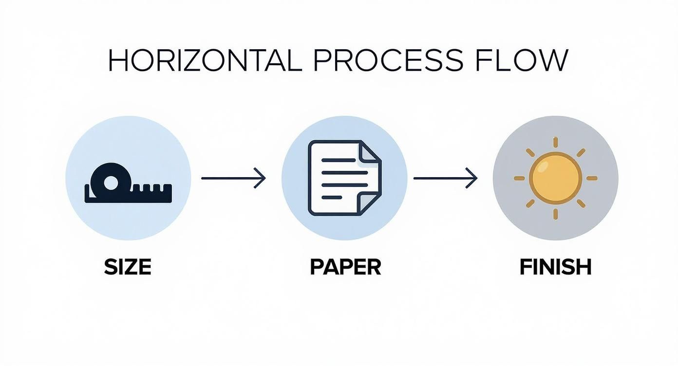
As you can see, each choice informs the next, leading straight into how you should set up your artwork file.
The Non-Negotiable Bleed
Ever seen a printed poster with a thin, jarring white sliver along one edge? That’s what happens when a design has no bleed. Bleed is a small safety margin usually 3mm on each side where your design extends beyond the final trim line.
During the high-speed trimming process, paper can shift ever so slightly. That extra 3mm margin acts as a buffer. The blade cuts within this bleed area, making sure your background colour or image runs right to the very edge of the finished poster, with no white gaps.
Think of it like using masking tape when painting a wall. You paint slightly over the tape, and when you peel it off, you're left with a perfectly sharp line. Bleed works on the same principle, guaranteeing a clean, professional finish every single time.
Forgetting to add bleed is one of the most common reasons we have to reject artwork. Always set up your document with a 3mm bleed on all sides from the very beginning to save yourself a headache later.
Mastering Resolution for Sharp Prints
The clarity of your printed poster all comes down to its resolution, measured in DPI (dots per inch). For print, the industry gold standard is 300 DPI. This high resolution ensures that all your images, text, and graphics are sharp, detailed, and professional-looking.
A classic mistake is grabbing an image from a website for your print design. Web images are typically low-resolution, around 72 DPI, which looks perfectly fine on a screen but will come out looking blurry and pixelated on paper.
- Low Resolution (72-150 DPI): Your images will look "soft," blocky, or jagged. Fine details get lost, and the overall quality will be noticeably poor.
- High Resolution (300 DPI): The result is sharp, clear, and professional. Every detail is rendered accurately for a high-quality finish.
Always check your image resolution before you start designing. If you zoom in to 100% on your screen and it looks fuzzy, that’s a dead giveaway it won’t print well. When in doubt, always start with the highest quality image you can get your hands on.
The Crucial Difference Between RGB and CMYK
This is the one that trips a lot of people up. The colours on your monitor are created with light (Red, Green, and Blue, or RGB), but a printing press uses ink (Cyan, Magenta, Yellow, and Black, or CMYK). The range of colours each method can produce—known as the 'gamut'—is different.
RGB has a much wider and more vibrant spectrum, which is why that electric blue or neon green looks so intense on your screen but can appear disappointingly dull in print. If you send us a file in RGB mode, our software has to convert it to CMYK, and the results can be unpredictable.
To make sure the colours on your final poster are as accurate as possible, it's vital to get your head around understanding CMYK vs RGB for print. The best practice is to always set your design software’s colour mode to CMYK from the very beginning. This gives you a far more realistic preview of the final printed colours as you work.
For more deep dives into artwork preparation, check out our blog for other helpful guides. By taking control of these technical details, you're ensuring your final poster looks exactly how you envisioned it.
Getting Your Proof Right and Hitting Your Deadlines
You've done the hard work and your artwork is ready. Now we move into the crucial final checks before anything hits the press. This is all about the proofing and production timelines – the steps that guarantee what you designed is what you get. A few minutes spent understanding this part of the process will save you from any headaches down the line.
The proof is your last chance to catch anything that's not quite right. It's that final checkpoint for spotting a rogue typo, making sure your brand colour is spot-on, or just confirming the layout is perfect before we print the whole batch.
Digital vs. Hard-Copy Proofs: What’s the Difference?
Before your full order goes into production, you’ll get a proof to sign off on. It usually comes in one of two flavours, and each has its place.
- Digital Proof (PDF): This is the standard, and by far the quickest, option. We'll send you a PDF that shows exactly how your artwork will look, complete with bleed and trim marks. It's the perfect way to double-check text, image placement, and the overall composition.
- Hard-Copy Proof: This is a physical, printed sample of your poster, produced on the exact stock you've chosen. It takes a little longer to get to you, but it's the only way to be 100% certain about the colour and how the paper finish feels in your hand.
For most jobs, a digital PDF proof does the trick just fine. But if you’re working on something where colour is absolutely critical – like a corporate logo that has to be a specific Pantone shade, or a fine art reproduction – then it’s worth investing in a hard-copy proof. It takes all the guesswork out of the equation.
A physical sample can also be a game-changer for bigger projects, like if you're exploring options for rigid board printing, as it lets you feel the sturdiness and quality of the material itself.
Think of it like this: a digital proof is like checking the architect's blueprints, while a hard-copy proof is like walking through the show home. The plans confirm the layout is correct, but only the show home lets you feel the materials and see the colours in real life.
What to Look For When You Check Your Proof
When that proof lands in your inbox, it's tempting to give it a quick scan and hit 'approve'. Don't. Take a proper moment to go over it with a fine-tooth comb.
- Read Every Single Word: Seriously. Check for spelling mistakes, grammar slip-ups, and make sure all dates, phone numbers, and web addresses are correct. A neat trick is to read it backwards – it forces your brain to see individual words instead of just skimming sentences.
- Check Your Visuals: Are the images sharp? Is anything pixelated or blurry? Make sure logos and graphics are exactly where they should be and haven't been stretched or squashed.
- Mind the Margins: Look at the edges of the design. Is any important text or part of a logo getting dangerously close to the trim line (your 'safe zone')? You want to make sure everything looks balanced and nothing is at risk of being chopped off.
Once you give us the green light, the responsibility for any errors in the artwork shifts. A thorough check at this stage is the best way to make sure you’ll be happy with the final result.
From Production to Your Doorstep
As soon as you approve the proof, your job officially joins the production queue. Turnaround times for custom poster printing UK can vary depending on a few things.
A standard job usually takes a few working days, but keep these factors in mind:
- The Size of the Order: A small run of 50 posters will obviously be quicker to print and finish than 5,000.
- The Complexity: If you've chosen special finishes like lamination or a custom shape, it'll add a bit more time to the process.
- Your Urgency: Most printers, including us, offer express or next-day services for an extra fee if you're up against a tight deadline.
Finally, there’s the delivery. We know your posters need to arrive looking as good as they did when they left the press. That's why we use sturdy postal tubes for smaller orders and robust flat-pack boxes for larger quantities to stop any creases, folds, or battered corners happening in transit. Always check what shipping options are available to make sure your posters land safely and on time for your big launch.
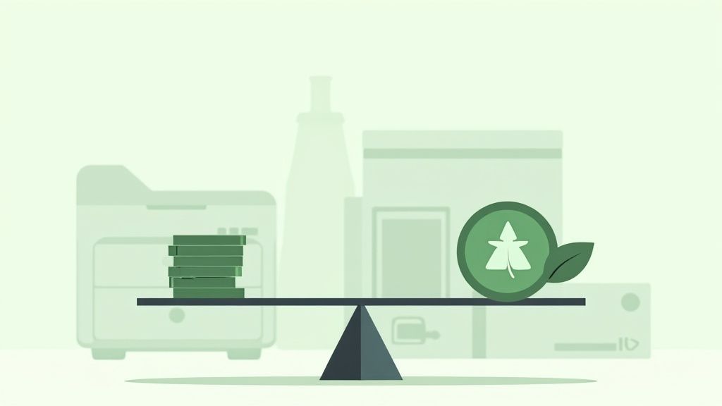
Balancing Cost and Eco-Friendly Choices
Getting the best value from your poster print run isn't just about chasing the lowest price tag. It’s about making smart choices on quantity, paper, and finishes that align with your budget and your brand’s values. Let’s break down how these elements affect the final cost and look at the growing importance of sustainable printing.
A thoughtful approach here can save you a surprising amount of money while strengthening your message.
Unlocking Economies of Scale
The single biggest factor influencing the price of your custom posters is quantity. The principle is simple: the more you print, the less you pay per poster. This is because the main costs—getting the printing press set up and preparing your artwork—are fixed, whether you print one poster or one thousand.
Once the setup is done, the cost of the extra paper and ink for each additional poster is minimal. This is what we in the industry call economies of scale. For a small batch of 50 posters, that initial setup cost is spread across just a few items, making each one more expensive. For a run of 1,000, the same cost is divided by a much larger number, dramatically dropping the price per piece.
The tipping point where you start seeing serious savings often comes sooner than you’d think. Always get quotes for a few different quantities—say, 250, 500, and 1,000. You might find that doubling your order costs far less than double the price, giving you much better value for your money.
How Your Choices Affect the Final Price
Beyond the print run size, a few other key decisions will shape your budget. Understanding them helps you put your money where it will make the most impact.
- Paper Stock: Heavier paper, like a premium 260gsm silk, feels more substantial but costs more than a standard 170gsm stock. Think about where the poster will be used. A high-end art print absolutely justifies the thicker paper, but a poster for a short-term promotion probably doesn't need it.
- Finishes: Special touches like lamination add a protective, professional feel but also increase the cost. For most bulk orders, a standard gloss or silk finish is the most cost-effective sweet spot.
- Turnaround Time: Need your posters by tomorrow? Express services are a lifesaver, but they come at a premium. Planning your project ahead and choosing a standard turnaround is one of the easiest ways to keep your costs down.
Embracing Sustainable Printing Options
Here in the UK, there’s a real and growing demand for environmentally conscious printing, and thankfully, it’s more accessible than ever. Choosing eco-friendly options isn’t just a niche decision anymore; it’s a powerful statement that connects with modern customers and can boost your brand’s reputation.
Many people now actively look for businesses that show a commitment to sustainability. By making greener choices, you're not just reducing your environmental footprint—you're aligning your brand with the values your audience cares about.
Accessible Eco-Friendly Materials
Making a sustainable choice doesn't have to be complicated or break the bank. Many eco-friendly options are now competitively priced and easy to find. One of the most effective ways to make a difference is by simply selecting the right materials from the get-go.
You can learn more about bringing green practices into your marketing by exploring options for recycled flyers, which follow the same principles as poster printing.
Key sustainable choices to look for include:
- Recycled Paper Stocks: Made from post-consumer waste, these papers reduce the need for virgin pulp and divert waste from landfills. They offer a fantastic, high-quality finish that’s virtually indistinguishable from their non-recycled counterparts.
- FSC-Certified Papers: Paper with the Forest Stewardship Council (FSC) logo is your guarantee that the wood pulp comes from responsibly managed forests, protecting biodiversity and promoting sustainable forestry.
- Vegetable-Based and Latex Inks: Traditional inks can be solvent-based, but many UK printers now offer brilliant alternatives. Vegetable-based inks use renewable resources, while water-based latex inks are odourless and release far fewer volatile organic compounds (VOCs).
Just ask your printer about these options. You can make an informed choice that balances cost, quality, and environmental responsibility, ensuring your custom poster printing UK project is a success on every level.
Your Custom Poster Printing Questions Answered
When you’re about to send a poster design to print, a few last-minute questions often pop up. It’s completely normal getting the details right is what turns a good poster into a great one.
To help you feel confident before you hit ‘order’, we’ve put together clear, straightforward answers to the most common queries we get from customers here in the UK.
Let’s get those final details sorted.
What Is the Best File Format to Submit for Poster Printing?
The industry gold standard, and what we always recommend, is a high-resolution PDF. There’s a good reason why it’s the preferred choice for professional printers everywhere.
Think of a print-ready PDF as a locked-down version of your design. It cleverly embeds all your fonts, fixes the layout in place, and preserves the CMYK colours exactly as you intended. Nothing can shift, change, or go missing when we open it on our end. For a perfect setup, make sure it includes the 3mm bleed and crop marks we ask for in our artwork guides.
While you can sometimes use a high-quality JPEG or TIFF file (as long as it’s saved at 300 DPI), a PDF is always the safest bet. It massively reduces the risk of weird surprises, like fonts being swapped out or colours looking off. A well-prepared PDF is your best guarantee for a flawless print.
How Can I Ensure Printed Colours Match My Screen?
This is probably the most common puzzle in printing, and it all boils down to one thing: screens and printers speak different languages. Your monitor uses light (RGB) to create colours, while our presses use ink (CMYK).
Your first and most important step is to set up your design file in CMYK colour mode right from the start. This gives you a much more accurate on-screen preview of how the colours will look when they’re actually printed on paper.
But even then, every monitor is calibrated differently. What you see isn't always a perfect match for the final print.
For projects where colour is absolutely critical like matching a specific brand shade or producing fine art prints—the only way to be 100% certain is to ask for a physical 'hard-copy' proof.
This is a real-deal printed sample of your poster, on your chosen paper. It lets you see and feel exactly how the colours will turn out, so you can sign off on the main print run with total peace of mind. It takes all the guesswork out of the equation.
What Are My Options for Outdoor Posters in the UK?
With our famously unpredictable British weather, a standard indoor poster won't last five minutes outside. For any kind of outdoor display, you need materials that are built to handle the wind, rain, and sun.
Letting your printer know the poster is for outdoor use is crucial. It means we can steer you towards the right stuff that won't fade or fall apart.
Here are a few excellent, weather-proof choices:
- PVC Vinyl: This is a tough, tear-resistant plastic material that’s completely waterproof. It’s the go-to for long-term outdoor signs and banners that need to be seriously durable.
- Waterproof Papers: These aren’t your average papers. They’re synthetic and specially designed to repel water, making them a great middle-ground for shorter outdoor campaigns.
- Blueback Posters: Ever wonder how they put up posters on billboards without the old one showing through? This is the secret. The opaque blue backing completely blocks out whatever is underneath, giving you a clean, vibrant display.
Just as important as the material are the inks. You need to be sure your printer is using UV-resistant inks, which are designed to stop your design from fading in the sunlight. Without them, even the toughest vinyl will look washed-out in a few weeks. Always double-check that both the material and the inks are fit for the great outdoors.
Ready to bring your vision to life? At The Print Warehouse Ltd, we make high-quality custom poster printing simple and affordable. From vibrant indoor displays to durable outdoor banners, we have the materials and expertise to make your project a success. Start your order today and see the difference professional printing makes.

